/ Bandcamp Rebrand
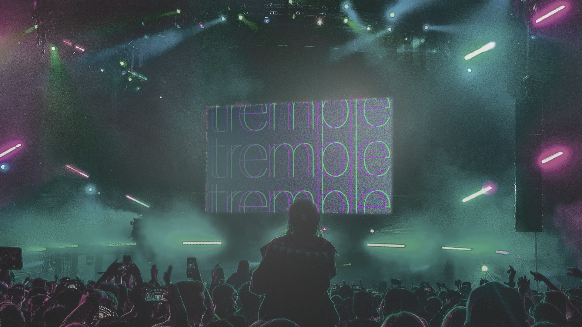
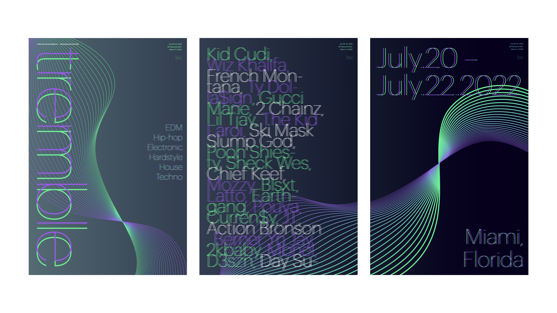
/ Tremble Music Festival
/ Aug–Dec, 2021
/ Transdisciplinary Design
/ Branding
/ Generative Design
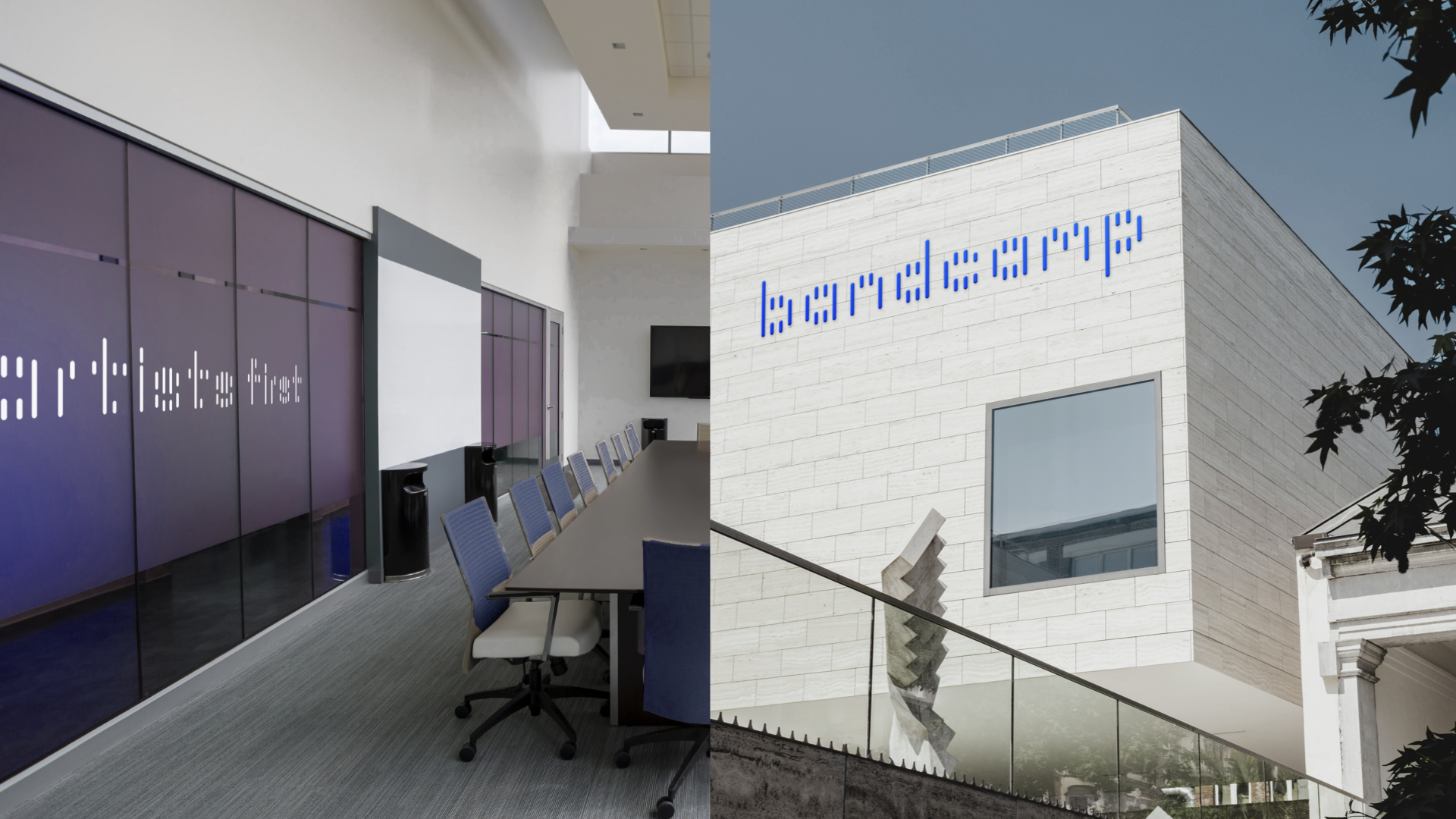
Bandcamp is an online record store and music community where passionate fans discover, connect with, and directly support the artists they love. With the rebrand, we hope to elevate the experience of both artists and the audiences. The transdisciplinary project allows artists to be more expressive with their music. This includes installation, generative coding, web design and printed matter.
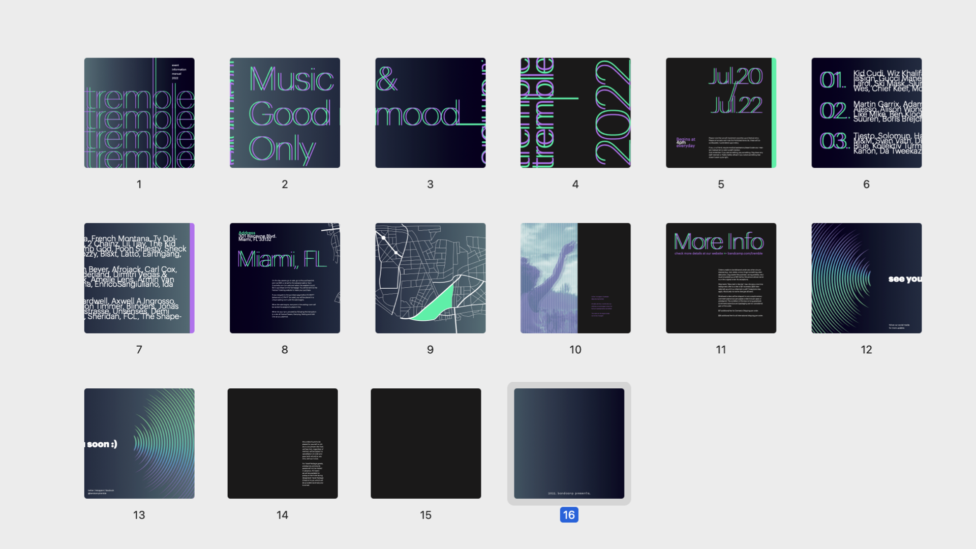
The rebrand project also contains a sub-brand identity, Tremble Music Festival.
The logo is redesigned with P5js, to mimic the sound vibrations of music. This allows the logo system to be versatile, where the colors and the sound waves change depending on the music.
Inspired by the vibrations of music, I created this lowercase typeface that can be applied to different contexts.
Vertical structures and a nice gradient of blue are applied to the stationery system in order to showcasing the nature of rhythm.
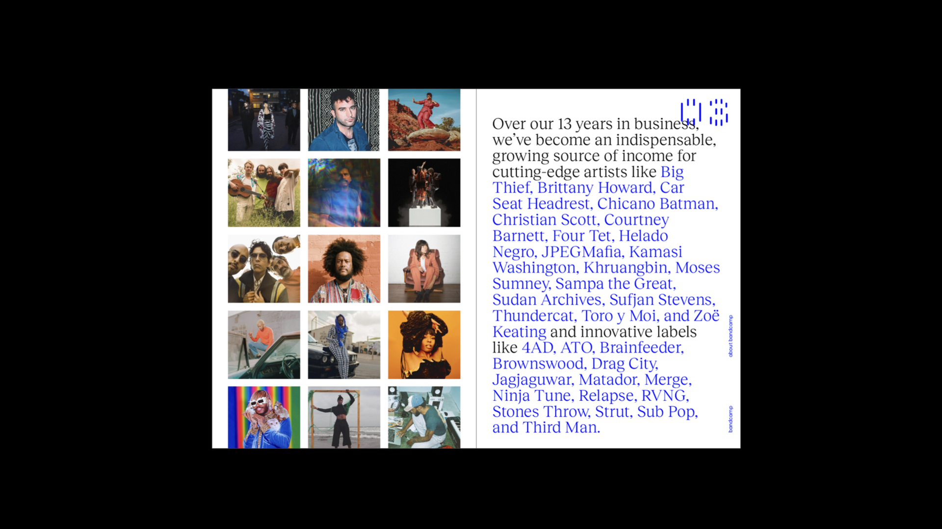
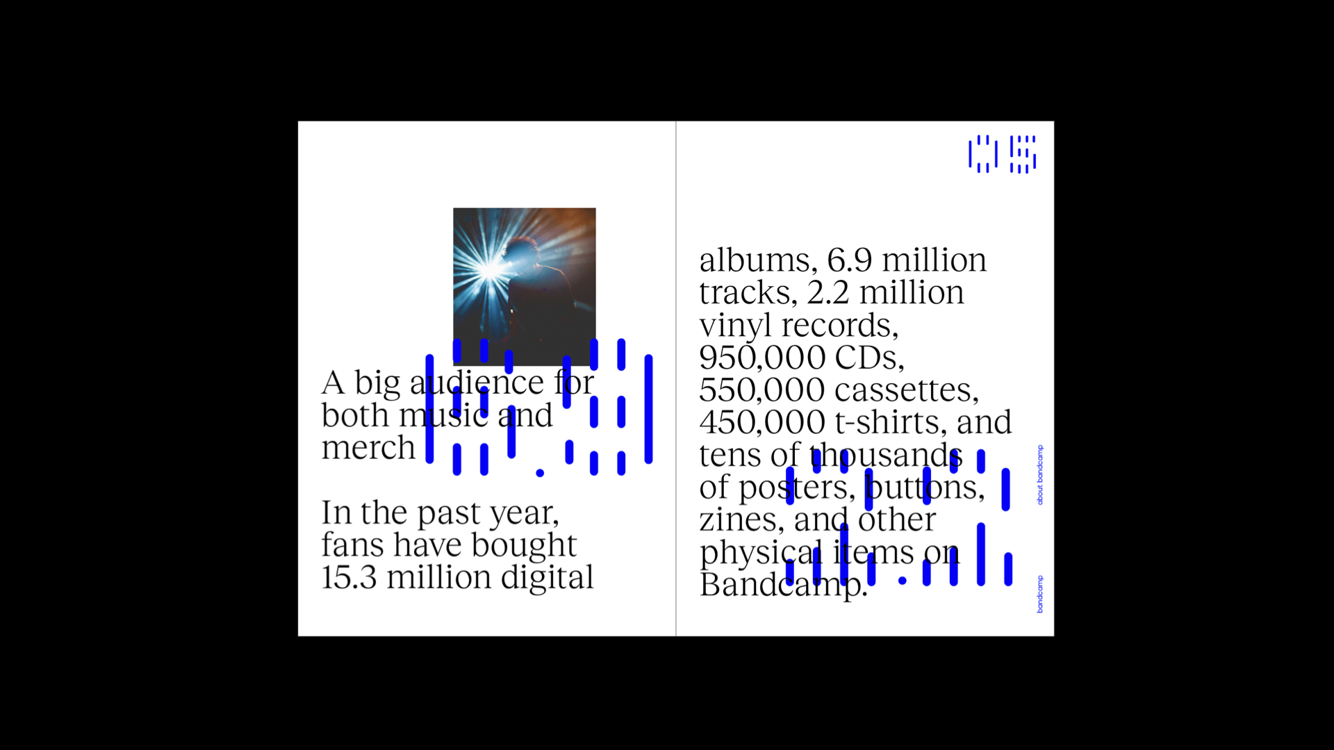
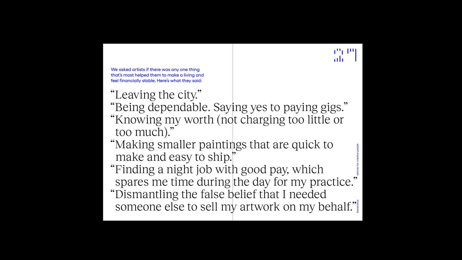
The booklet is created to help music artists on how to make a living by doing what they are passionate about.
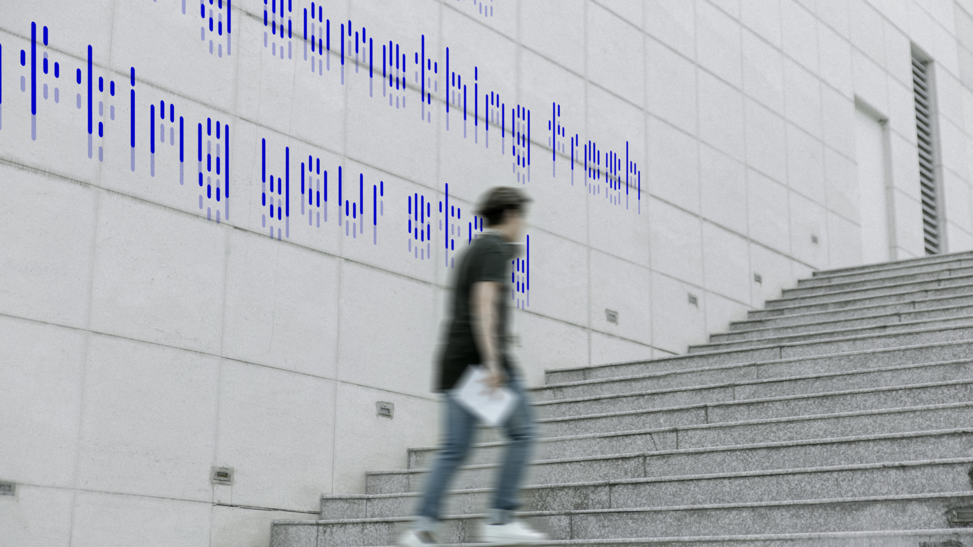
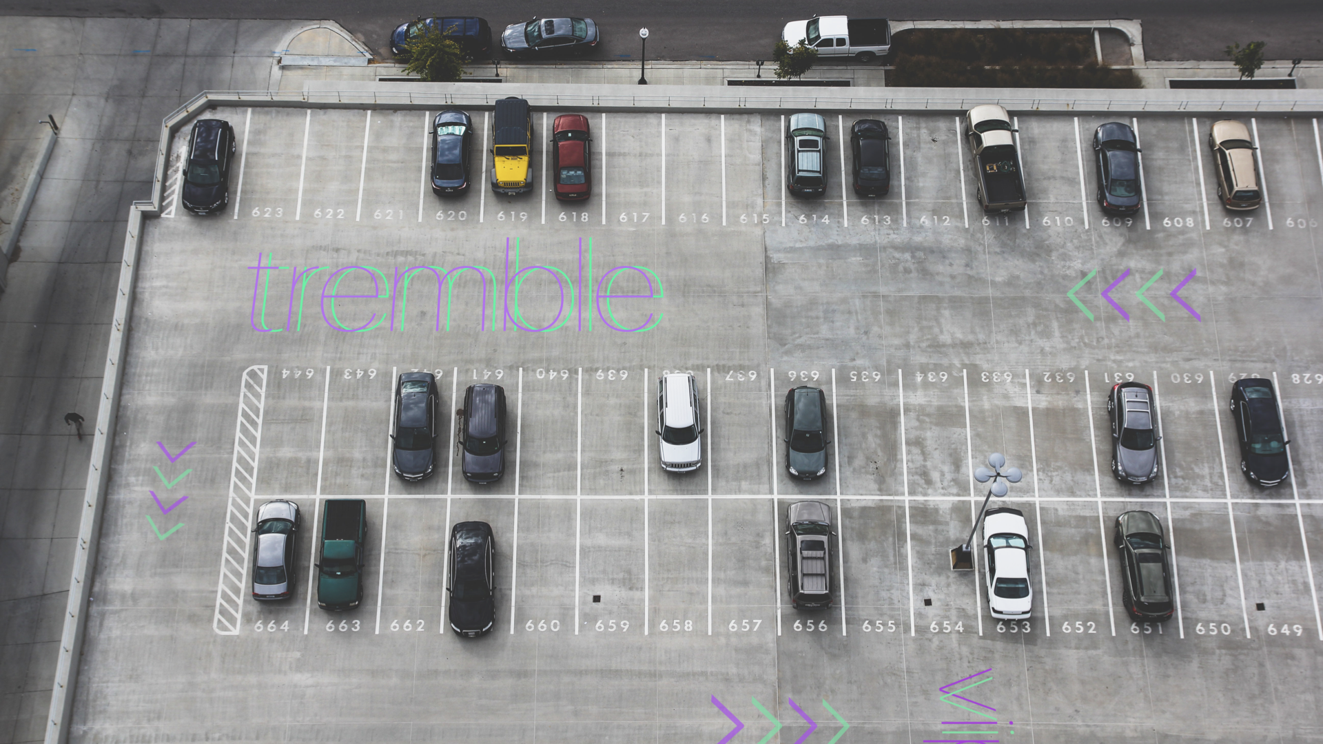
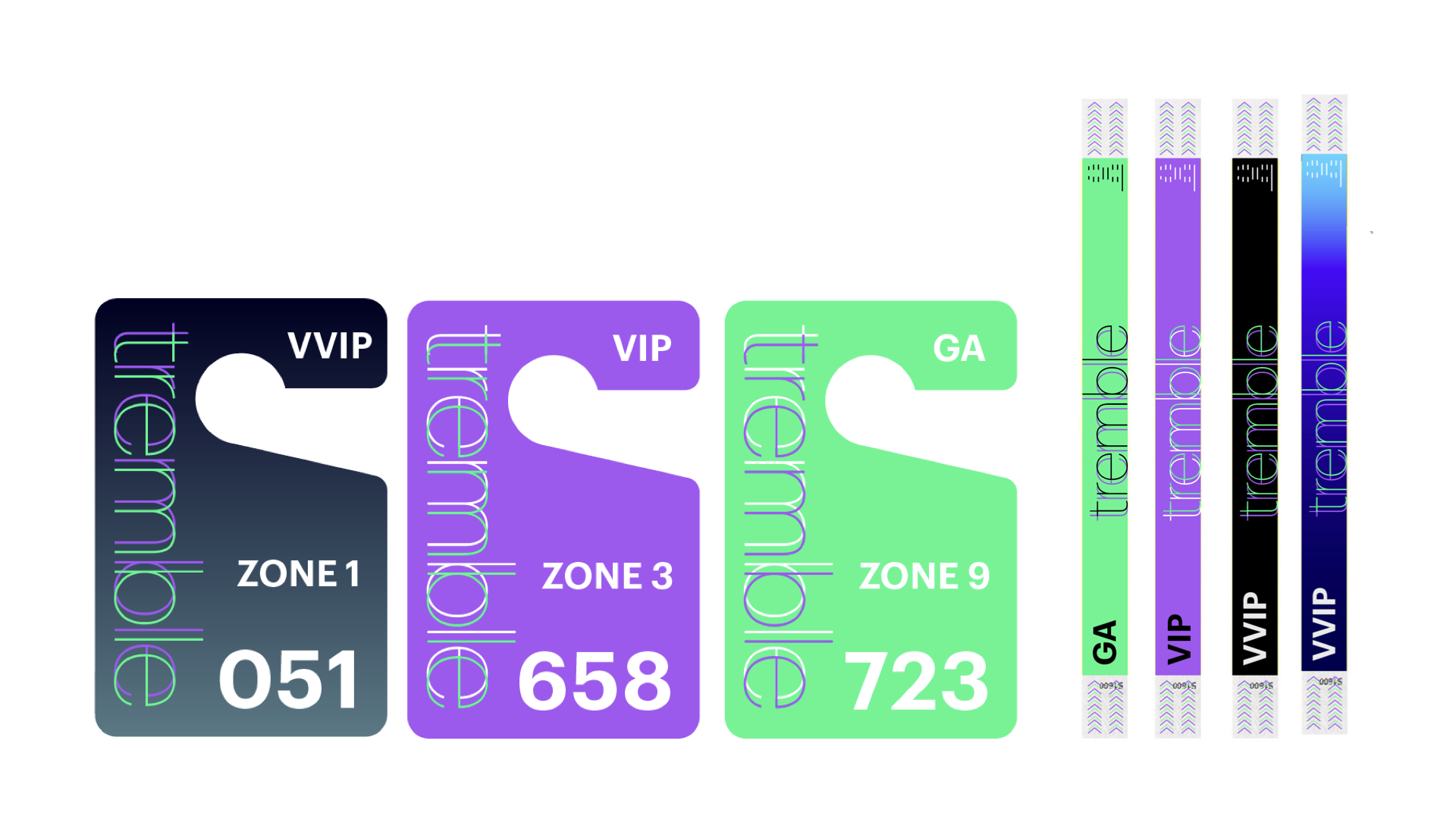
Environmental signage and way finding systems follow the same guidelines.
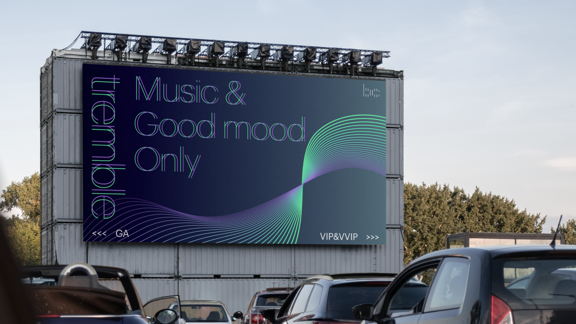
Campaign materials help promote Bandcamp as a music platform which leads stronger connections between artists and their fans.

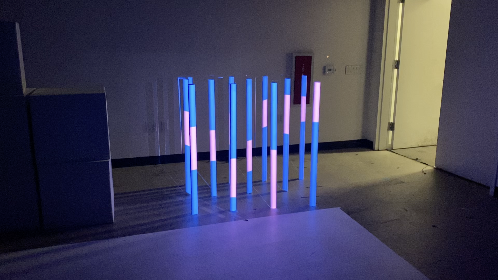
Sound sensoring installation extends the iconic structure from 2D to 3D. Elevates the music appreciation experiences of audiences.
Official website has the identical structure from the system. A music visualizing generator created with p5.js enables artists to show more personality to their fans.
PLAY WITH VISUALIZER
PLAY WITH VISUALIZER
The identity project comes with a sub-identity called Tremble. Tremble is a 3 day electronic+hiphop music festival featuring famous music artists, and aims to provide the best music trip to audiences.
/ Juvenn
/ Sponsored by Jacuzzi Inc.
/ Apr–Aug, 2021
/ Brand Strategy
/ Trans-disciplinary Design
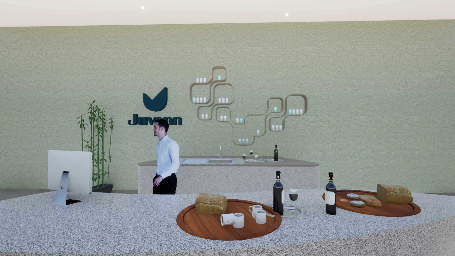
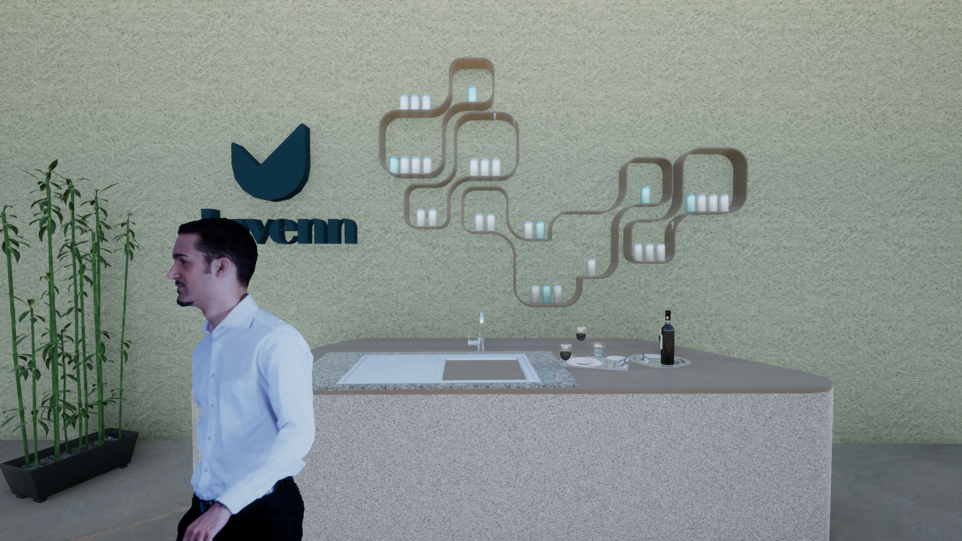
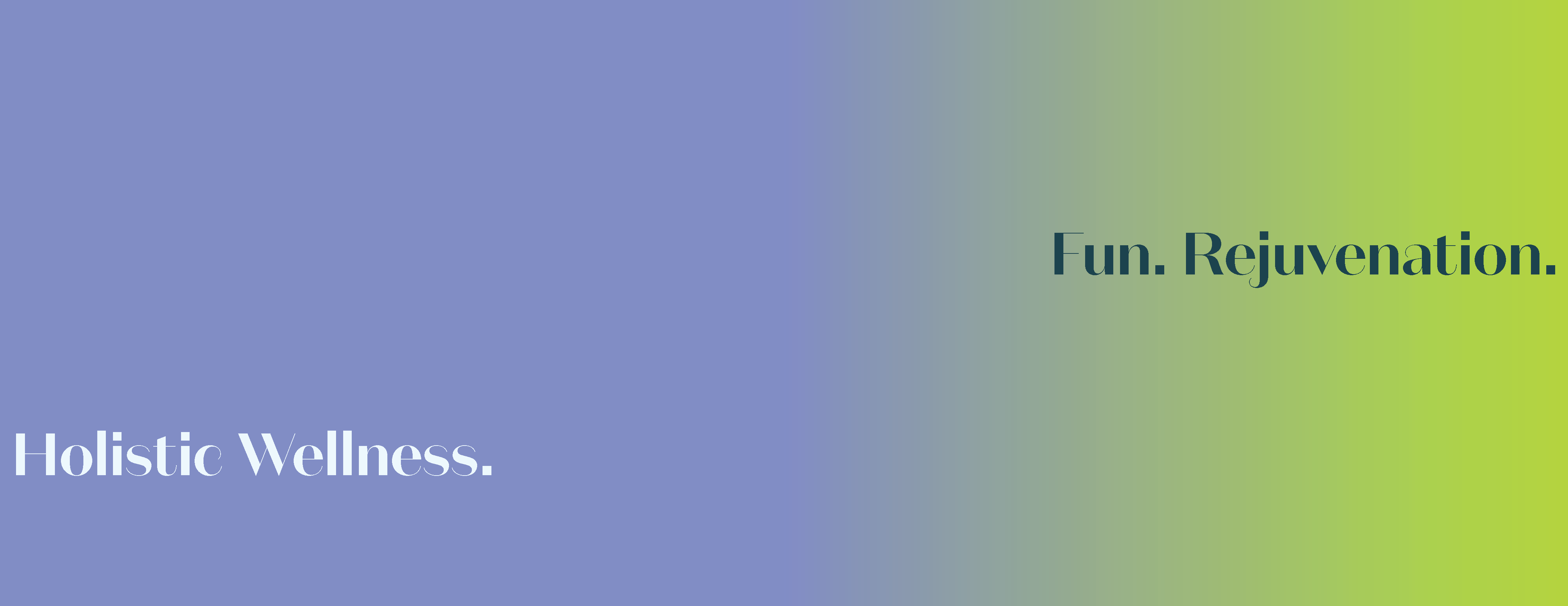
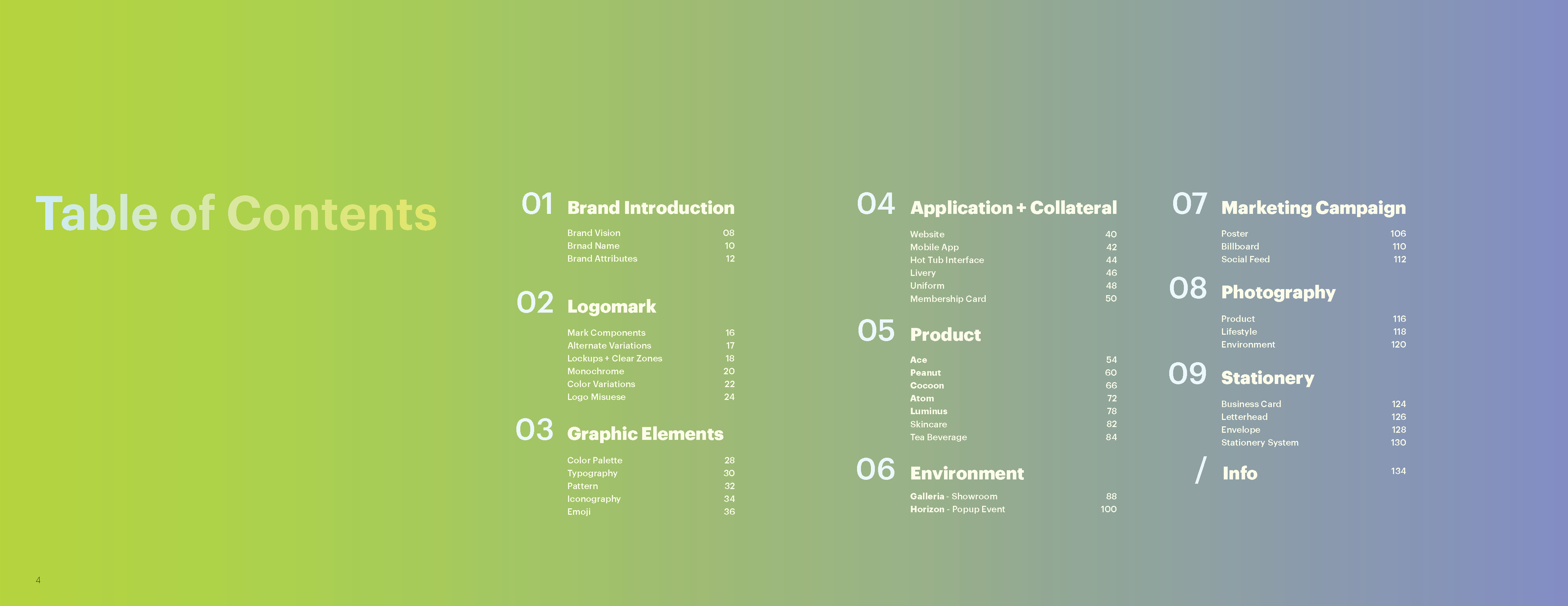
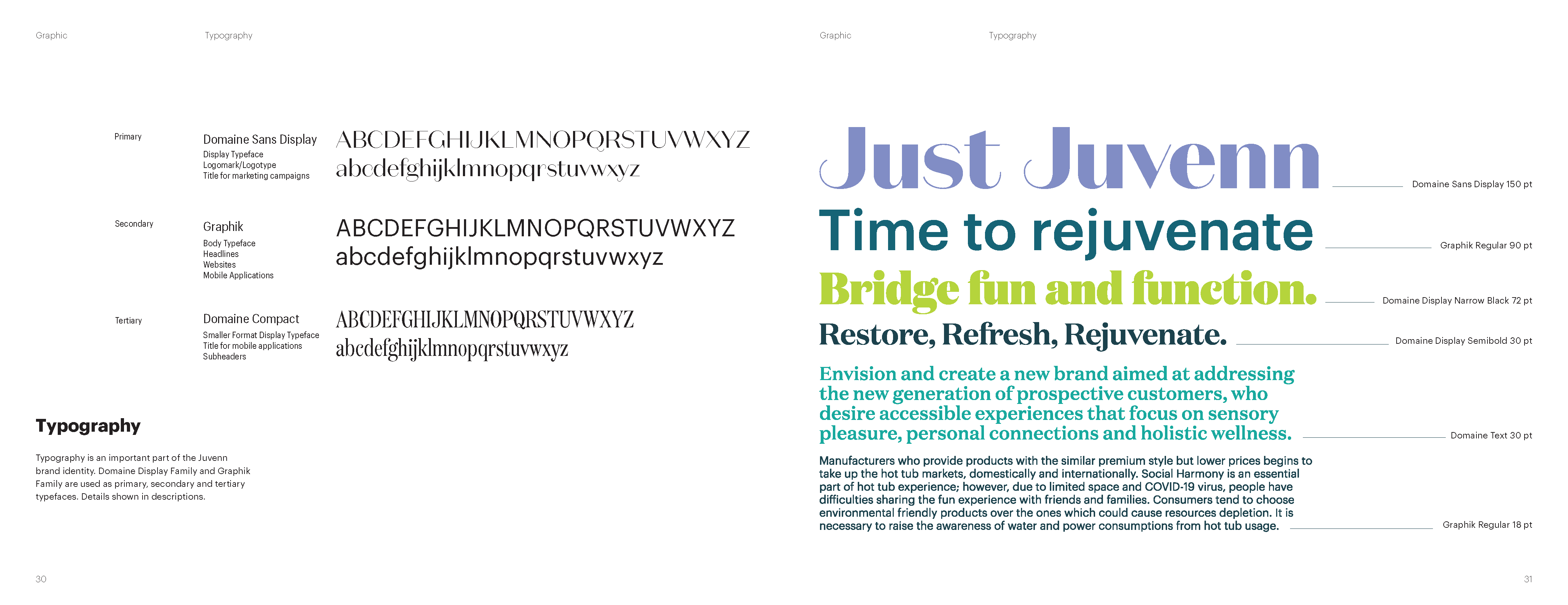
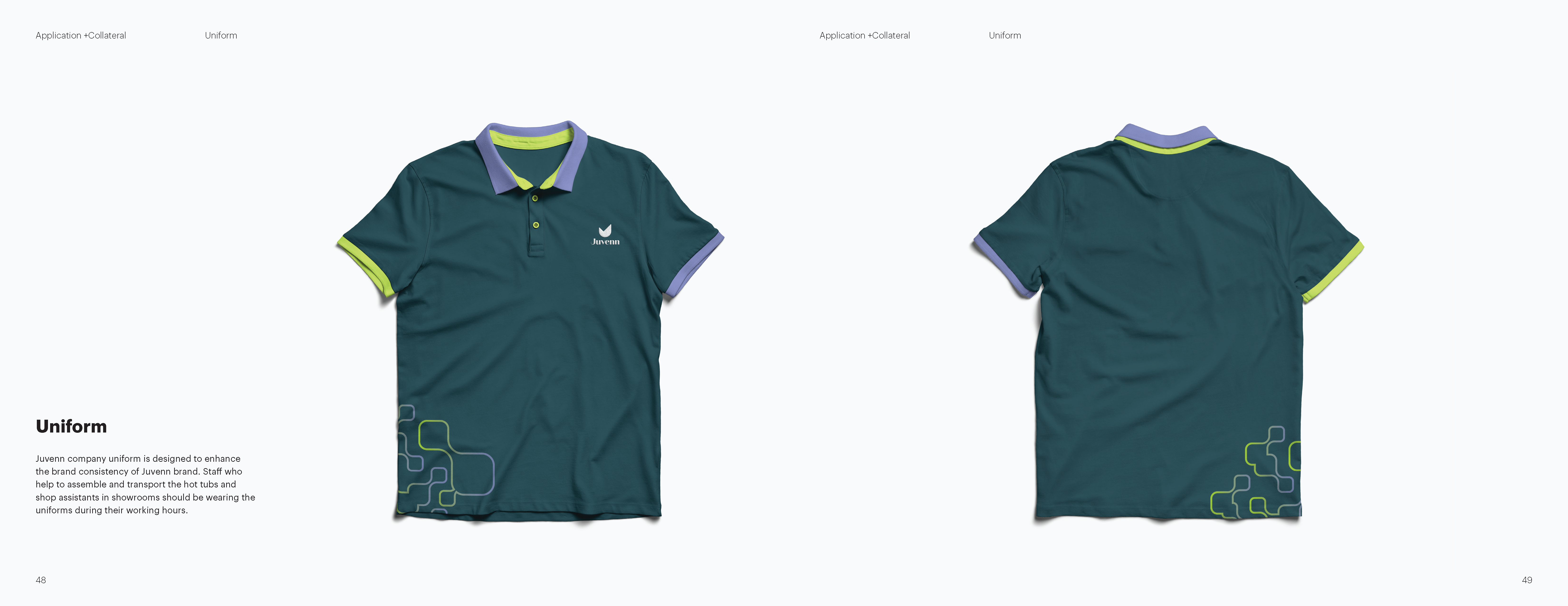
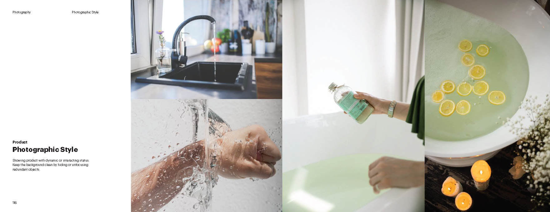
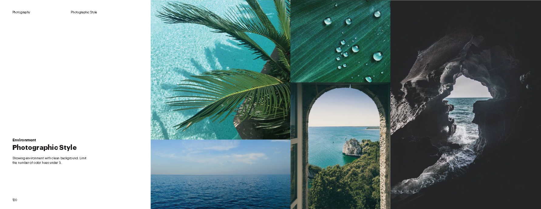
Juvenn is a hypothetical hot tub brand sponsored by Jacuzzi Inc. Starting at 2028, Juvenn aims to bring relaxation and rejuvenation to future generations. This team project contains branding, product design and spatial design. I was in charge of the visual language development, brand identity guidelines, marketing campaigns, collateral merchandise packaging design as well as participated in the hot tub product design, showroom and pop-up event promotion design.
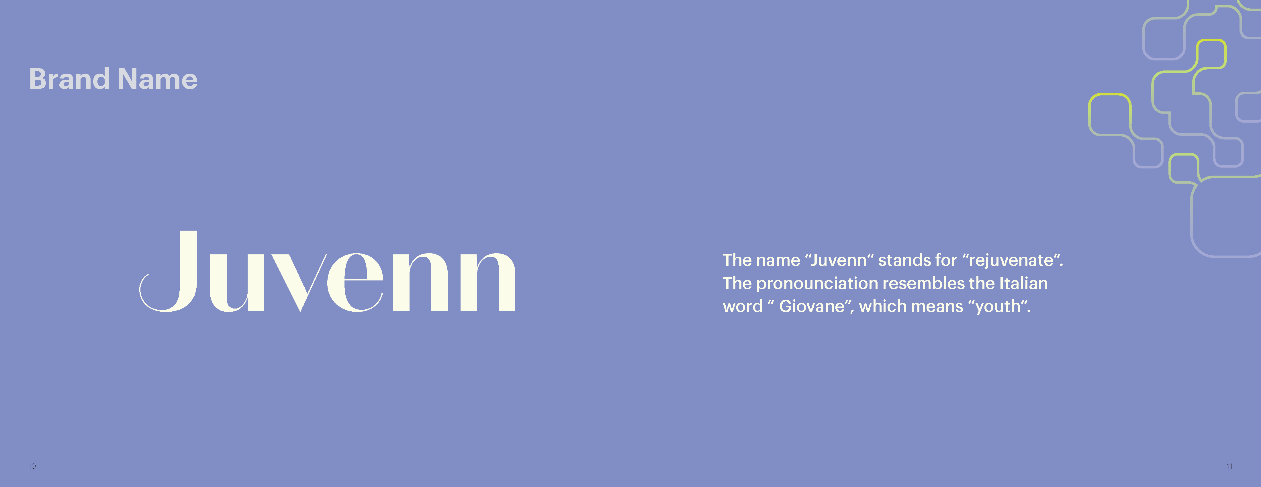
The name “Juvenn” stands for “rejuvenate”. The pronunciation resembles the Italian word “ Giovane”, which means “youth”.
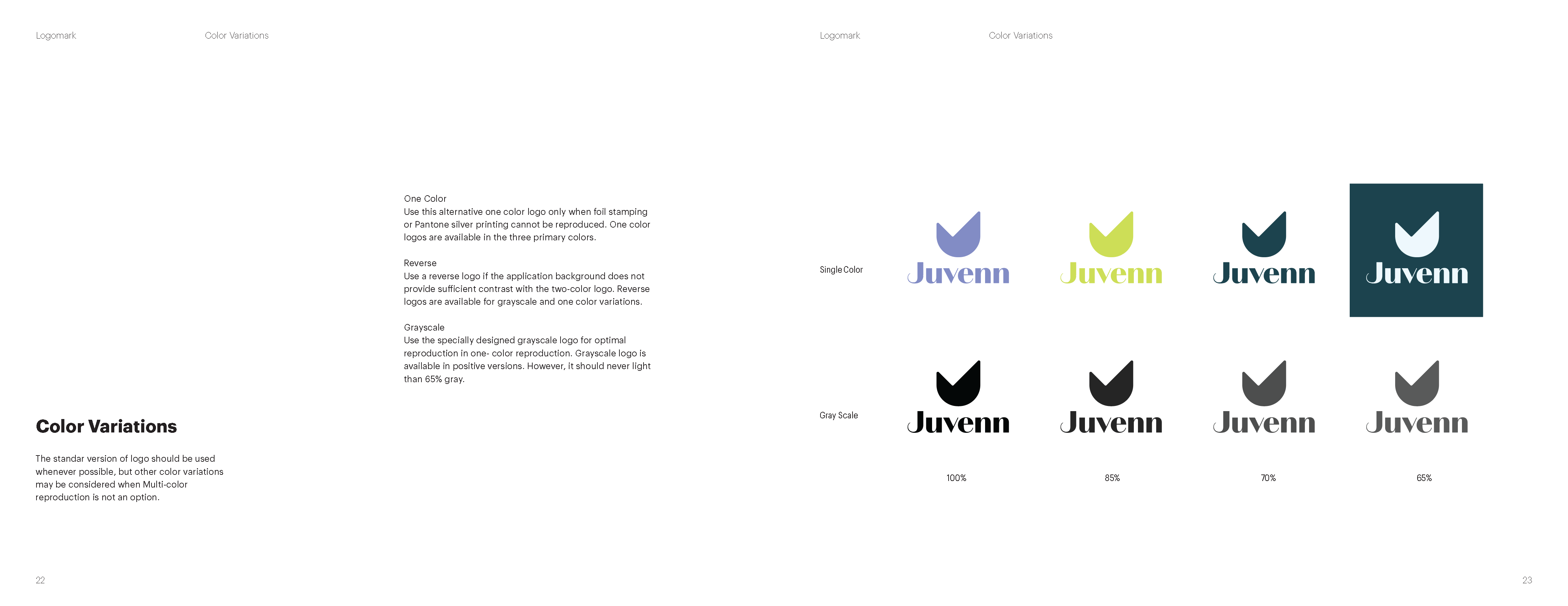
The logo represents rejuvenation and playfulness, reflecting Juvenn’s brand essence.
The logo represents rejuvenation and playfulness, reflecting Juvenn’s brand essence.

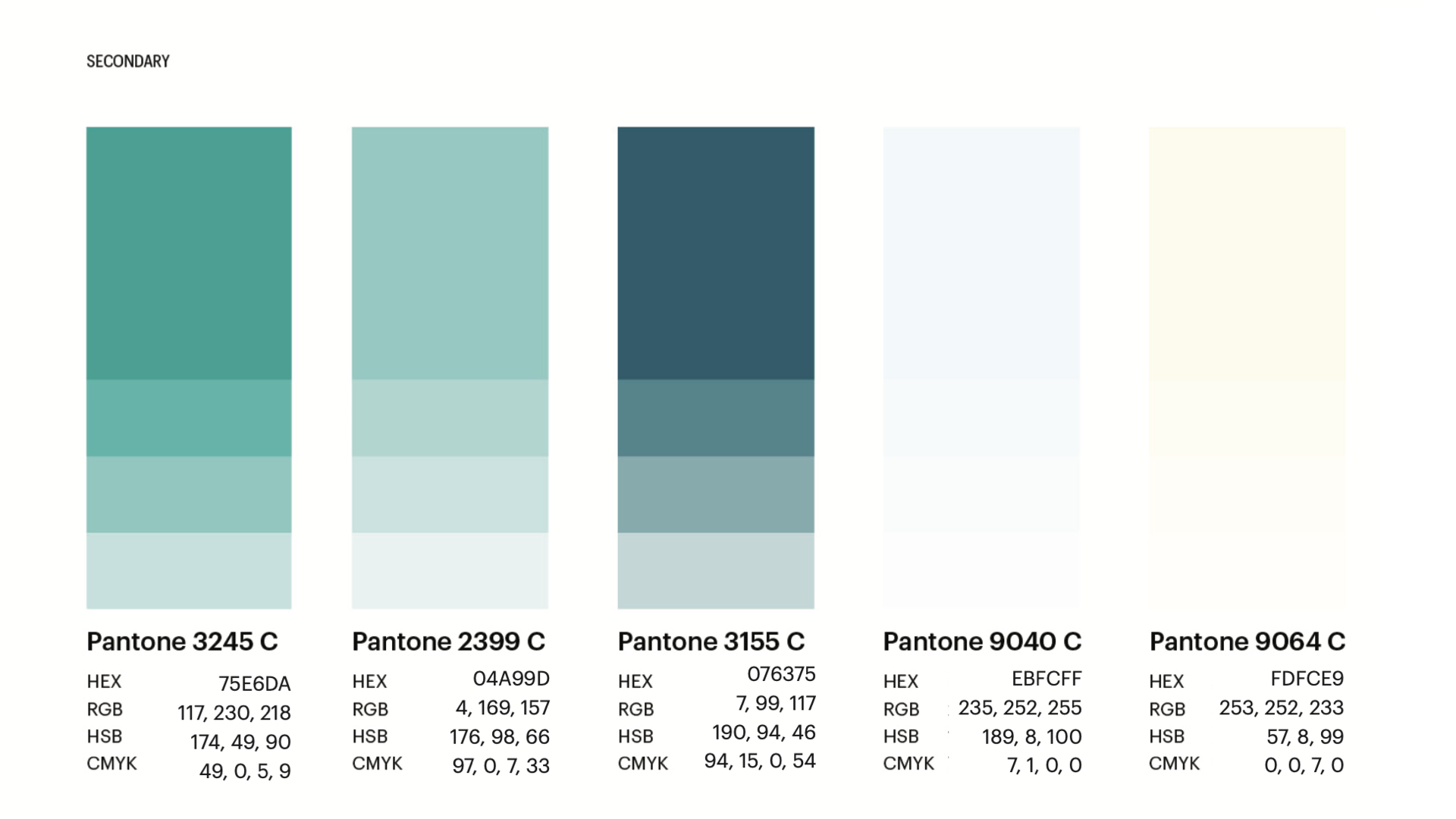
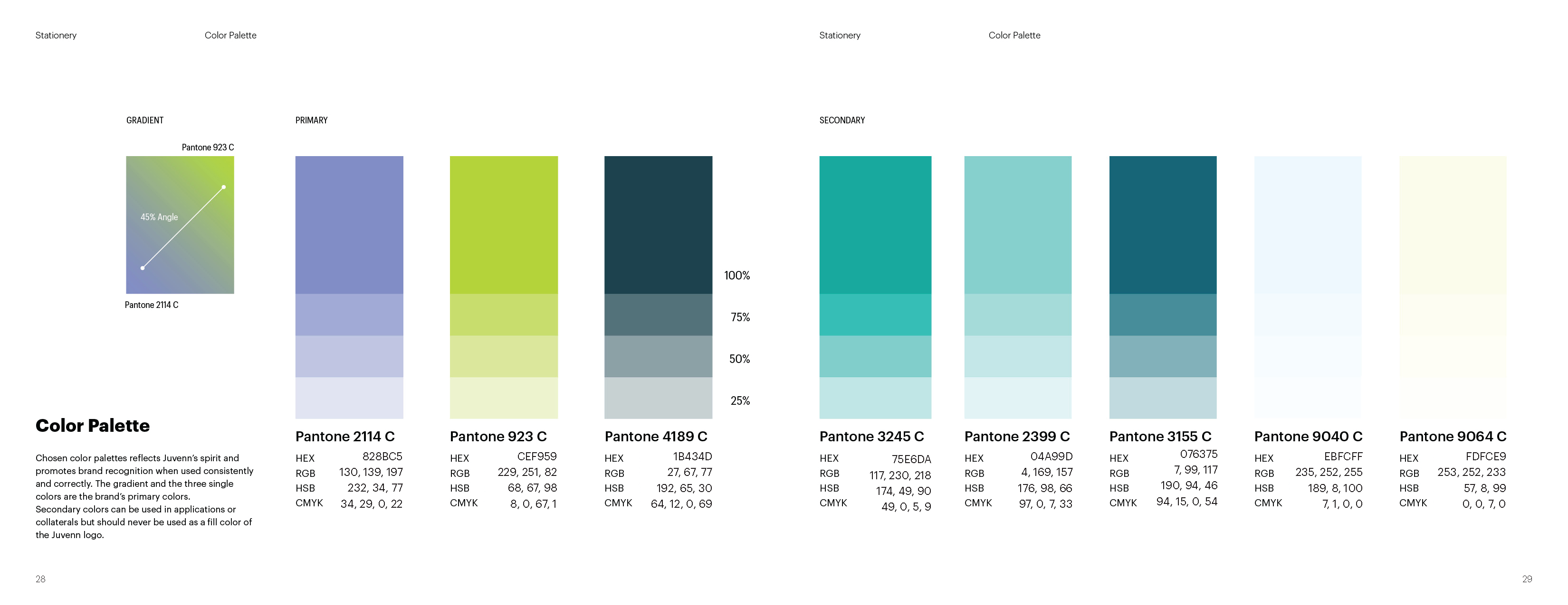
The color palette is chosen to reflect Juvenn’s spirit and to differentiate ourselves from the competitors based on the color audit.


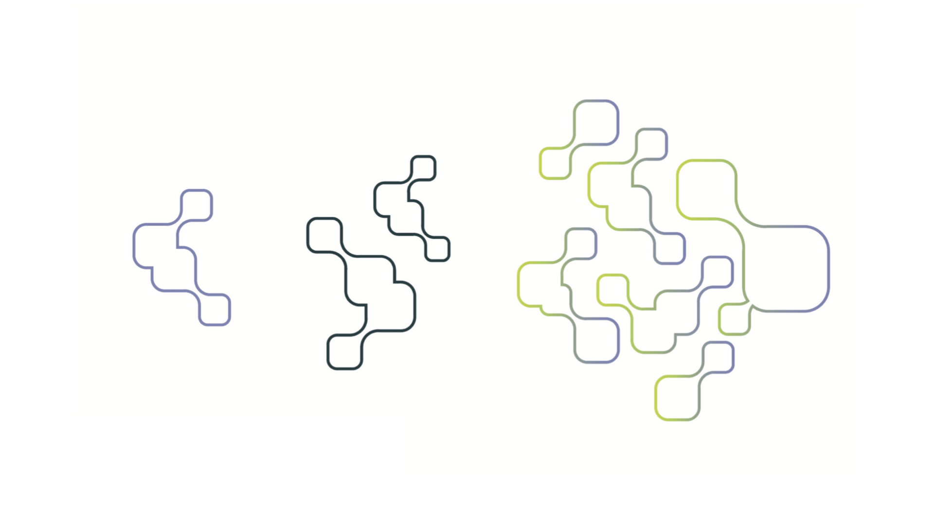
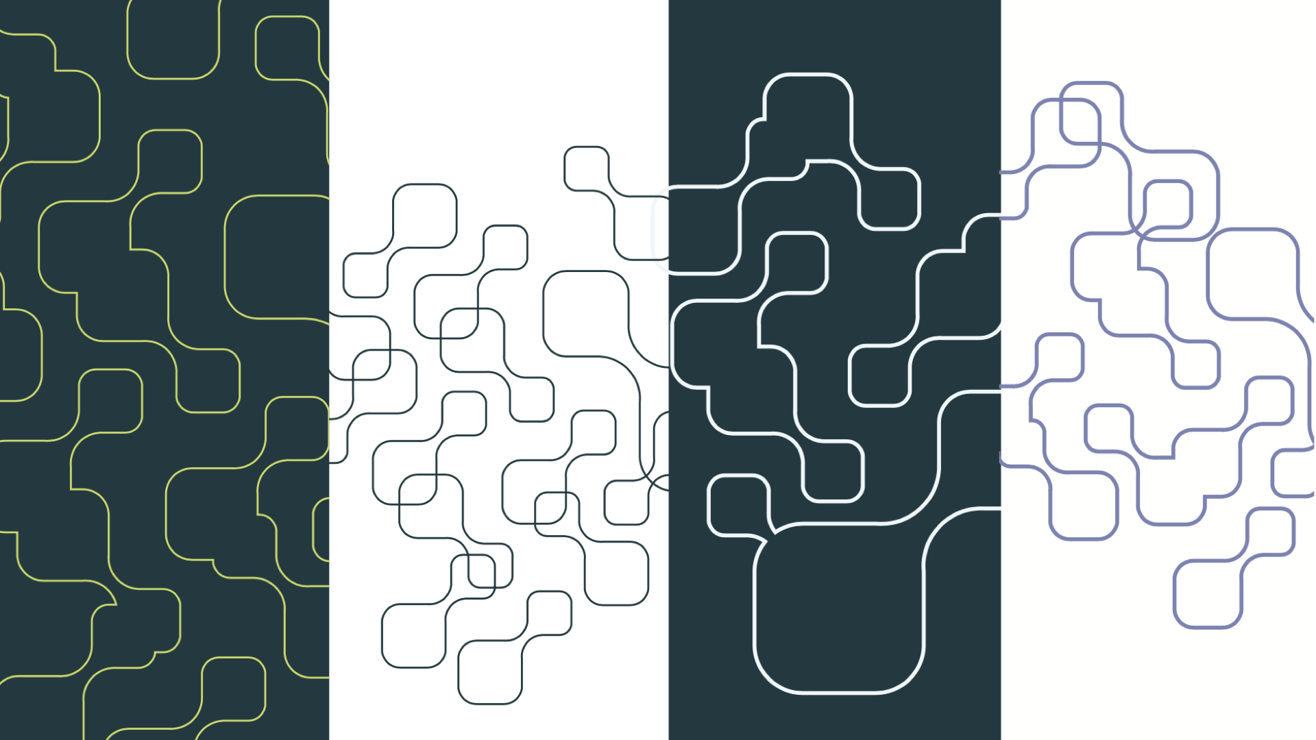
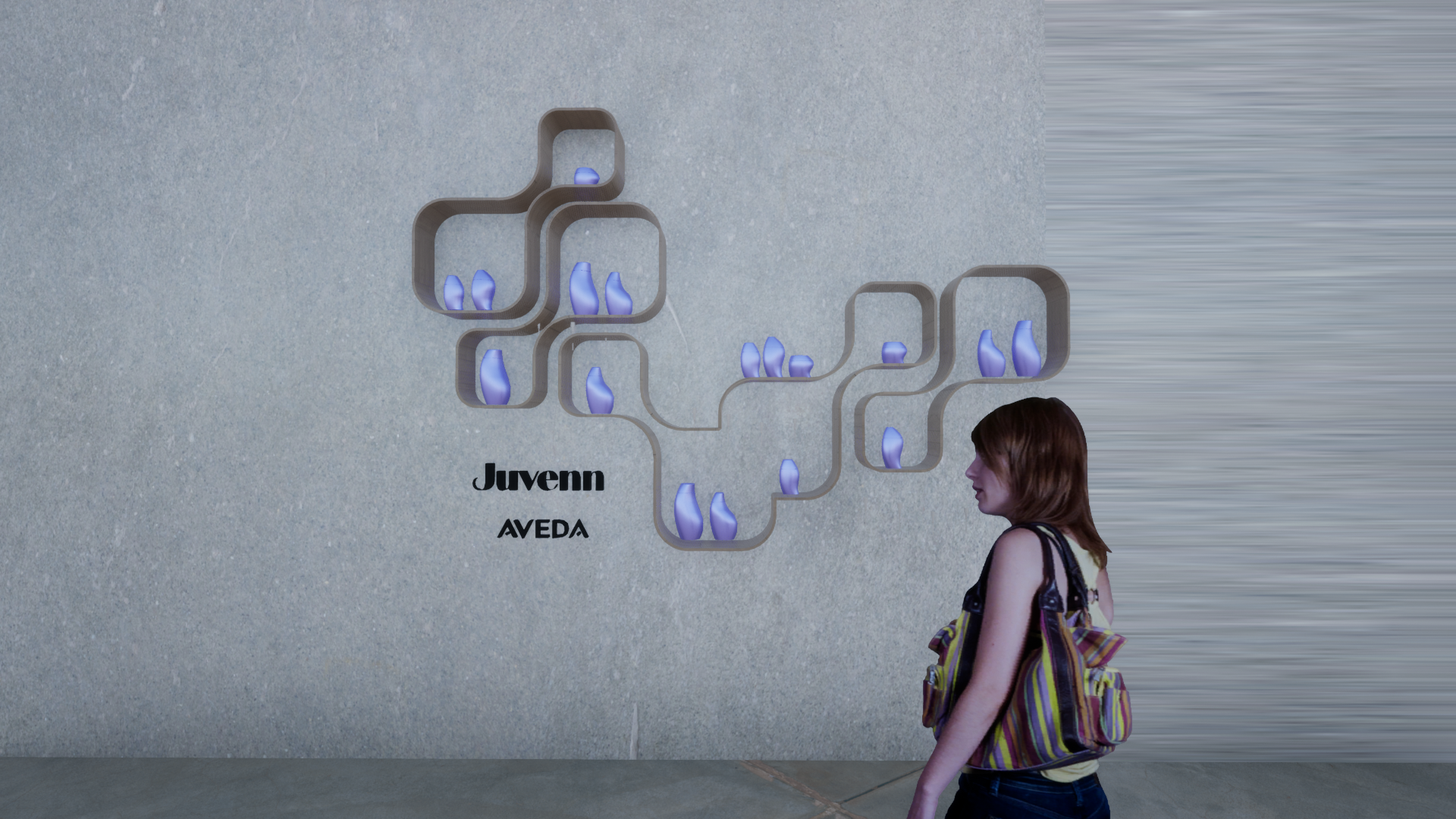
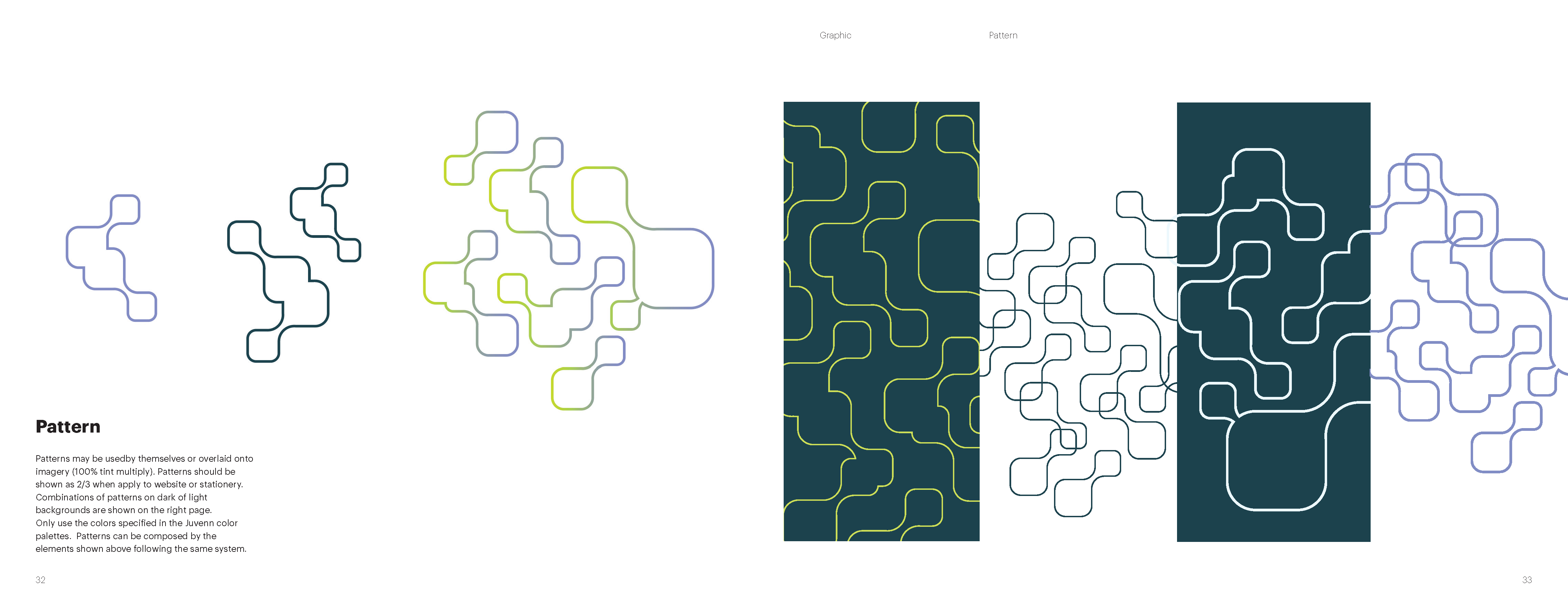
Pattern is inspired by water bubbles and waves. As an iconic element of the identity system, this pattern is applied to both 2D and 3D context.
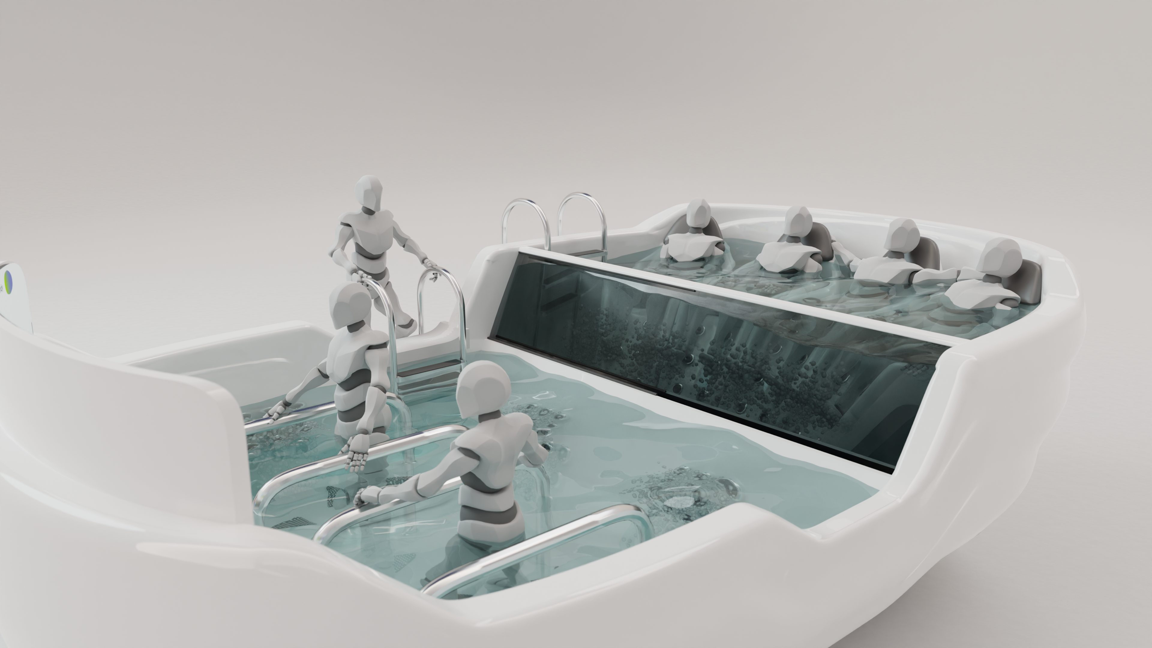
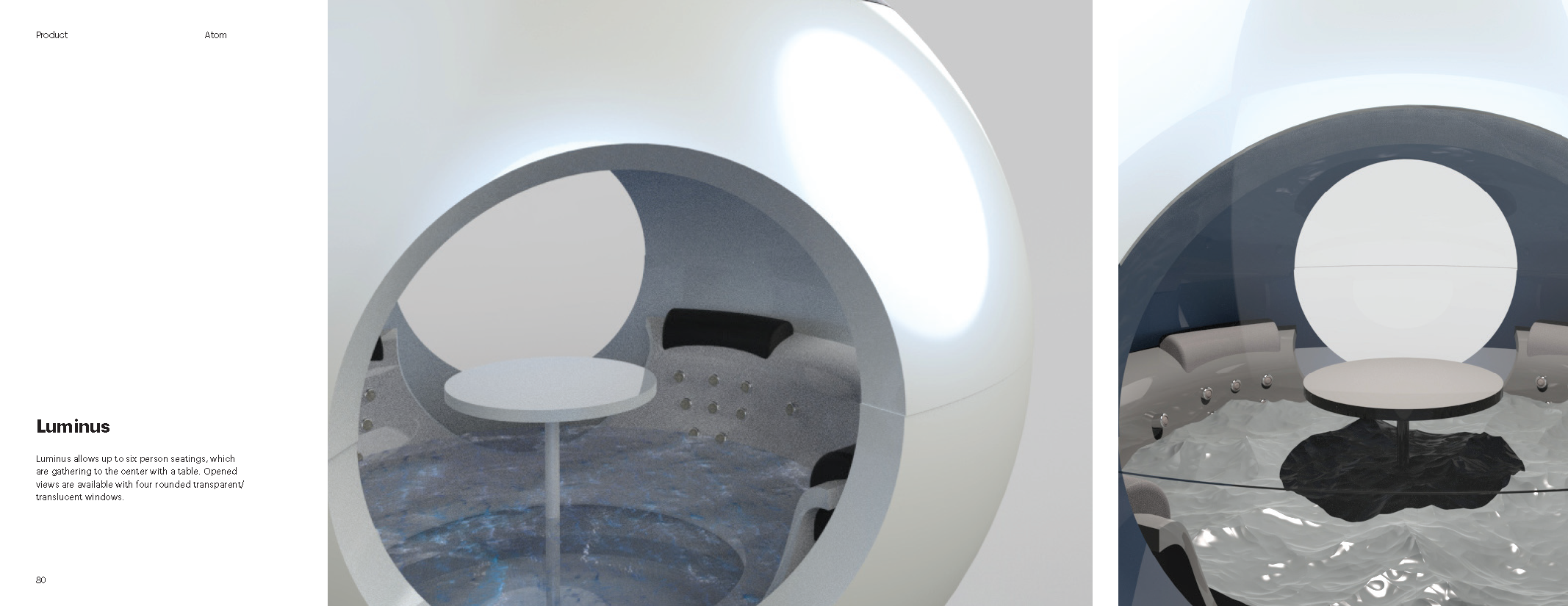
5 Hot tubs are created for this new brand. Targeting on generation alpha and beta, we offer products with different sizes/functions/contexts based on consumer’s need. All hot tubs can be personalized when purchase.
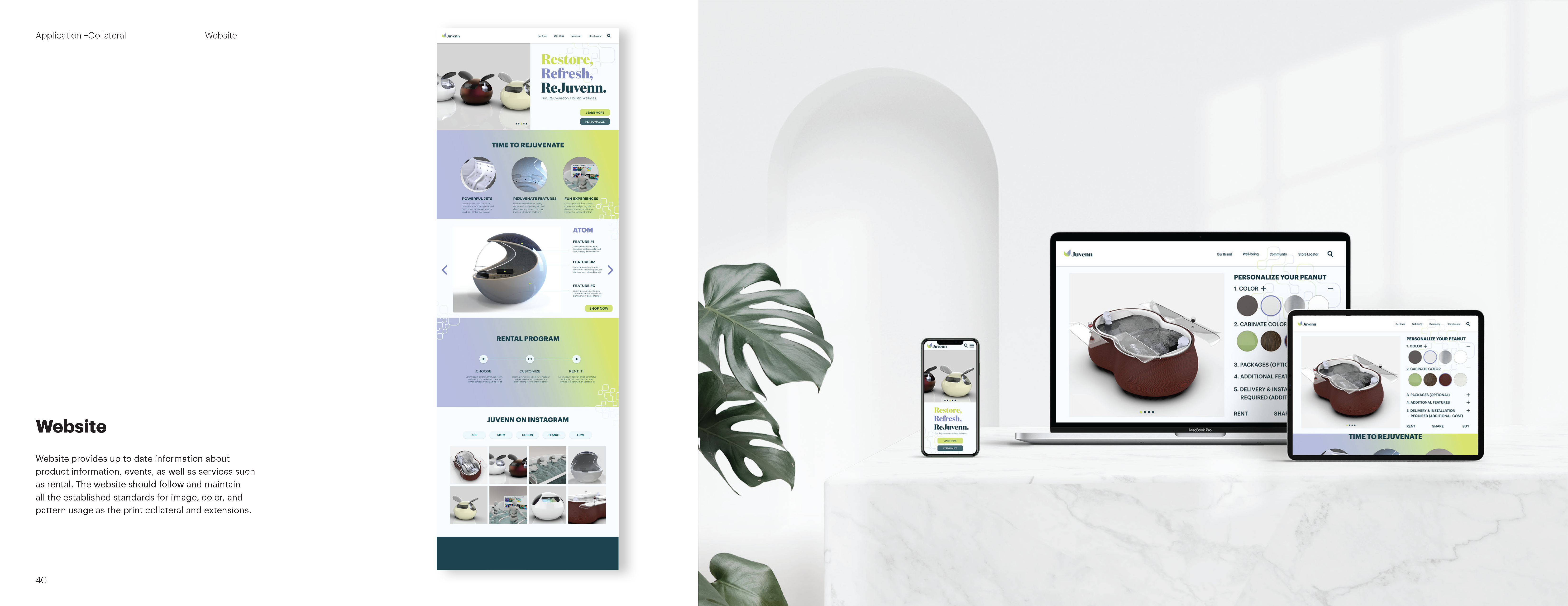
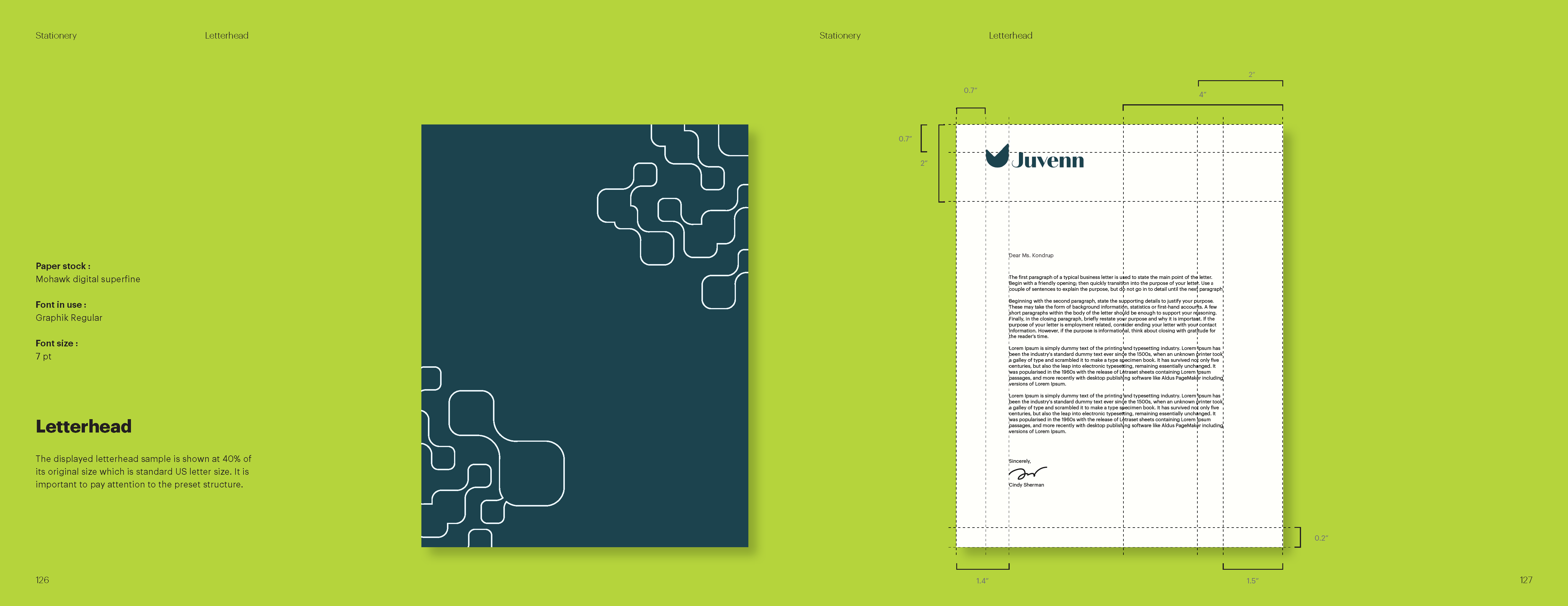
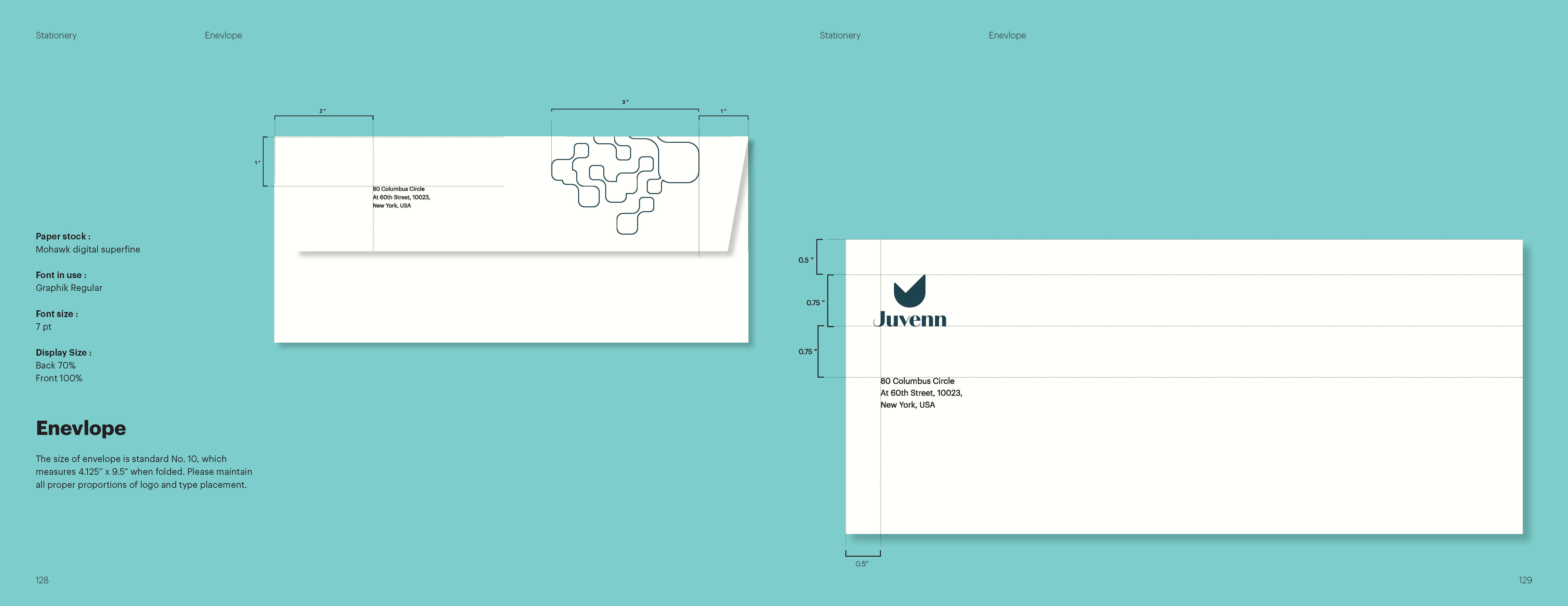
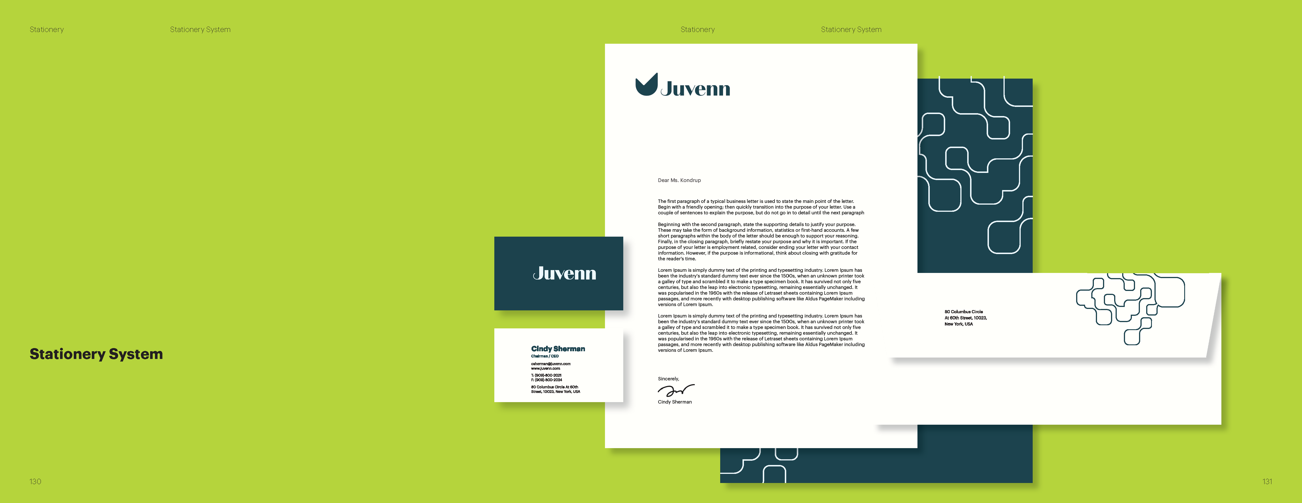
For detailed information, please check out the product section of the brand identity guideline at the end of this page.
For detailed information, please check out the product section of the brand identity guideline at the end of this page.
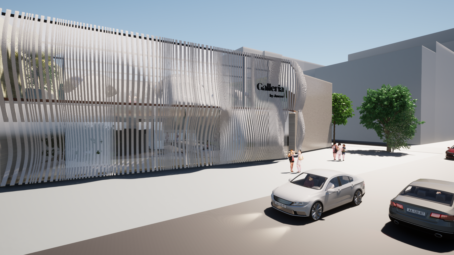
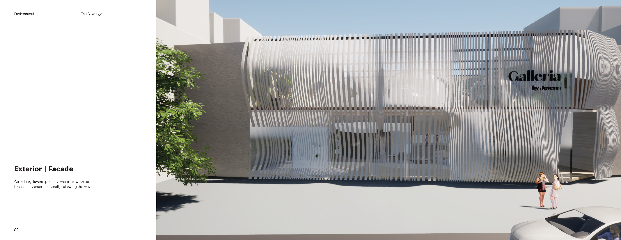
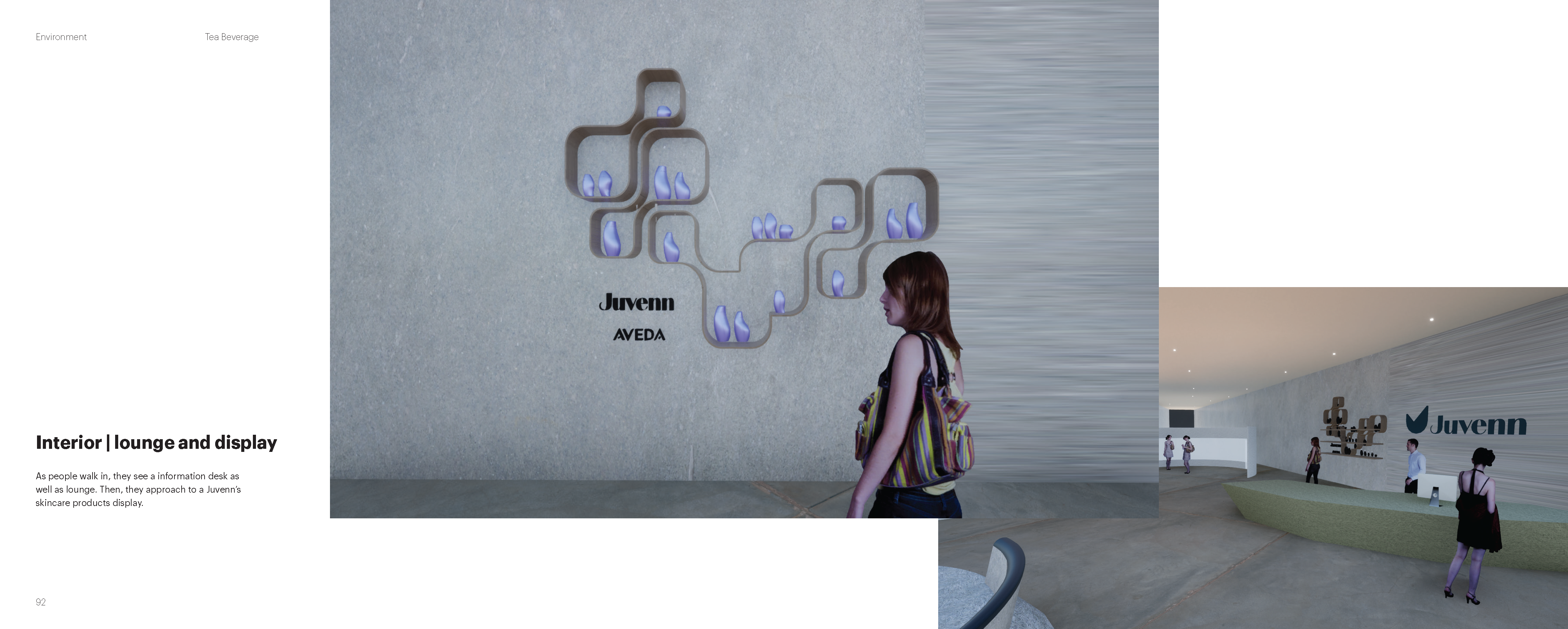
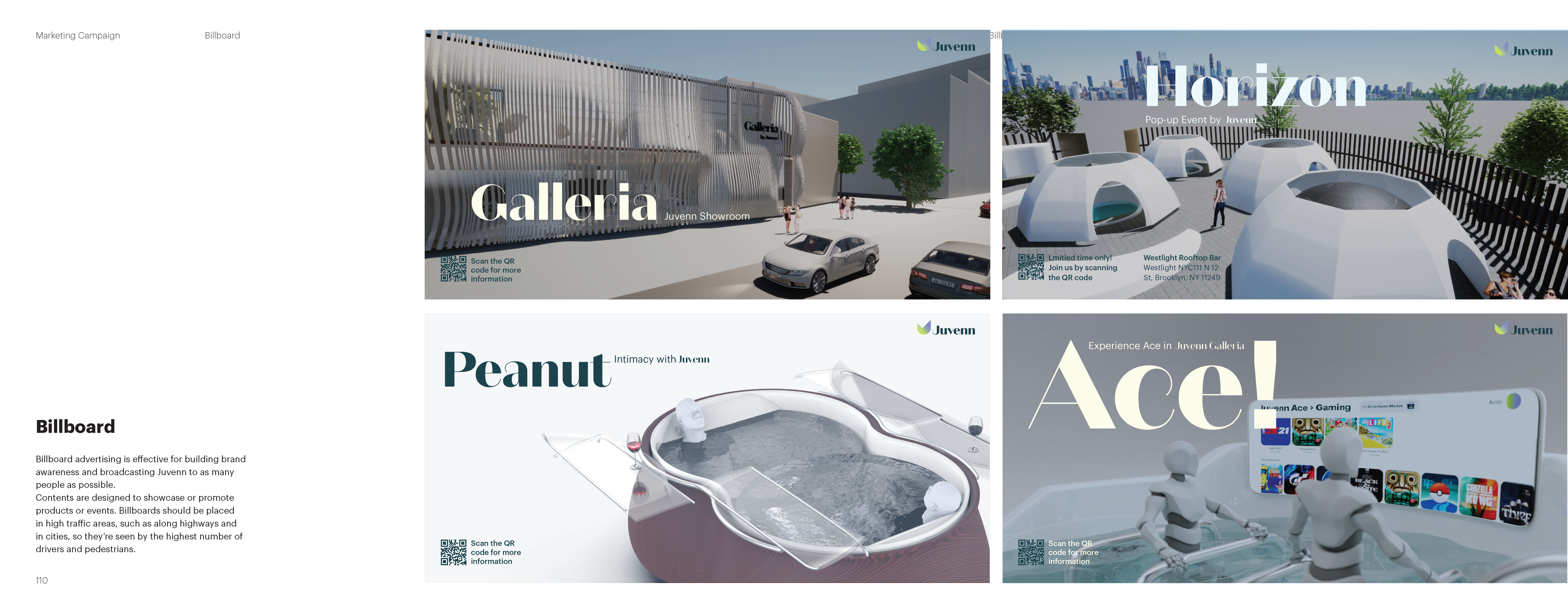
Galleria – Showroom/Concept storeThe Launch of Galleria marks the beginning of an exciting new chapter for our business, enabling us to engage more effectively with hot tub experience.
Consumers have the opportunity to learn the features of all products and can make purchase after their session.Membership and loyalty programs are available at all locations.
For detailed info, please check out environment section of the brand identity guideline at the end of this page.
Consumers have the opportunity to learn the features of all products and can make purchase after their session.Membership and loyalty programs are available at all locations.
For detailed info, please check out environment section of the brand identity guideline at the end of this page.
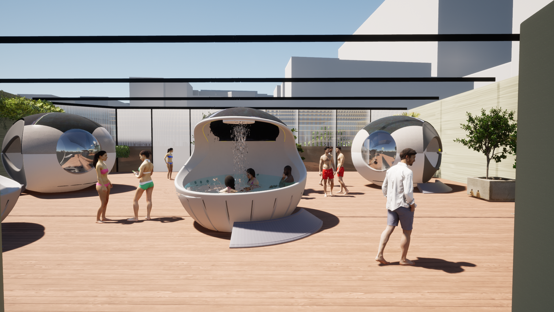
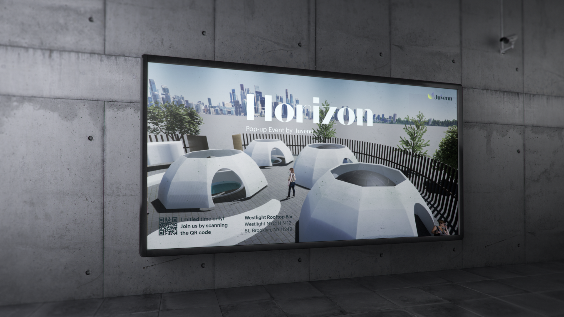
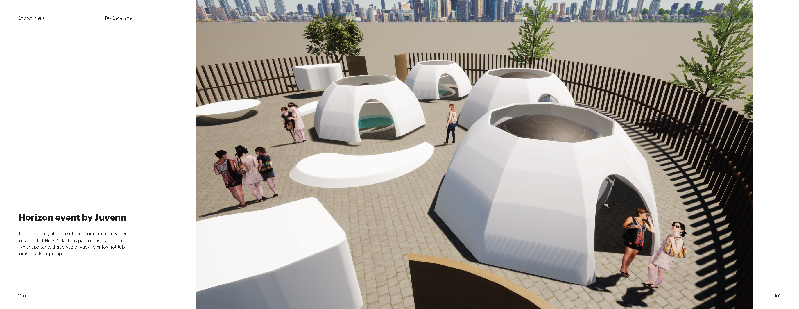
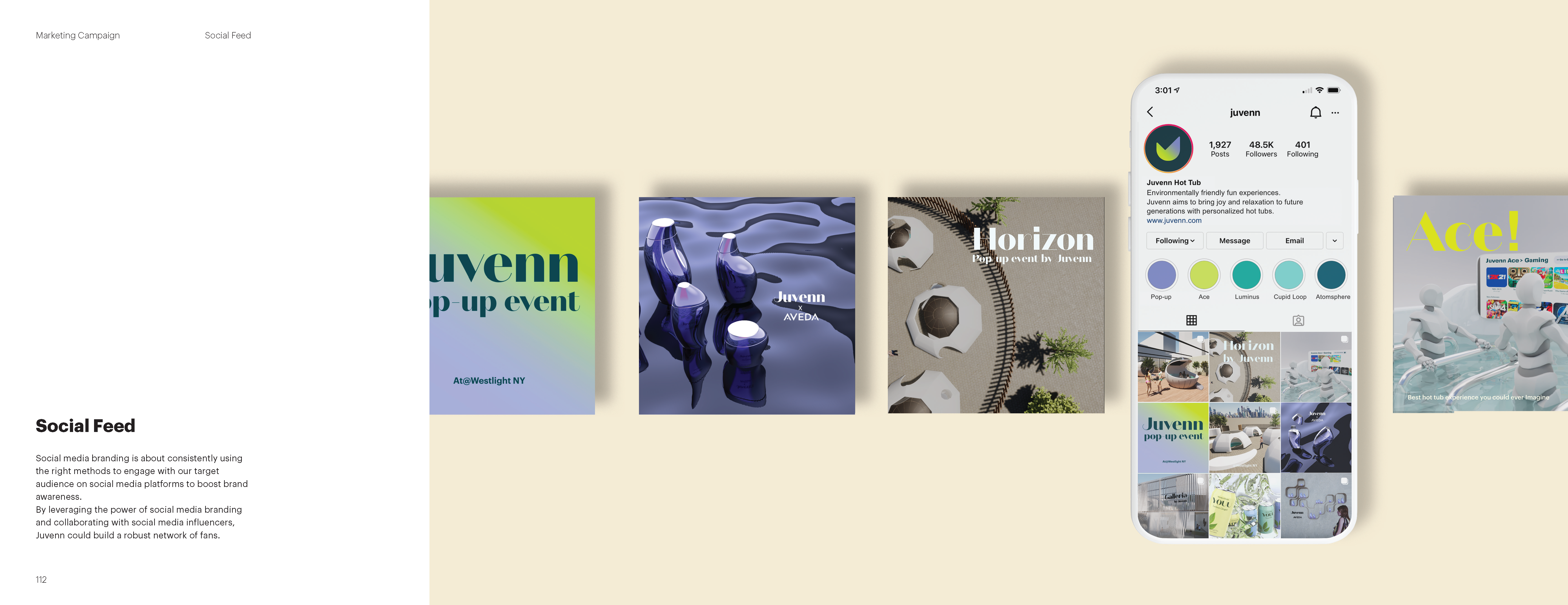
Horizon – Pop Up Event by Juvenn
This event allows consumers to experience the hot tub products and services before purchase.
This event allows consumers to experience the hot tub products and services before purchase.
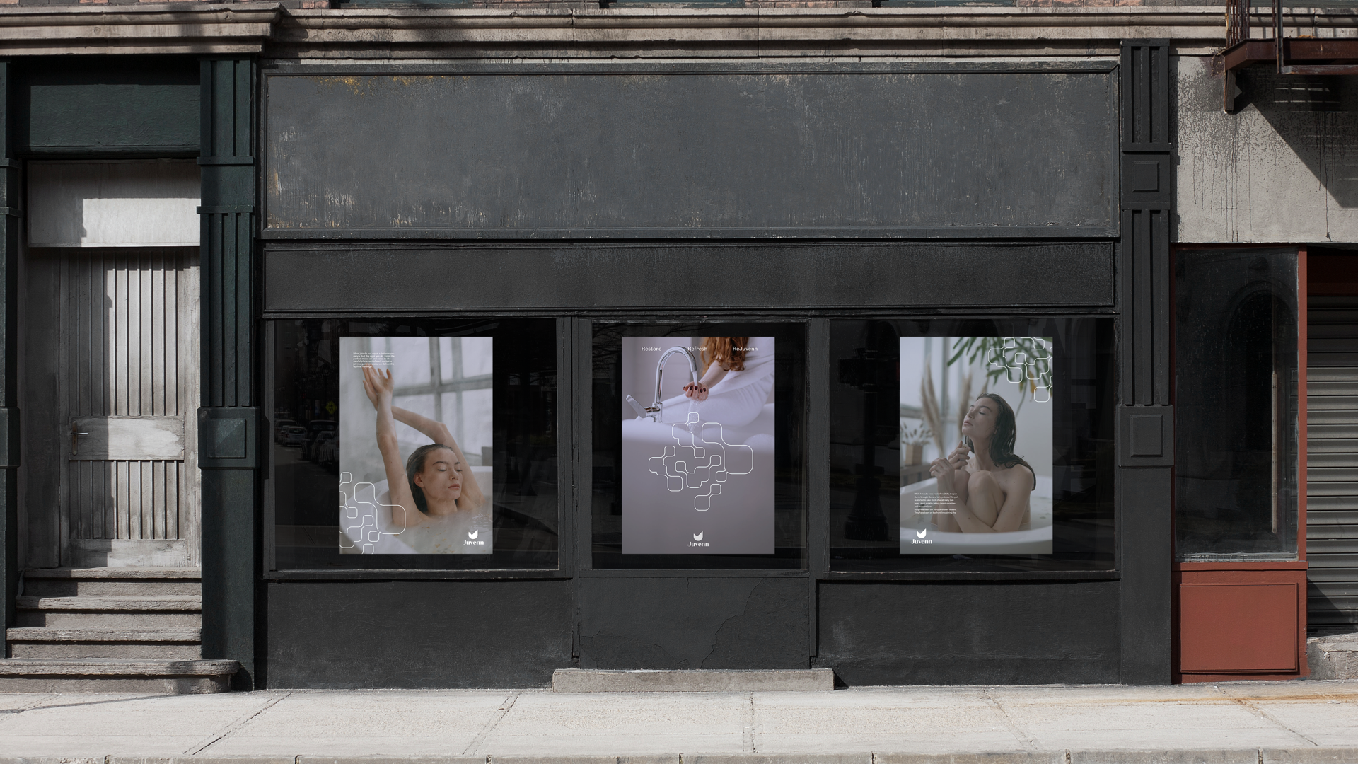
Promotional Posters – aim to evoke the connection between brand and audiences. Instead of showing the actual product like all others do, we are selling the lifestyle related to the brand image.

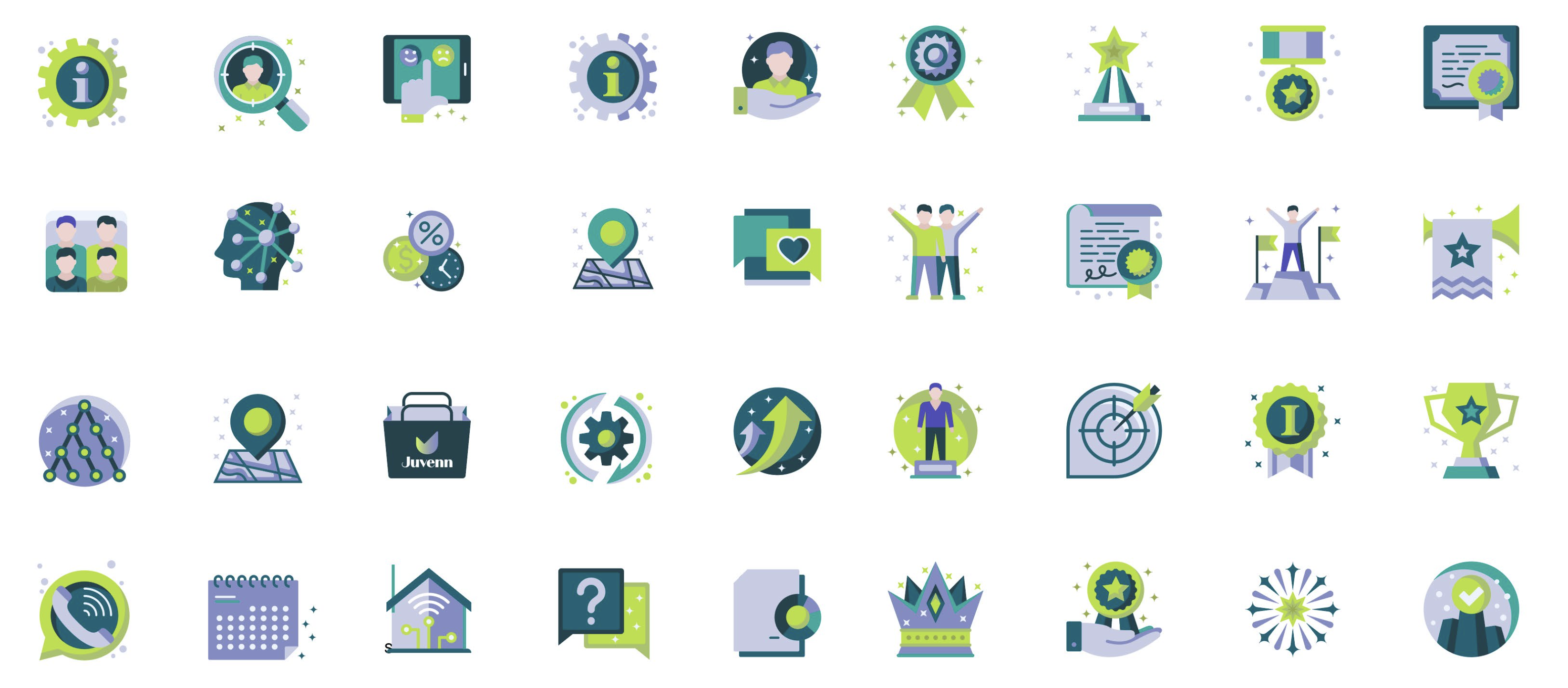
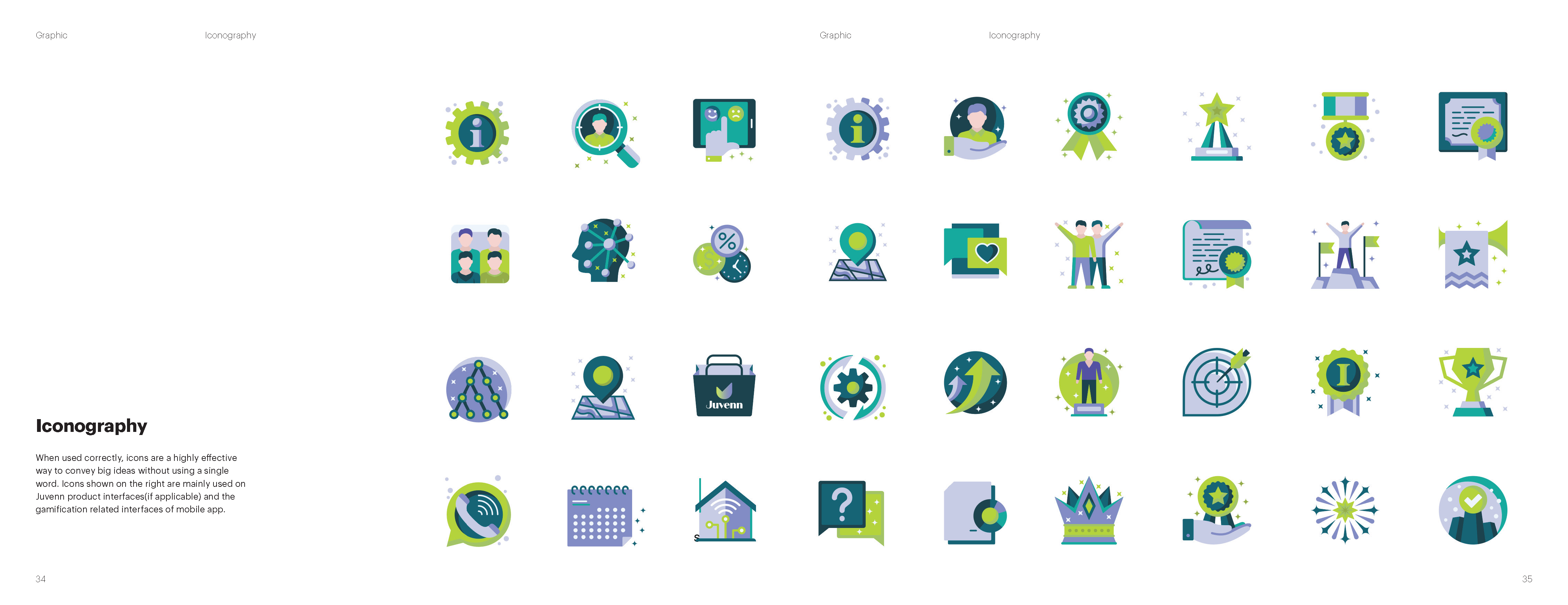
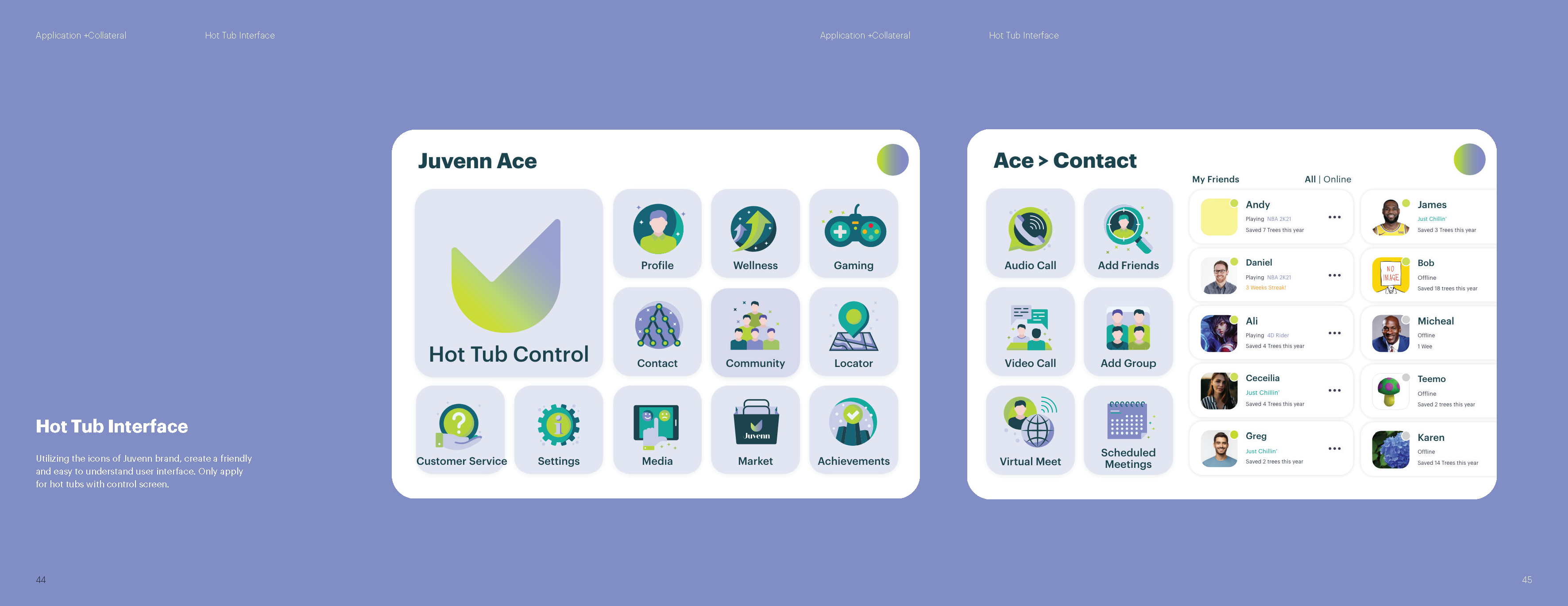
Iconography enhances the consistency of our brand image. It also works as gamification elements like a reward system and community collaboration.
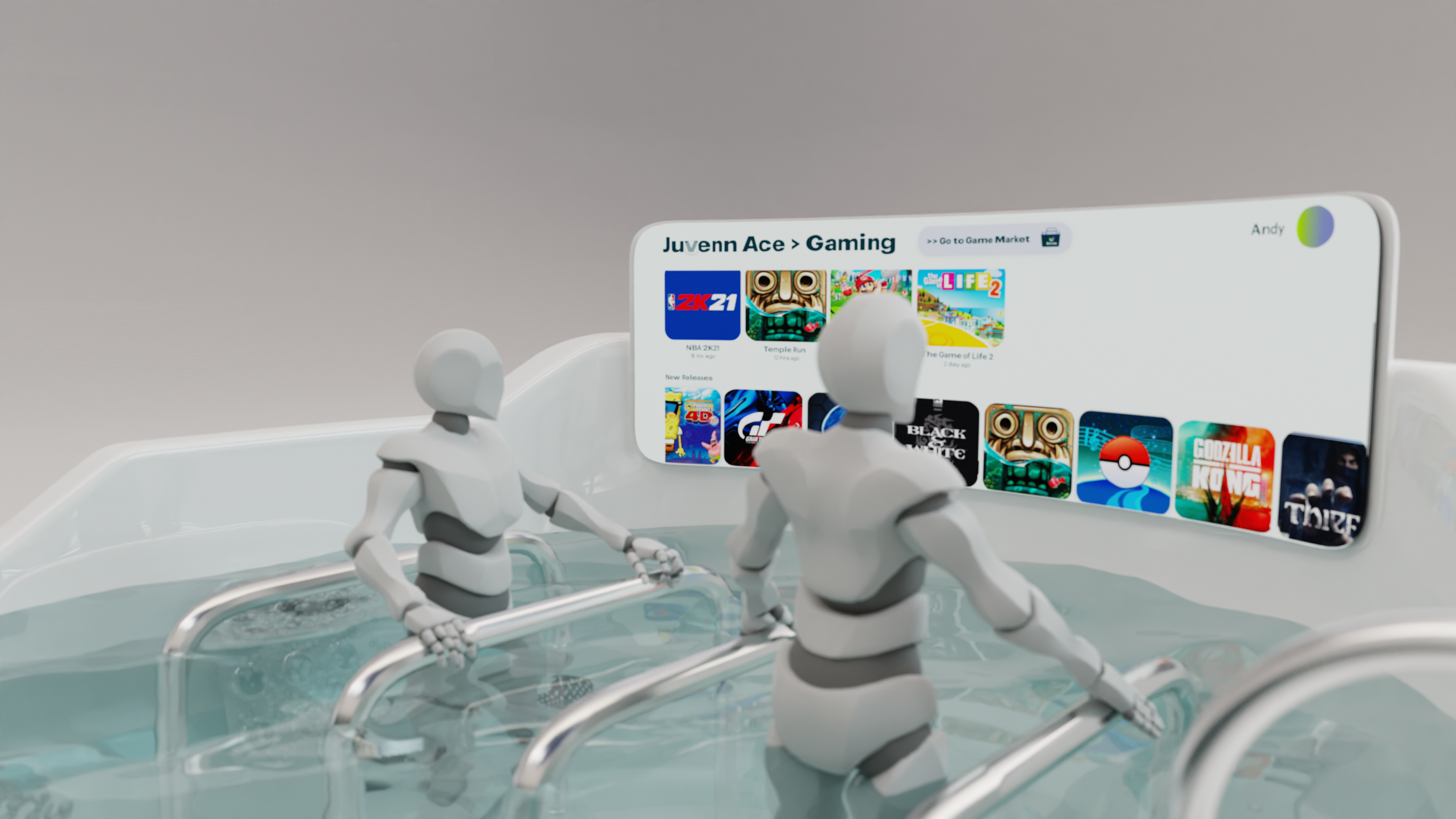
The iconography system is applied to both mobile and hot tub control interface.
The iconography system is applied to both mobile and hot tub control interface.
Targeting on younger generations, gaming elements and strategies are applied in order to engage with consumers.
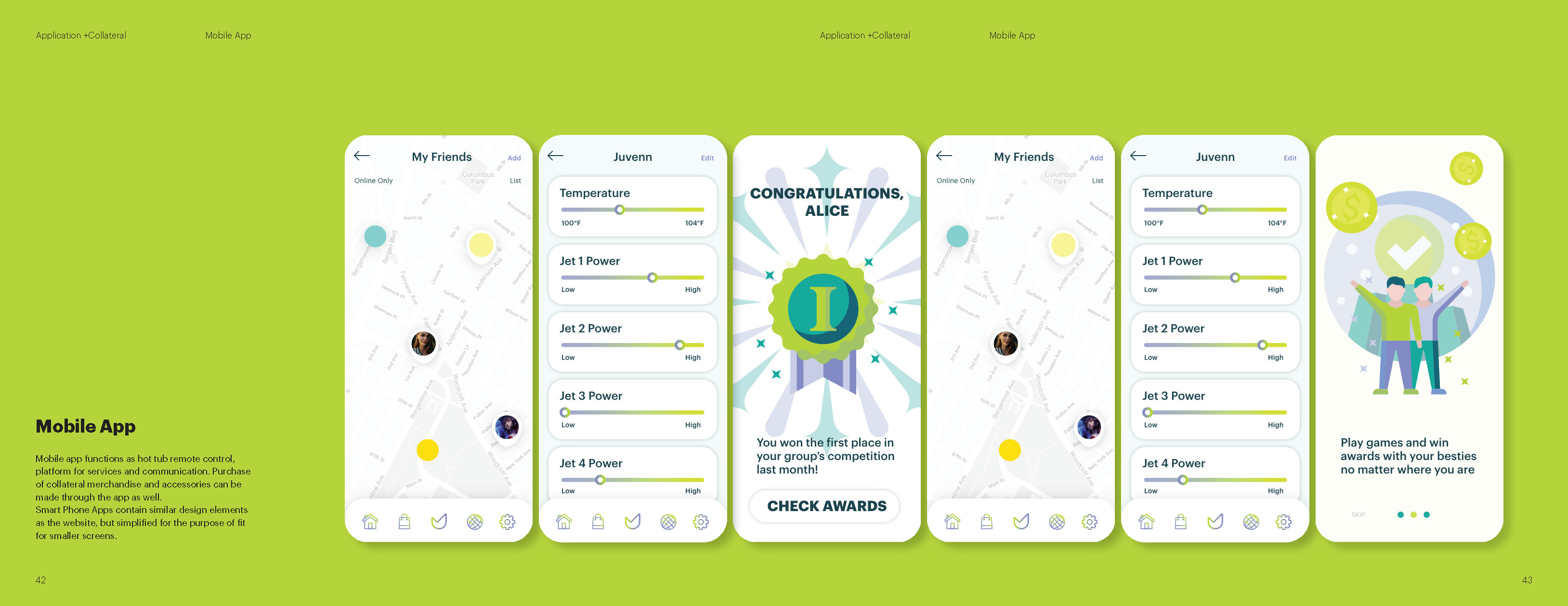
Mobile app also functions as hot tub remote control, platform for services and communication. Purchase of collateral merchandise and accessories can be made through the app as well.
Mobile app also functions as hot tub remote control, platform for services and communication. Purchase of collateral merchandise and accessories can be made through the app as well.

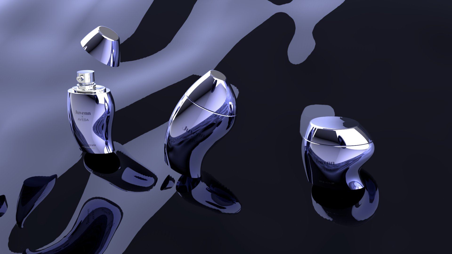
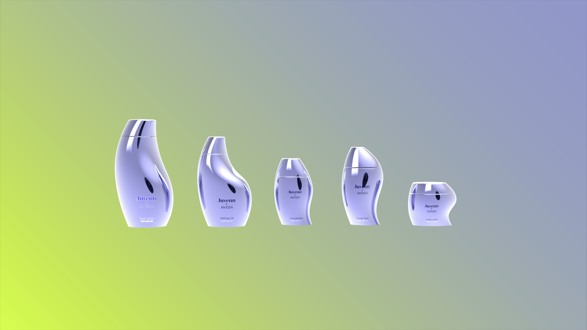
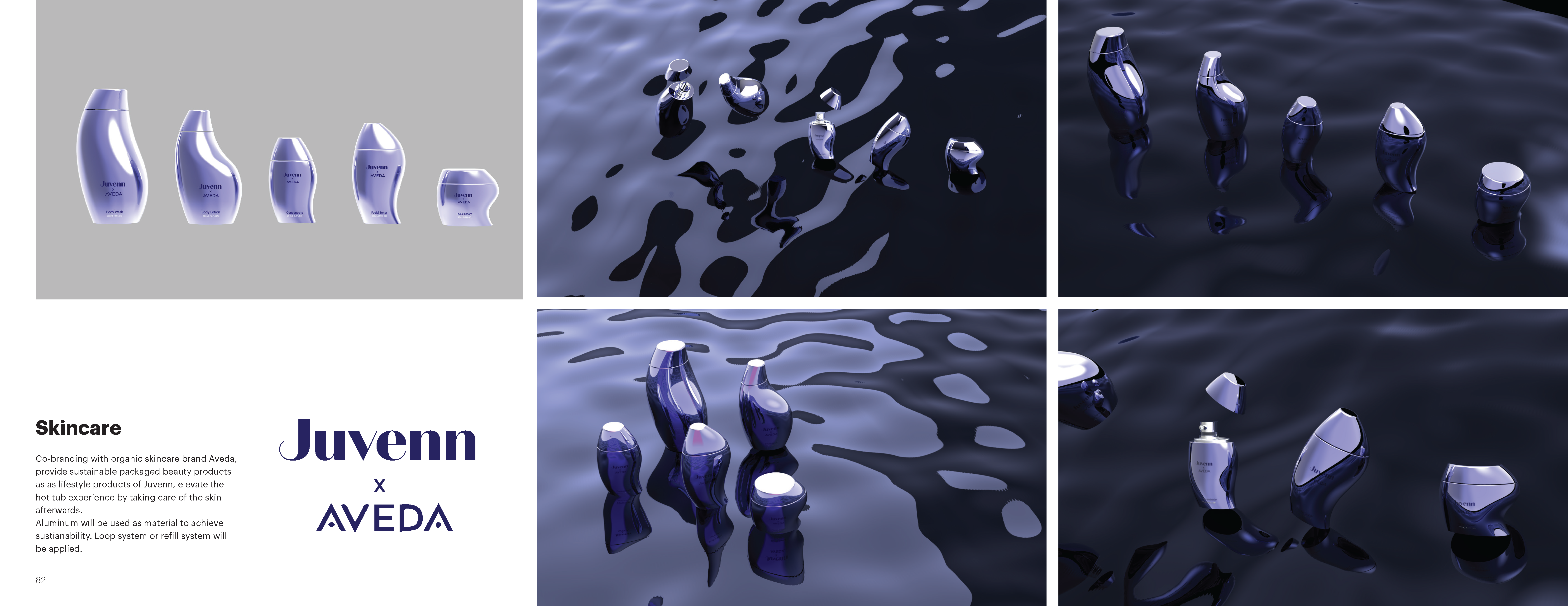
We also co-branded with organic skincare brand Aveda, where sustainable packaged beauty products will be a part of the lifestyle products of Juvenn. This elevates the hot tub experience by taking care of the skin afterwards.
Aluminum will be used as primary material to achieve sustianability. Loop system or refill system will be applied.
Aluminum will be used as primary material to achieve sustianability. Loop system or refill system will be applied.
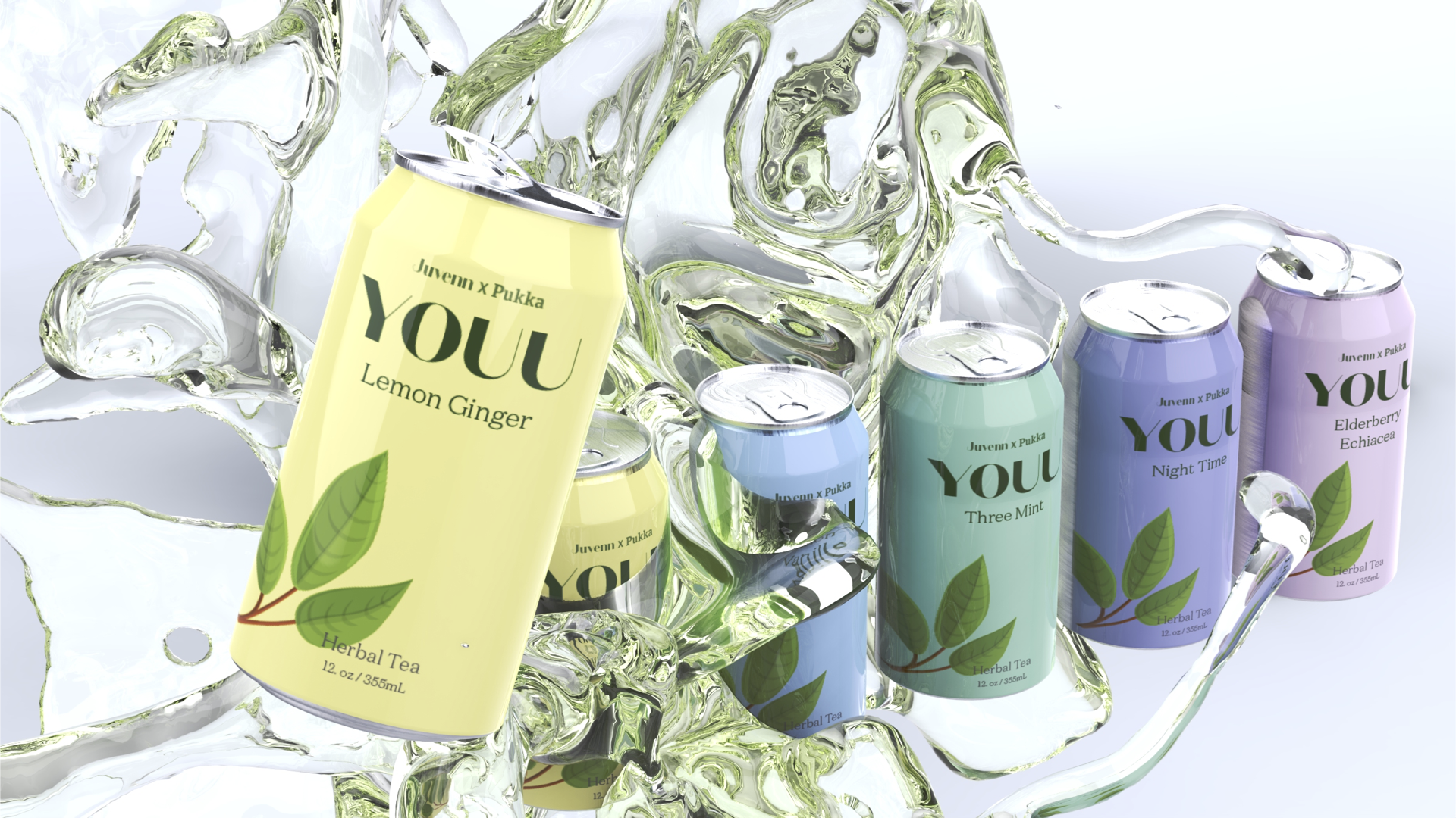
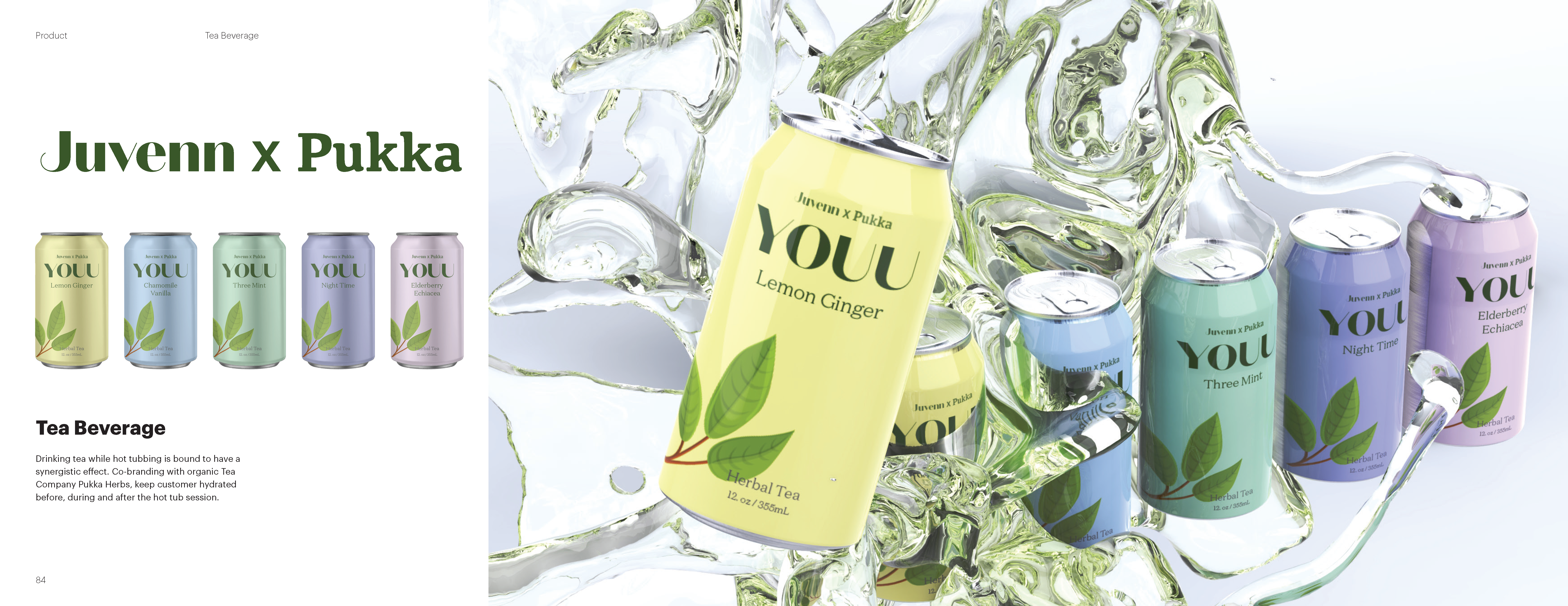
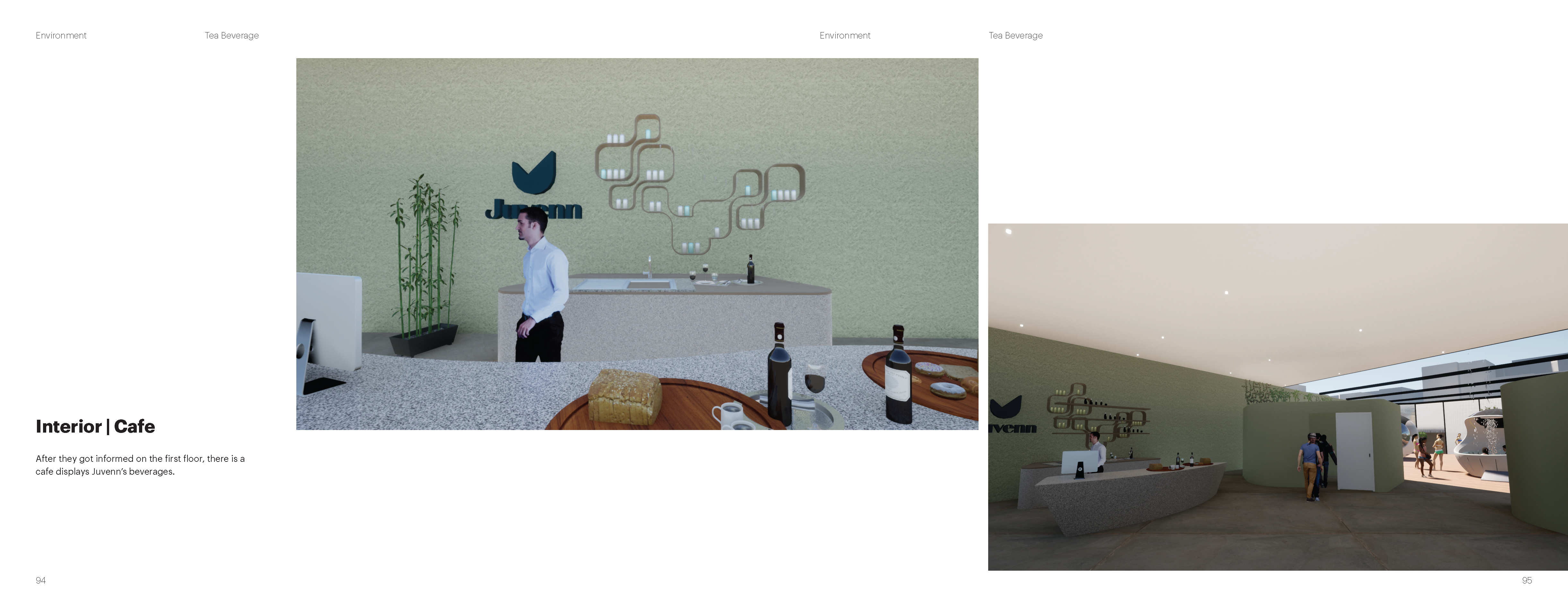
Drinking tea while hot tubbing is bound to have a synergistic effect. Collaborating with organic Tea Company Pukka Herbs, the herbal tea beverage series YOUU keeps customer hydrated before, during and after the hot tub session.
A wide range of flavor selections will be provide in the concept store and online.
A wide range of flavor selections will be provide in the concept store and online.
For detailed info about this team project, please refer to the brand identity guideline.


Project sponsored by Jacuzzi Inc.
Team Members:
Graphic: Mikka Huang
Environment: Jieun Hwang
Product: Lance Li
Special Thanks:
James Chu
Micheal Neumayr
/ NatureMade Redesign
/ Aug–Dec, 2021
/ Packaging Design
/ Branding
/ Retail Space Design
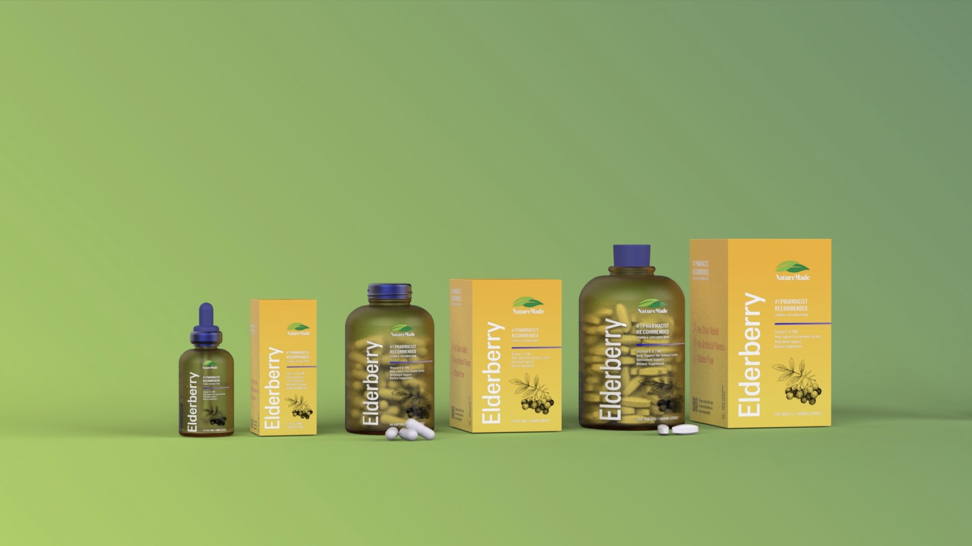
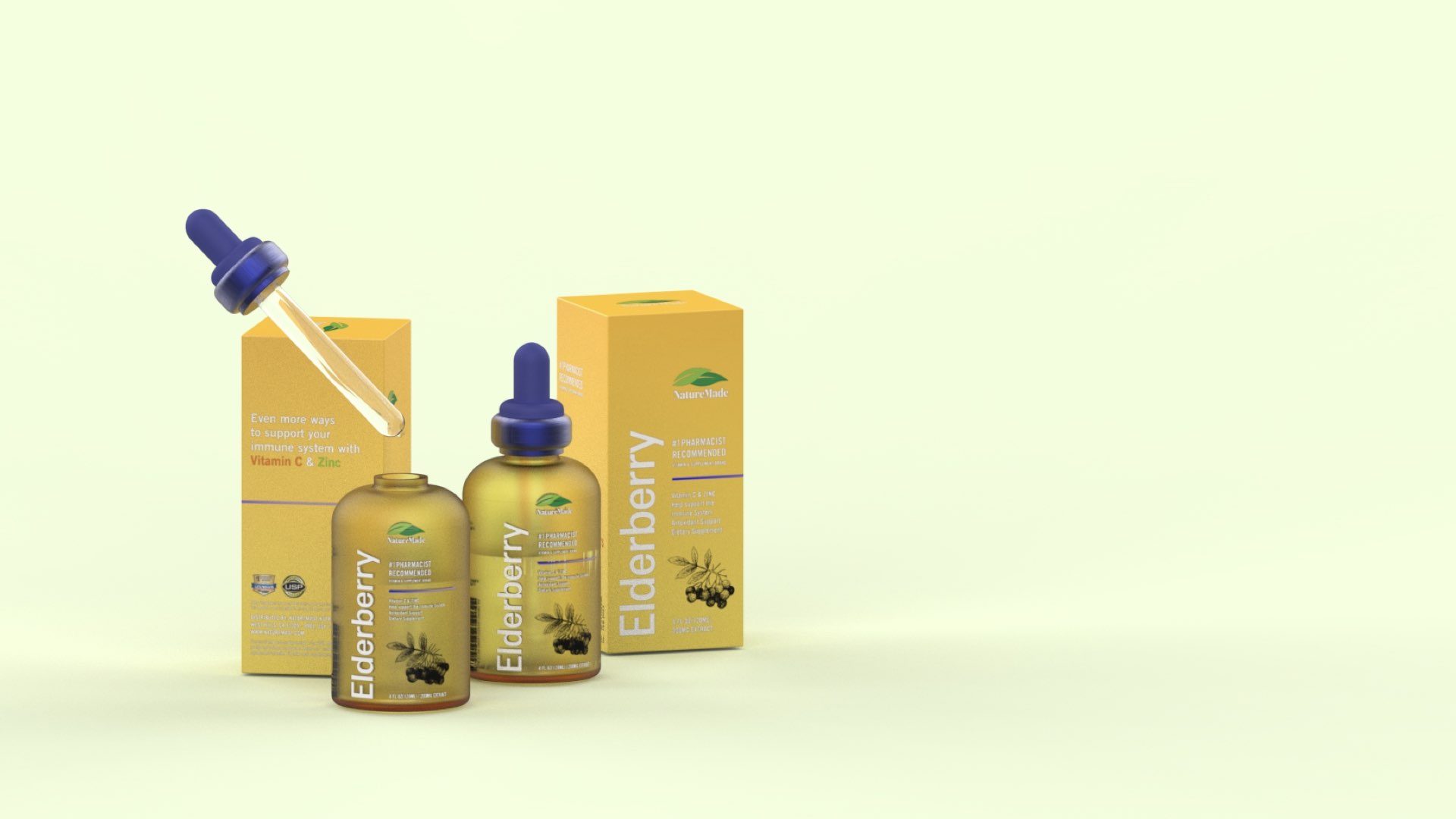
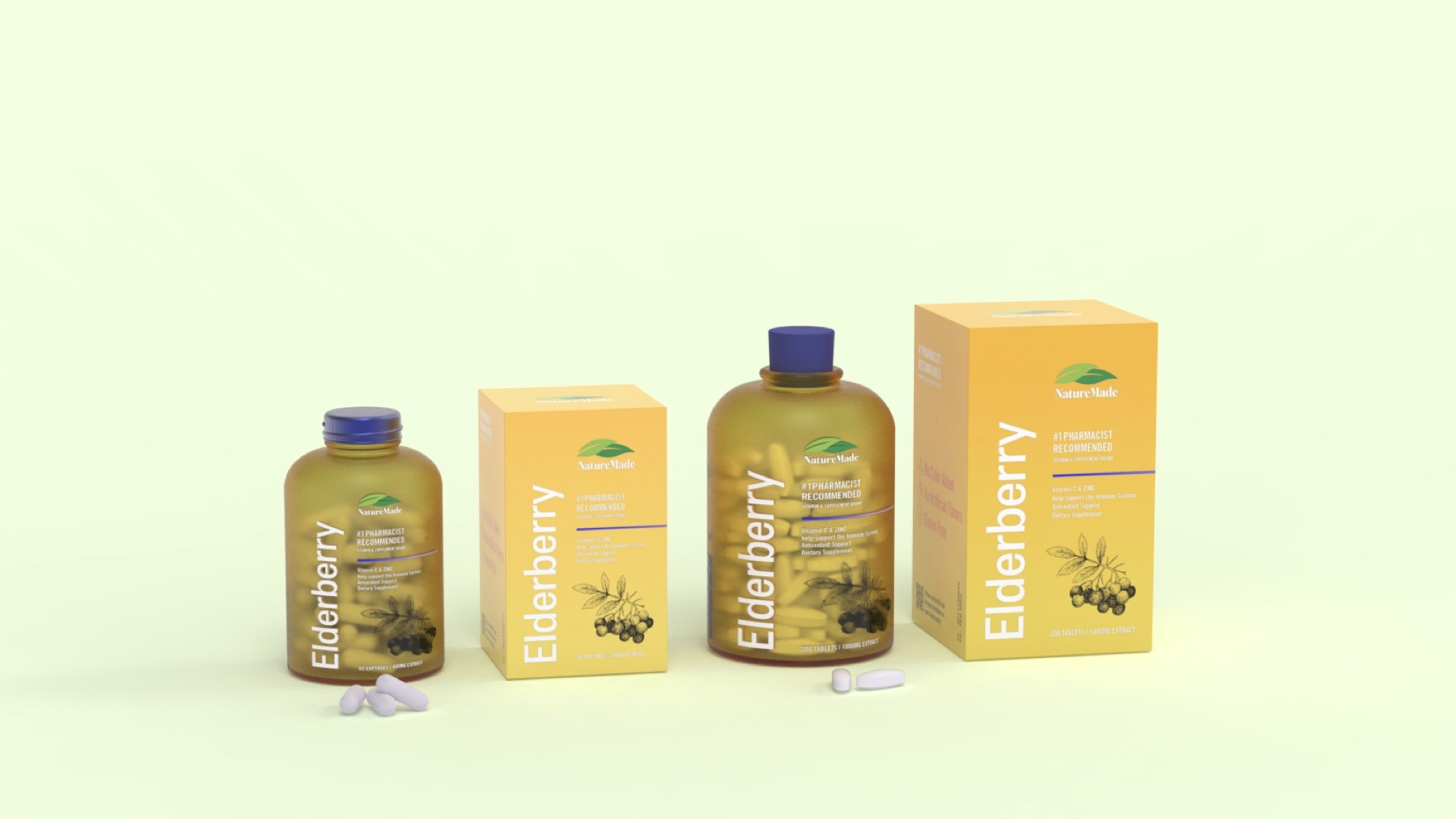
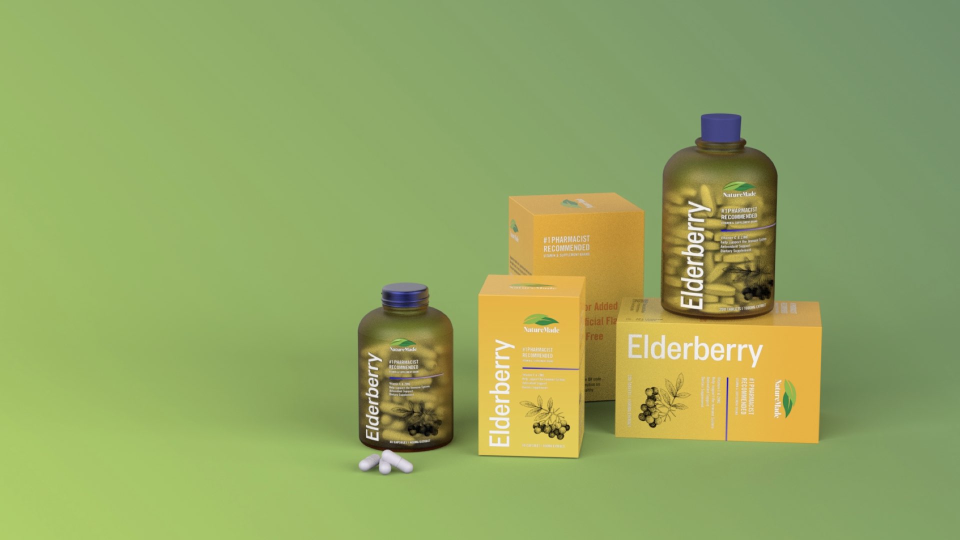
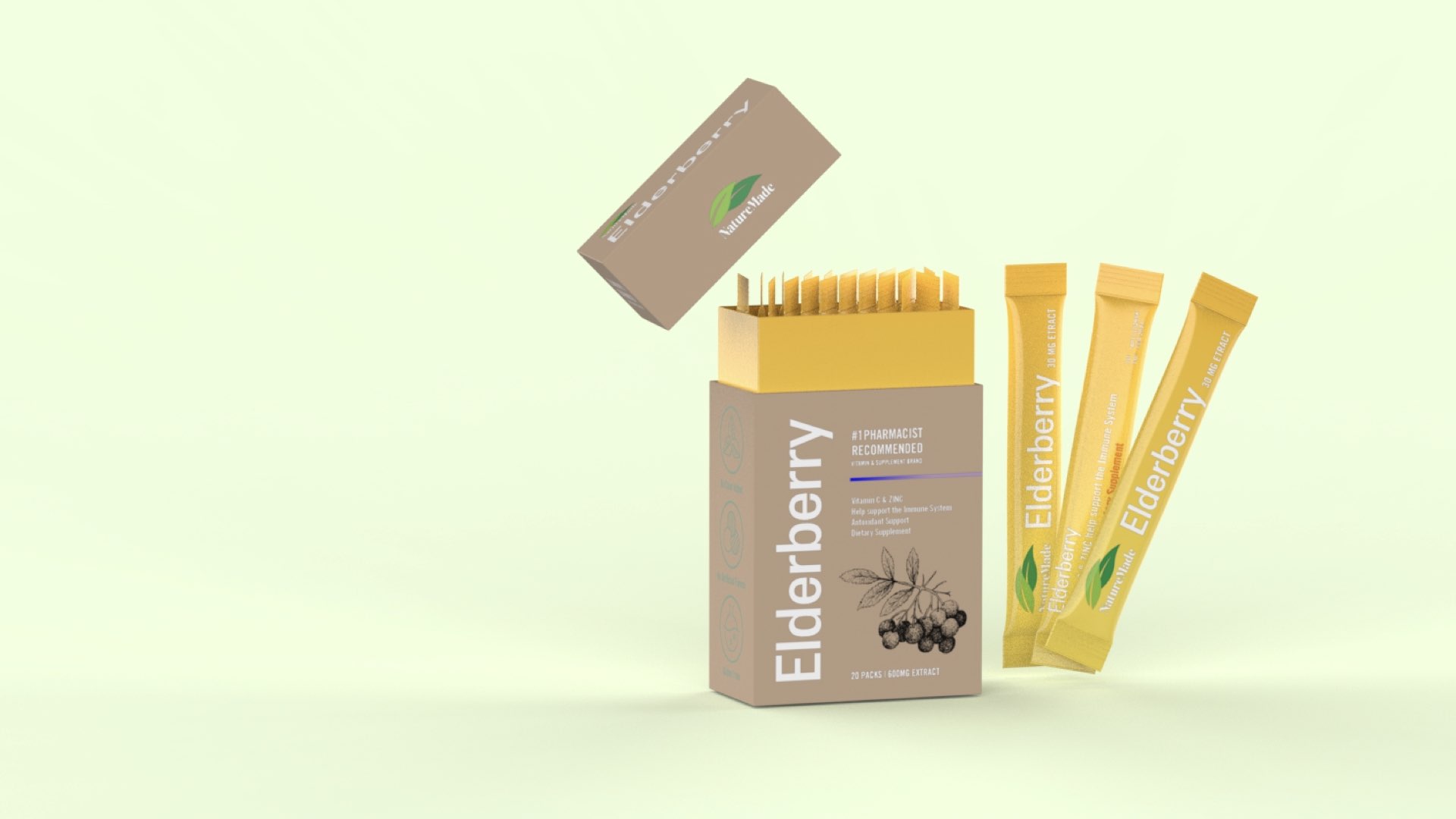
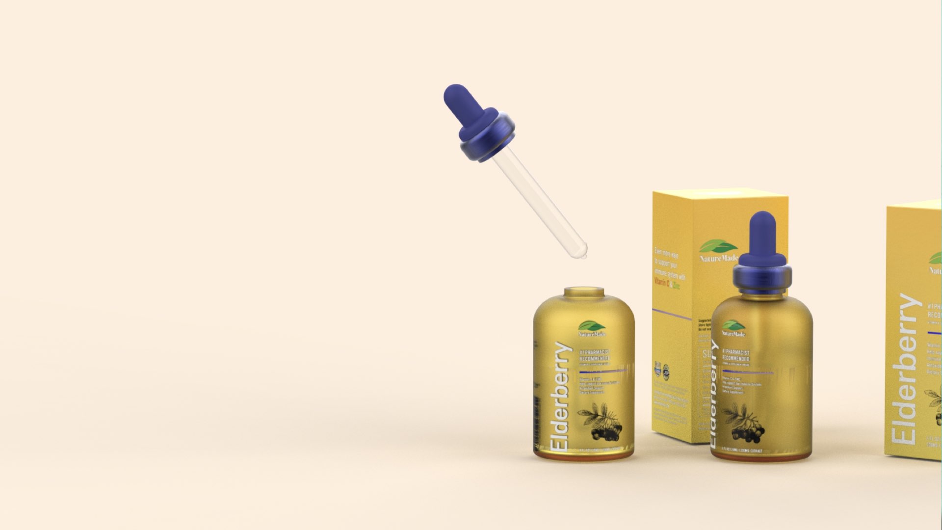
As US’s No.1 Pharmacist Recommended vitamins and supplements brand, Nature Made aims to provide products with science-based organic ingredients to health conscious consumers. Targeting on millenials, NatureMade’s classic brand identity was modernized with a contemporary, energetic appearance and sustainable packaging system.

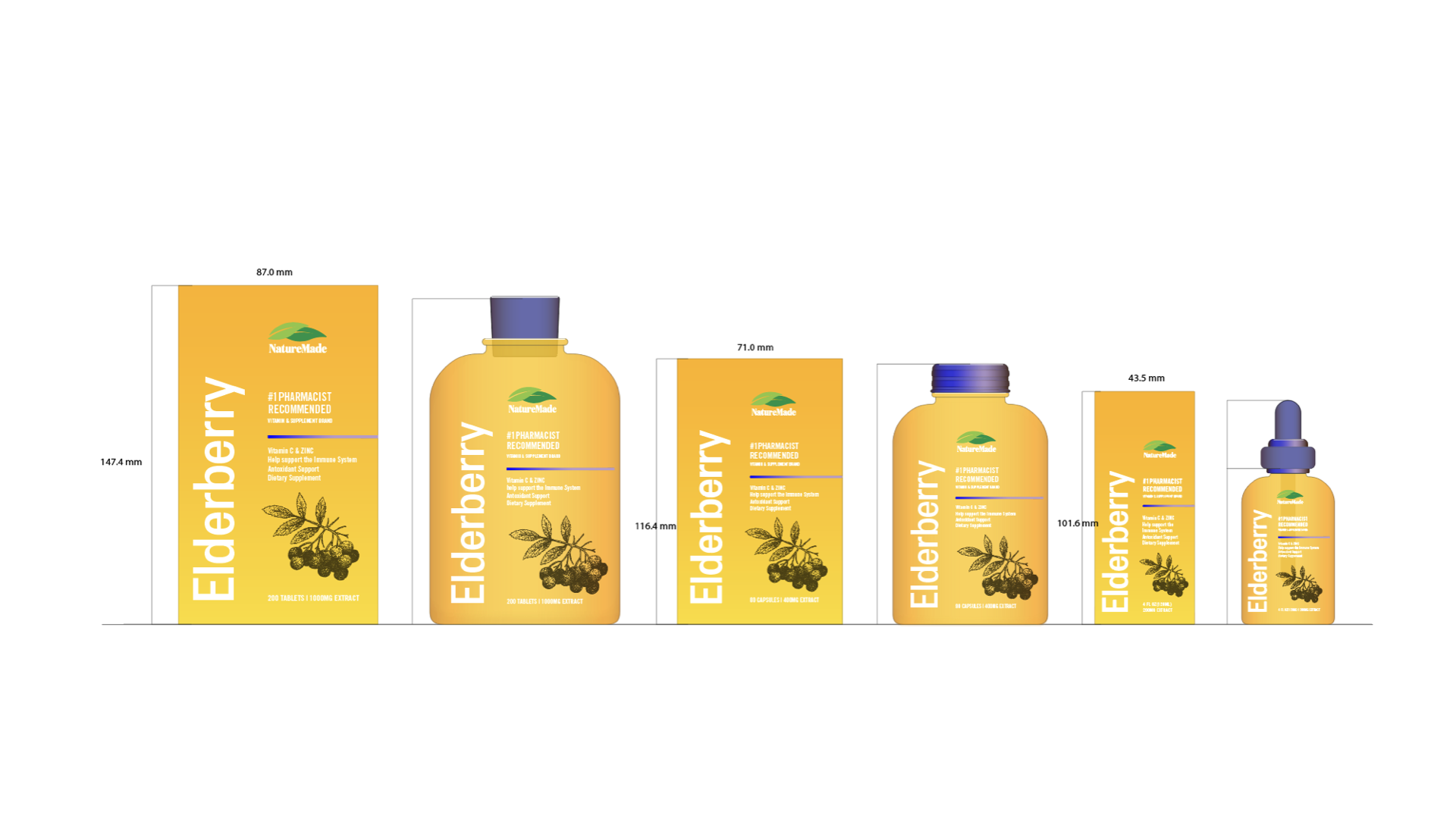
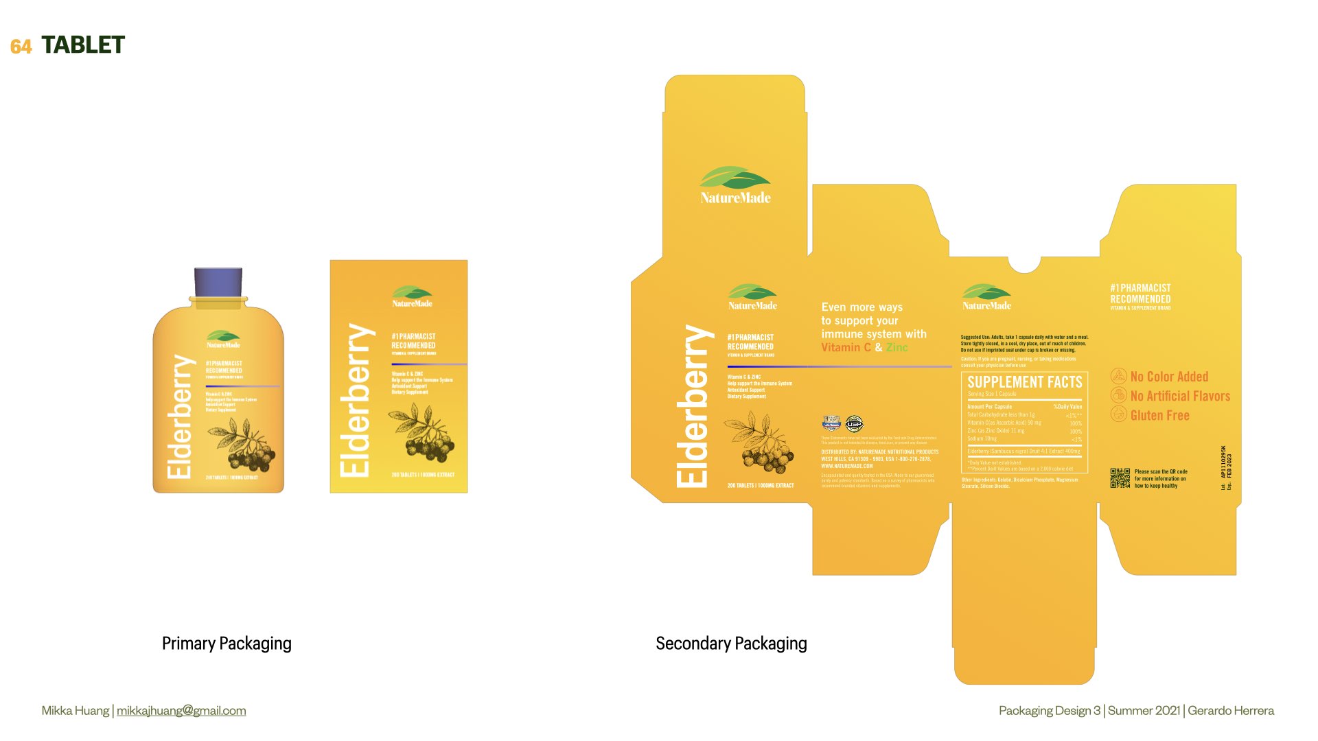
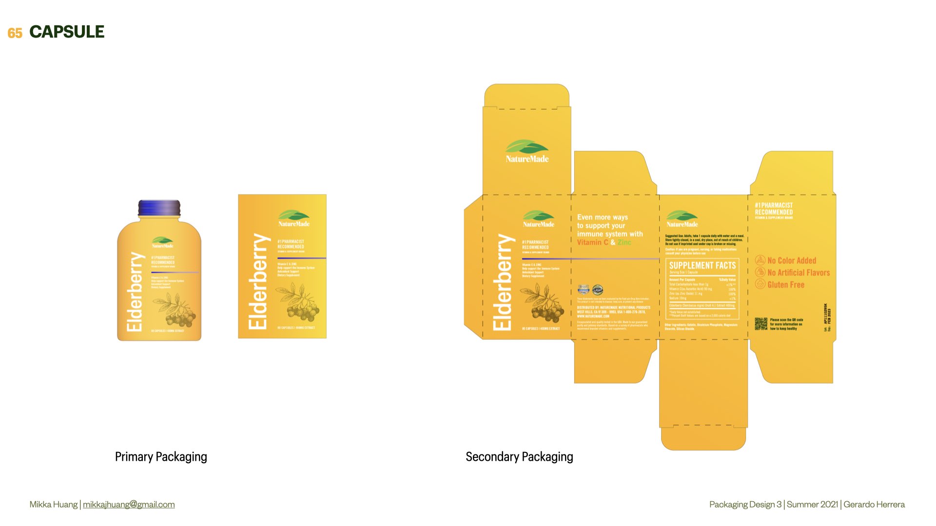
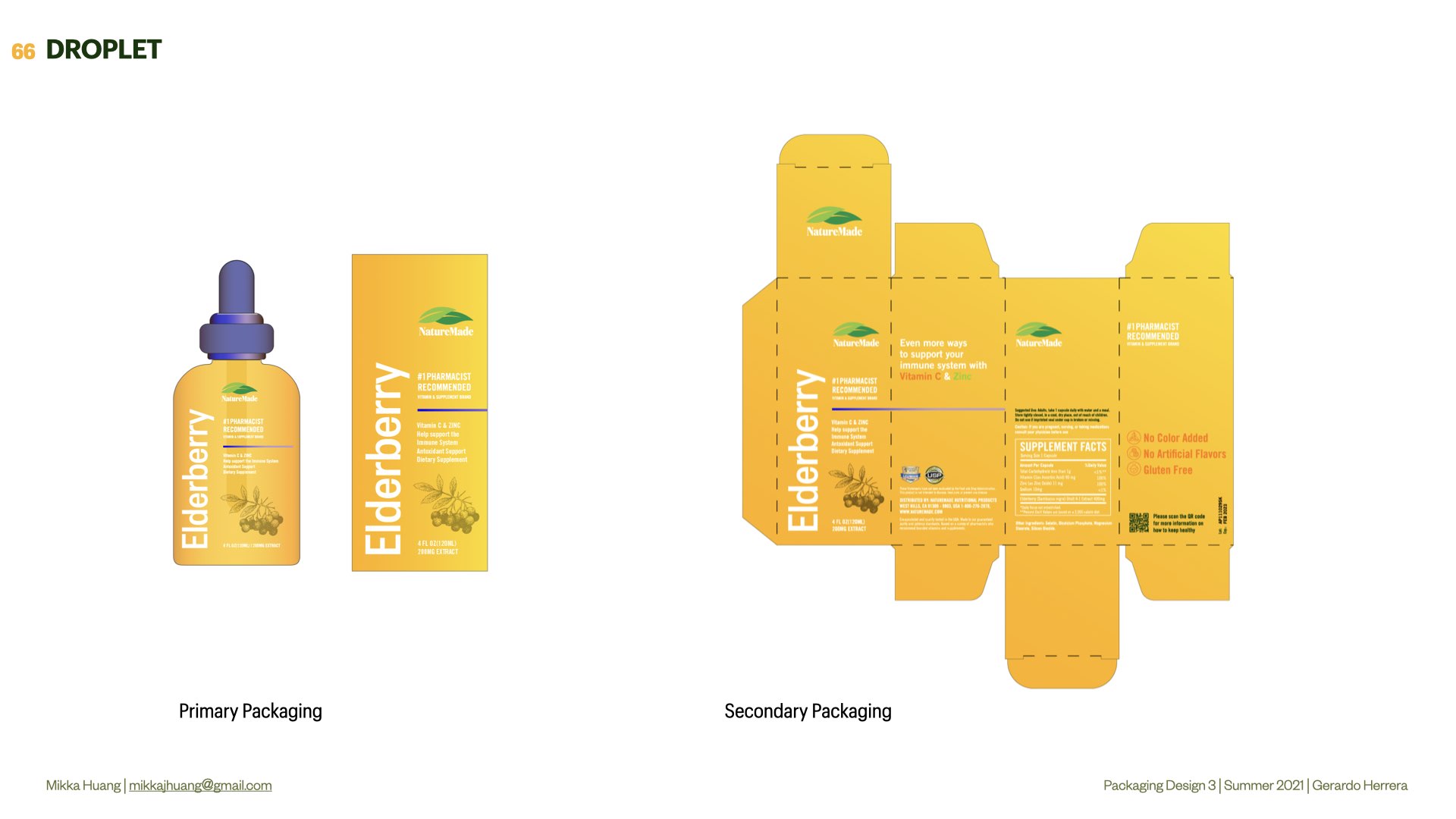
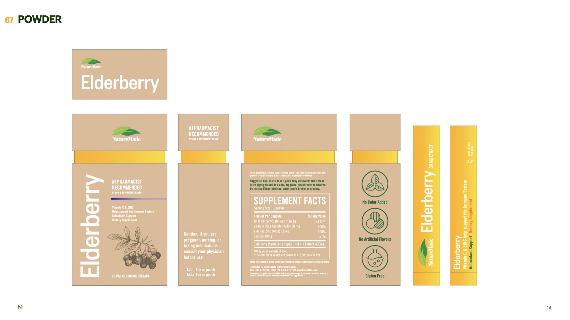
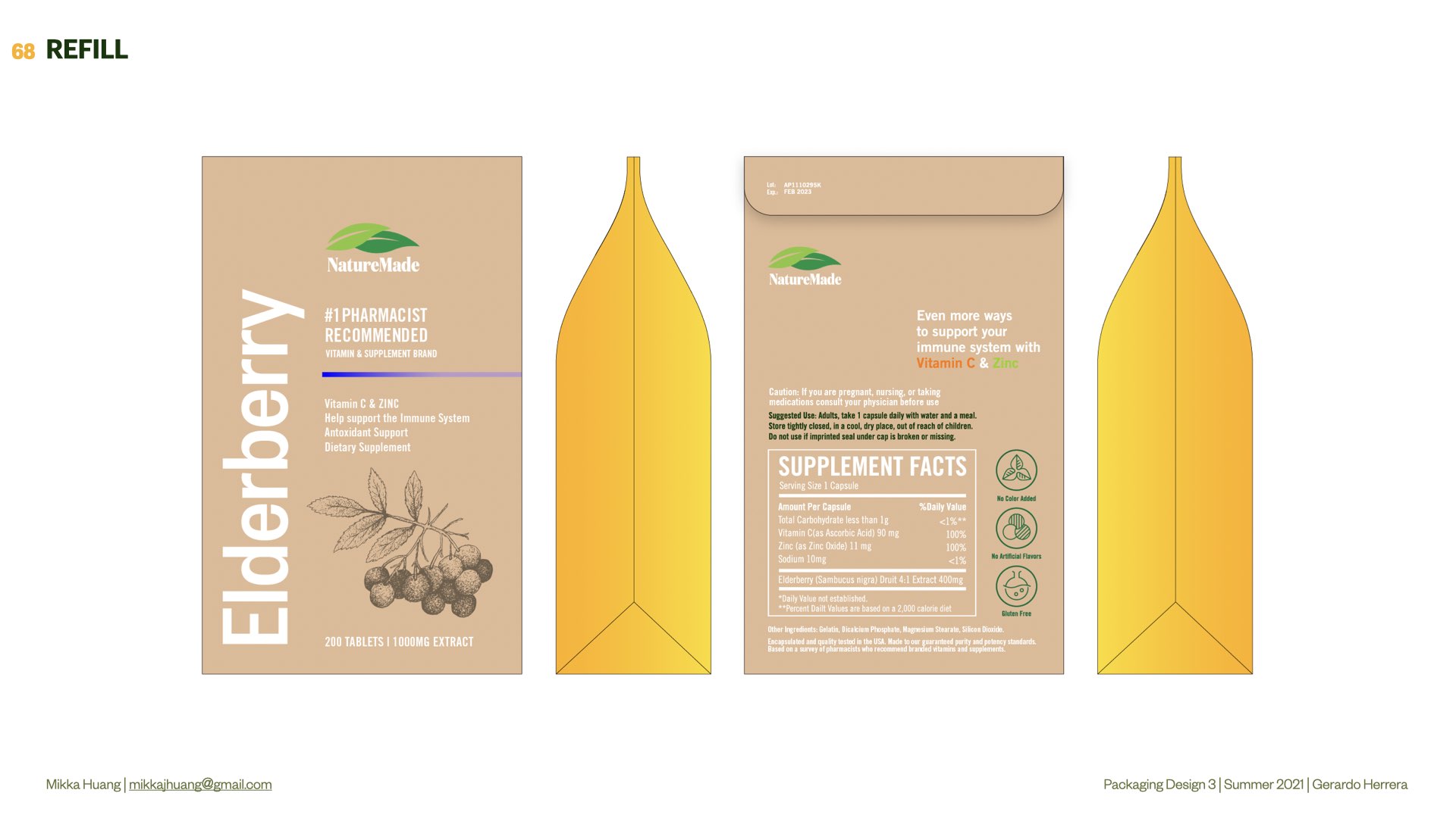
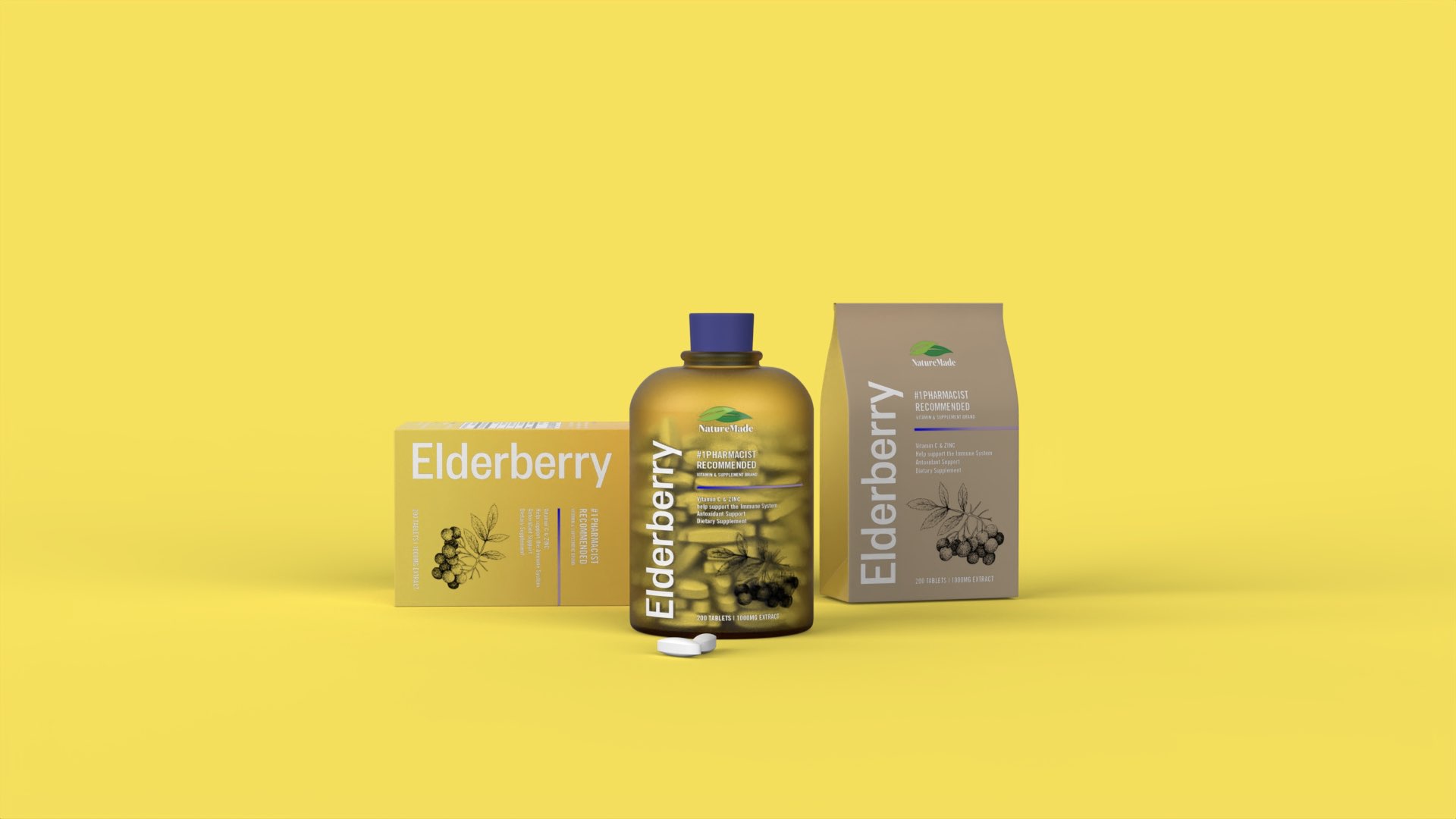
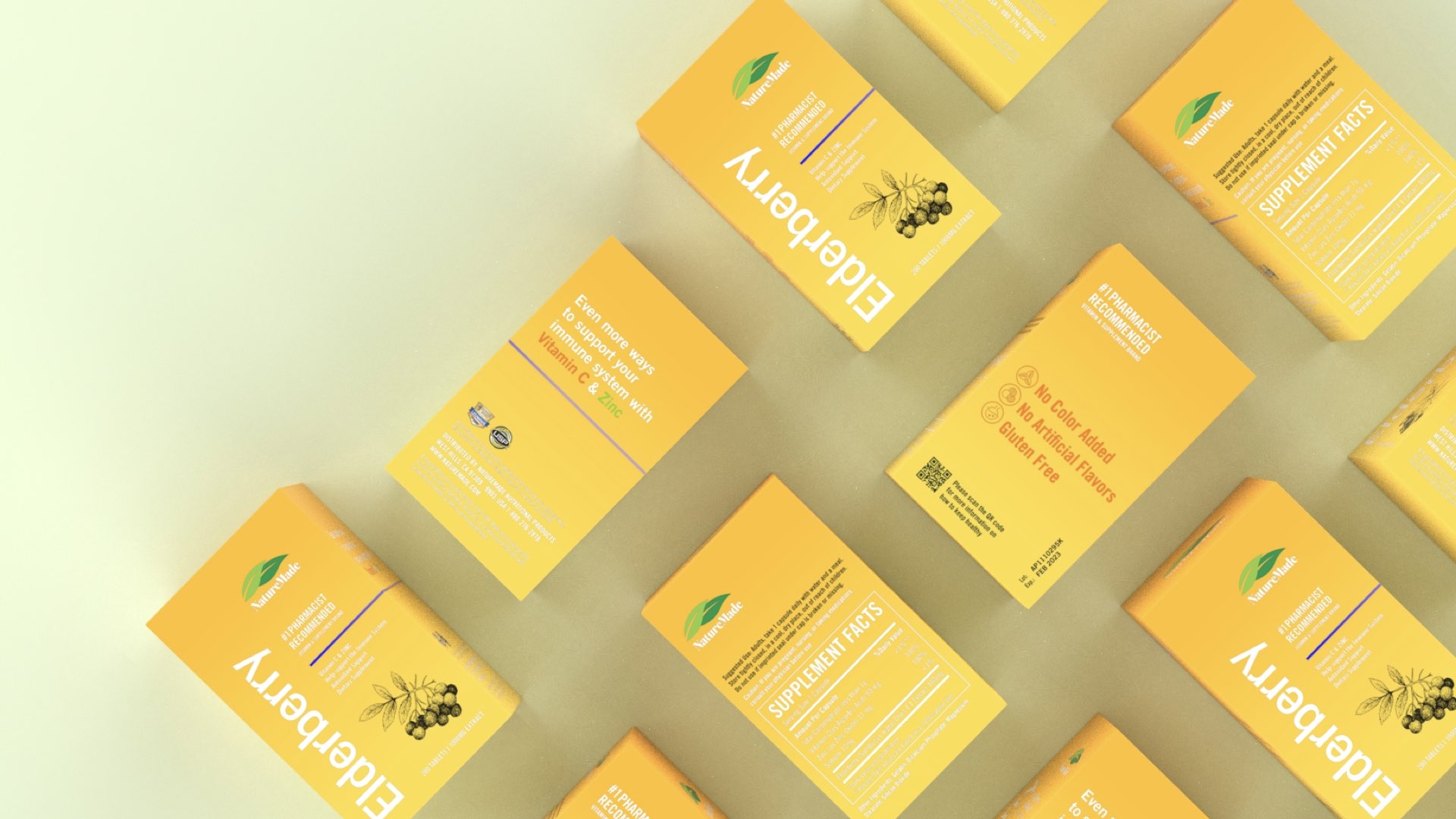
The packaging system is made out of sustainable materials. Powder product in individual packaging is easy to carry and refillable glass bottles could work as decorations on your kitchen counter.Different packaging allows consumers to choose for the best suitable context.

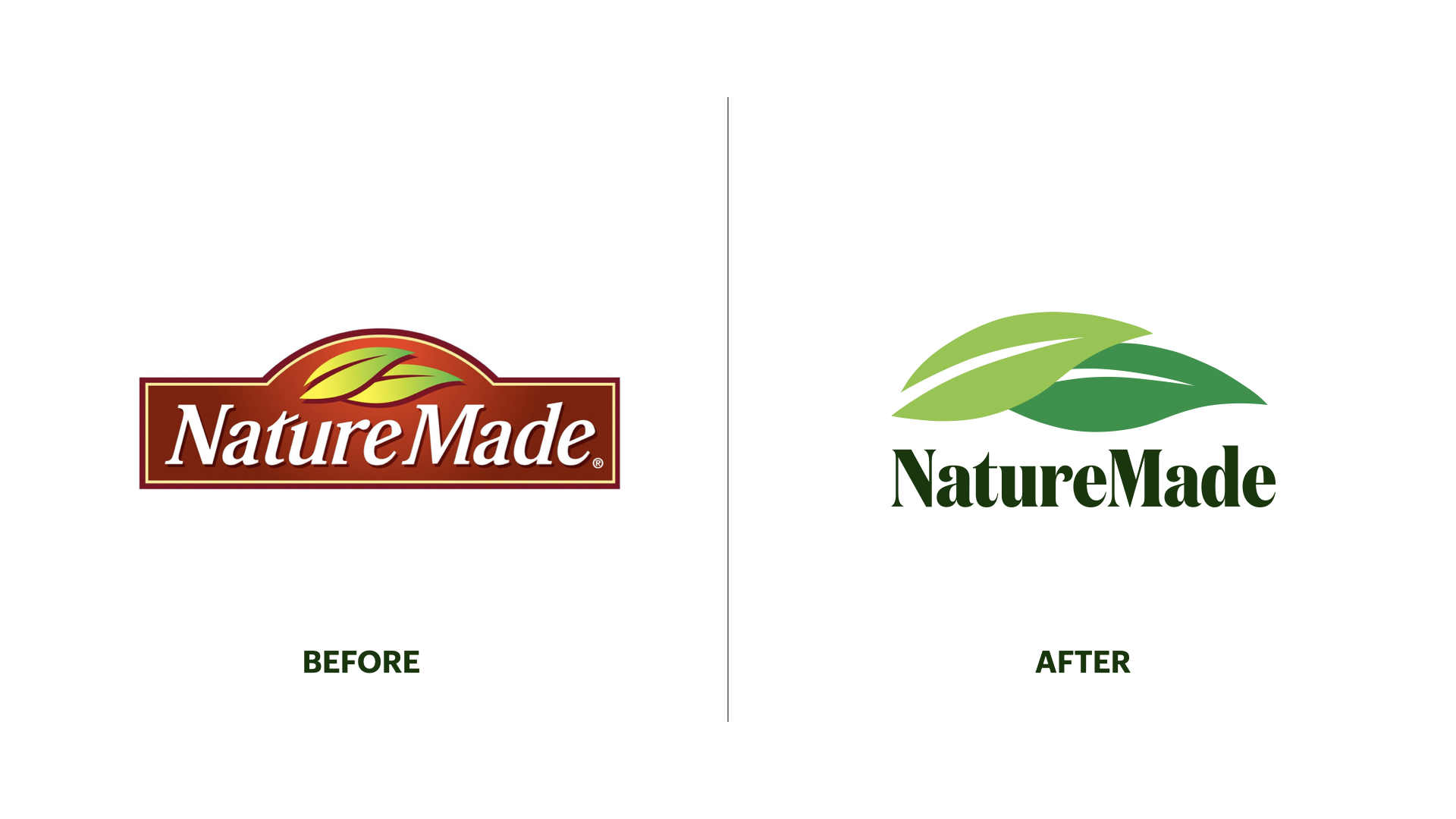
The new logo is freed from its old frame but inherited the leaf and serif typeface to achieve a contemporary and eco-friendly style.
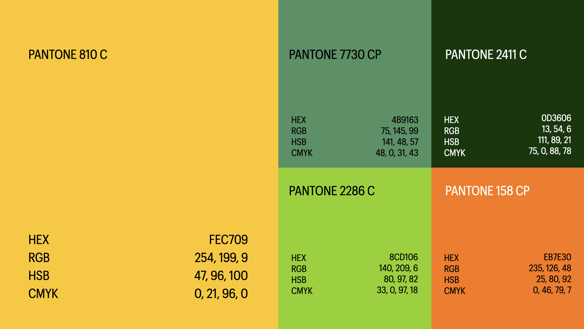
Keeping the saturated yellow as the primary color with different shades of green and orange as a highlight color, allows the refreshment of the brand identity.
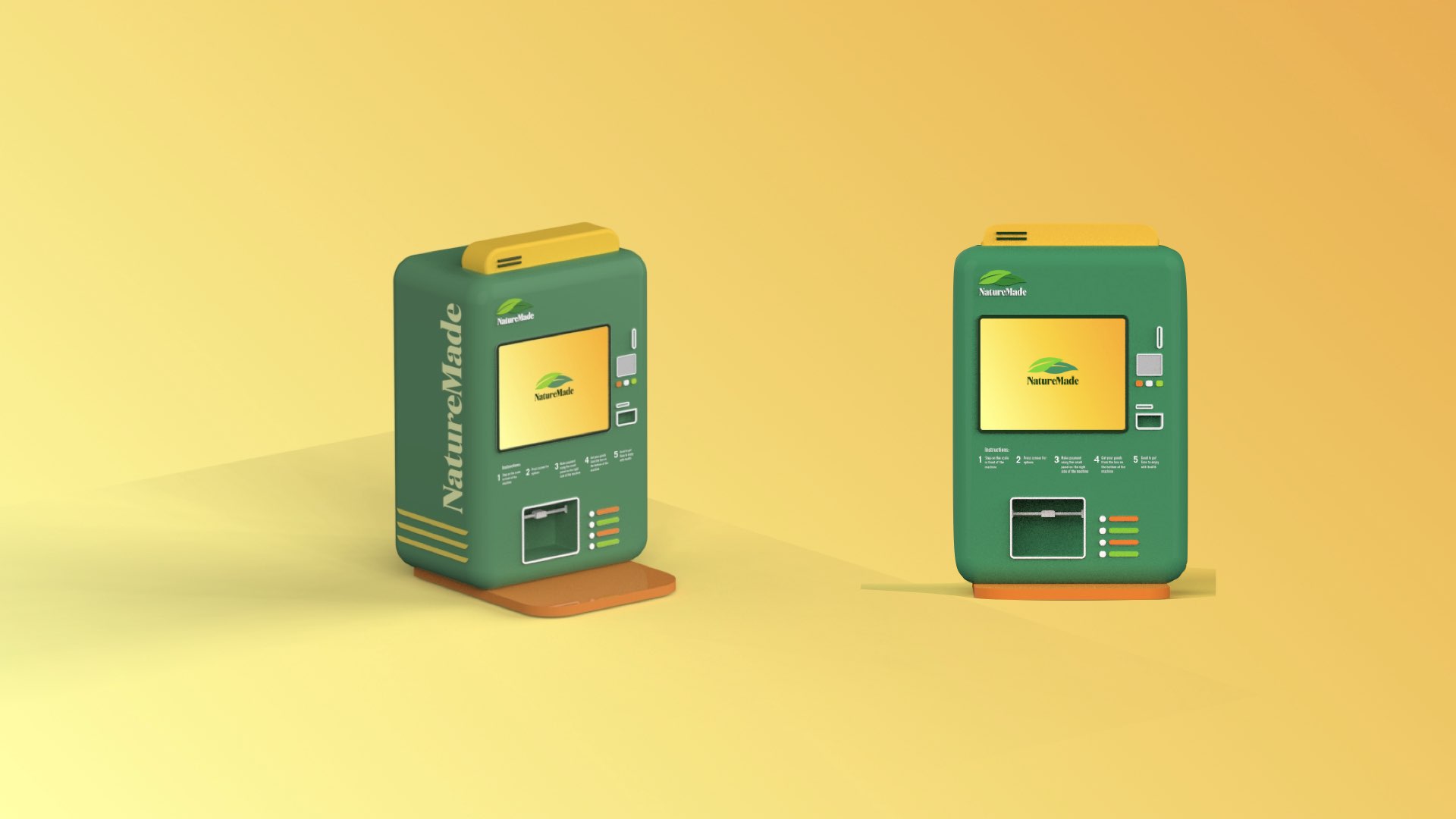
Customers are able to find customized solutions with the quiz, available on the official website, mobile app, and vending machines in retail spaces.

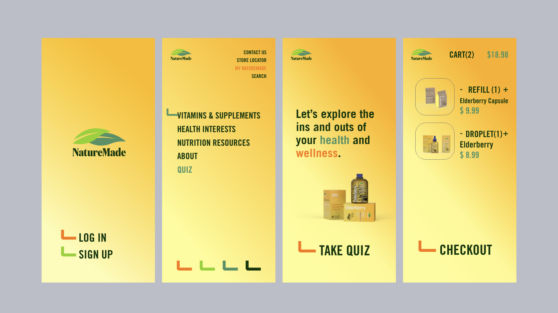
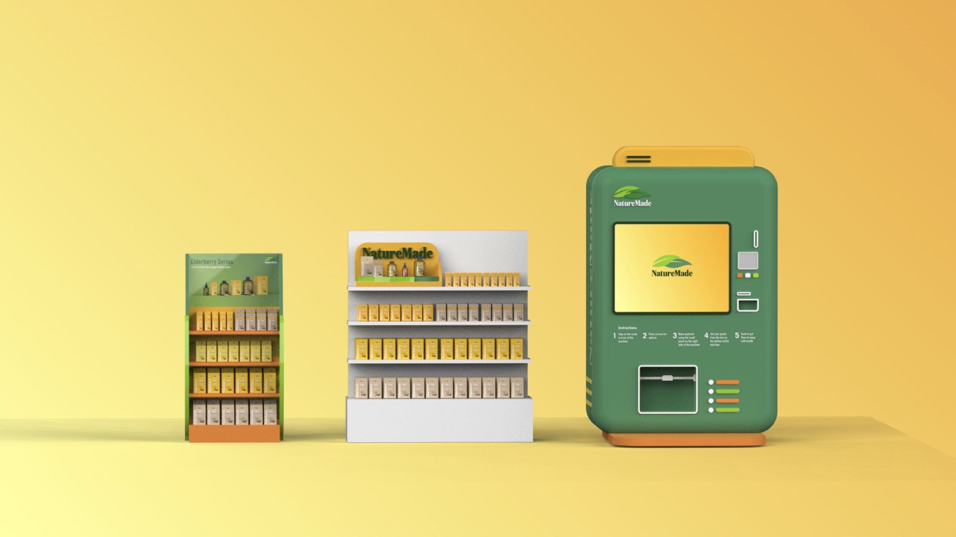
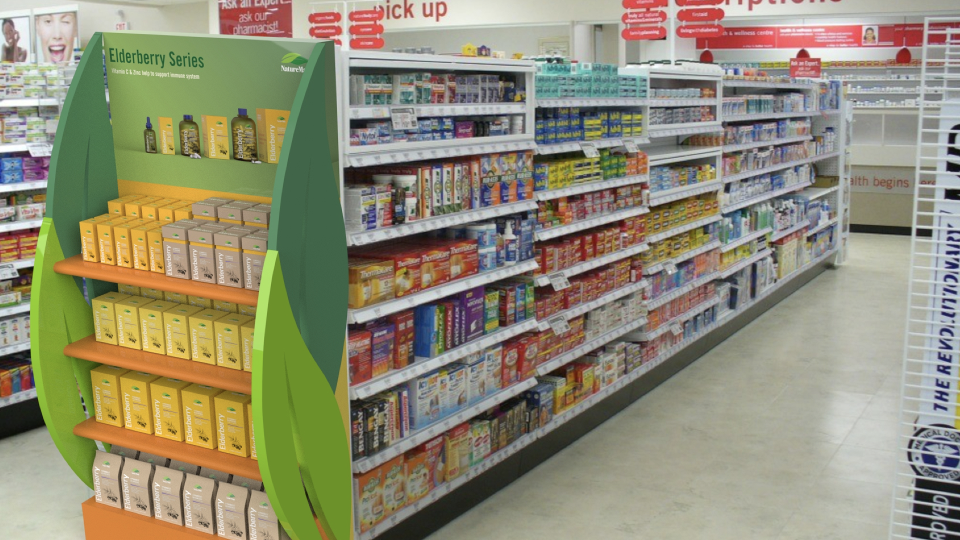
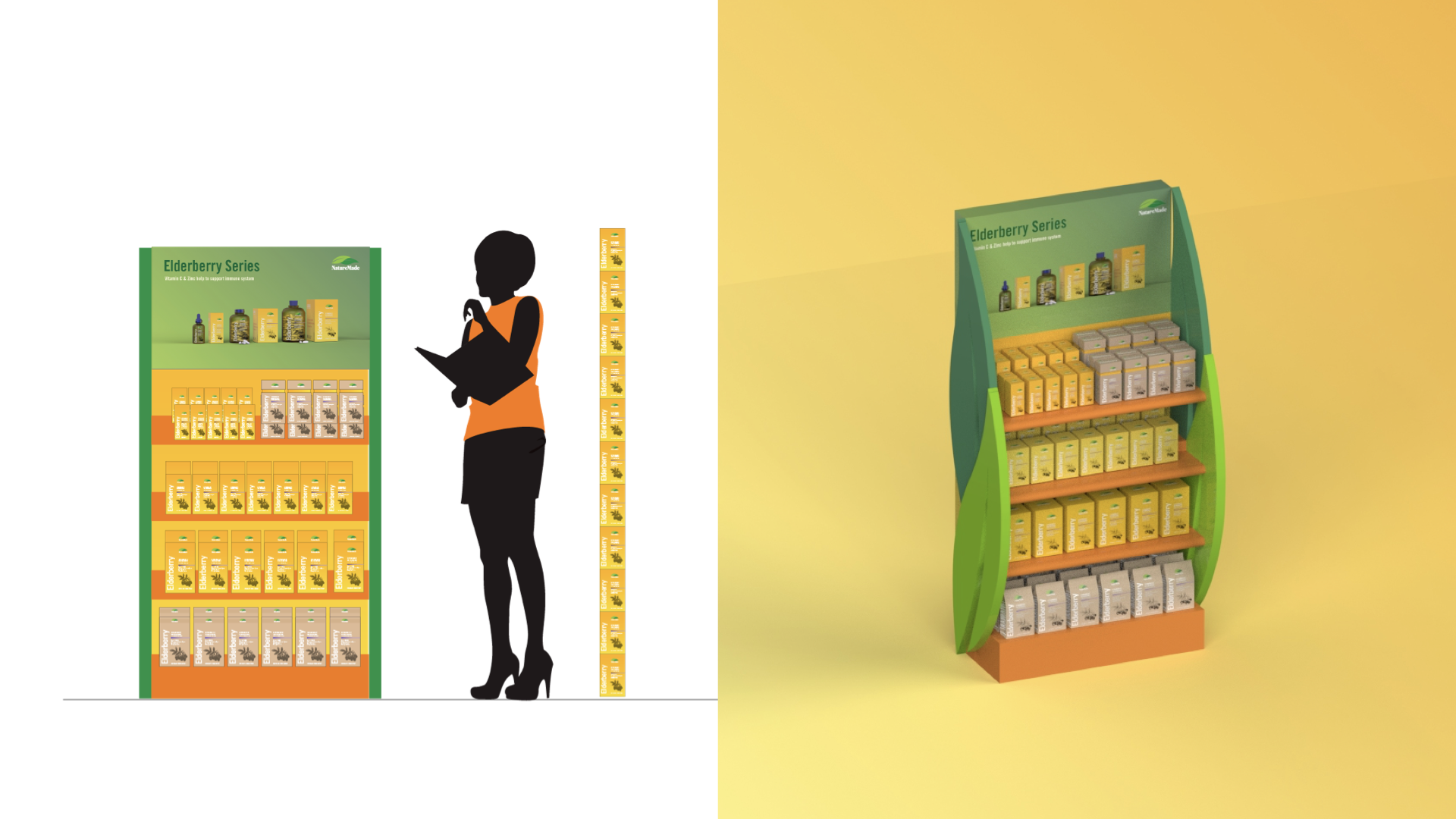
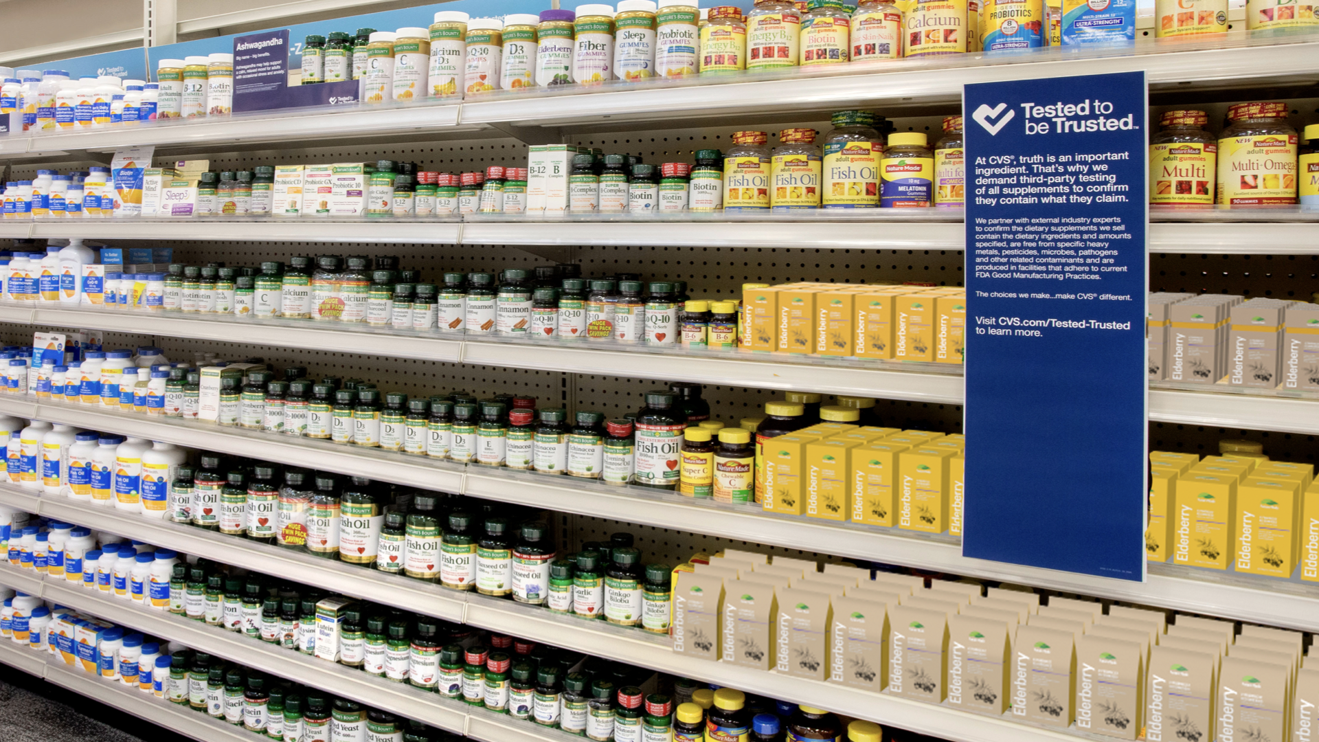
The vending machine, endcap display, retail space design and shelf presence enhance the consistency of the overall brand image.
Modeling and rendering is created with Rhino 7 and Keyshot 9, as wel as Adobe Illustrator and Photoshop.
Modeling and rendering is created with Rhino 7 and Keyshot 9, as wel as Adobe Illustrator and Photoshop.


More Digital Renders
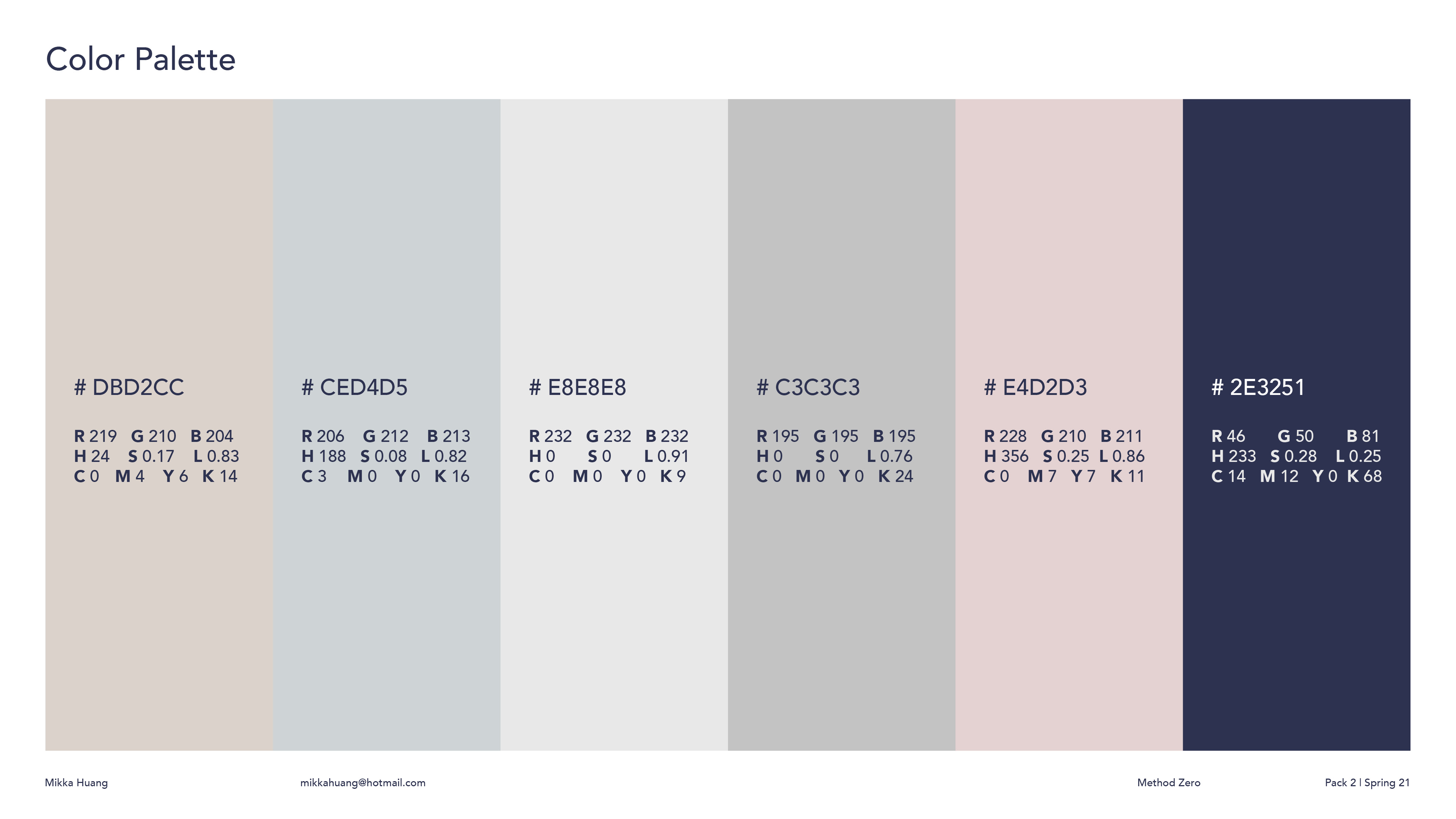
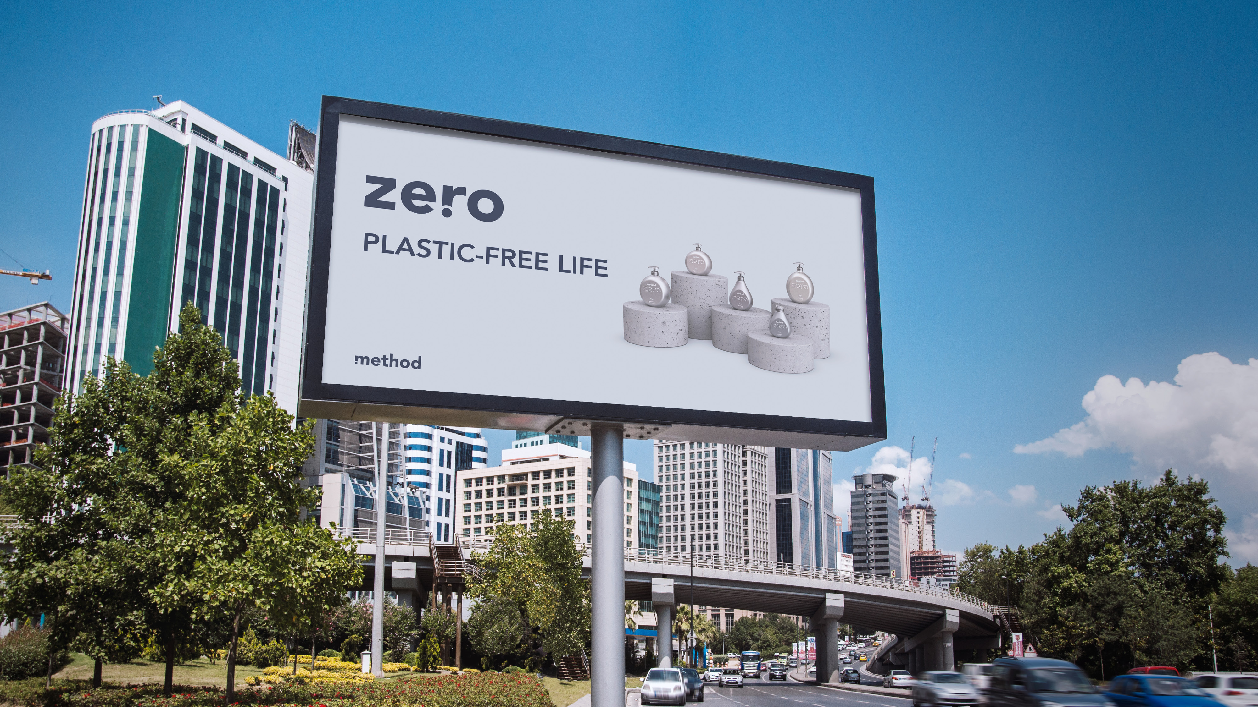
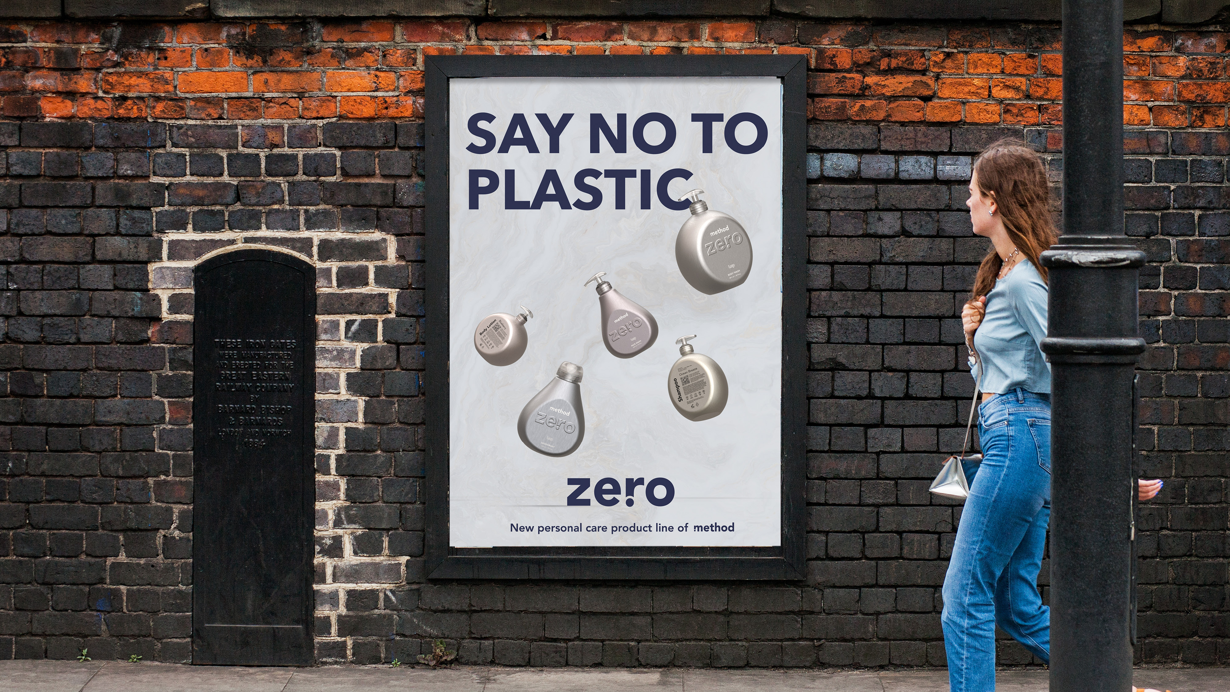
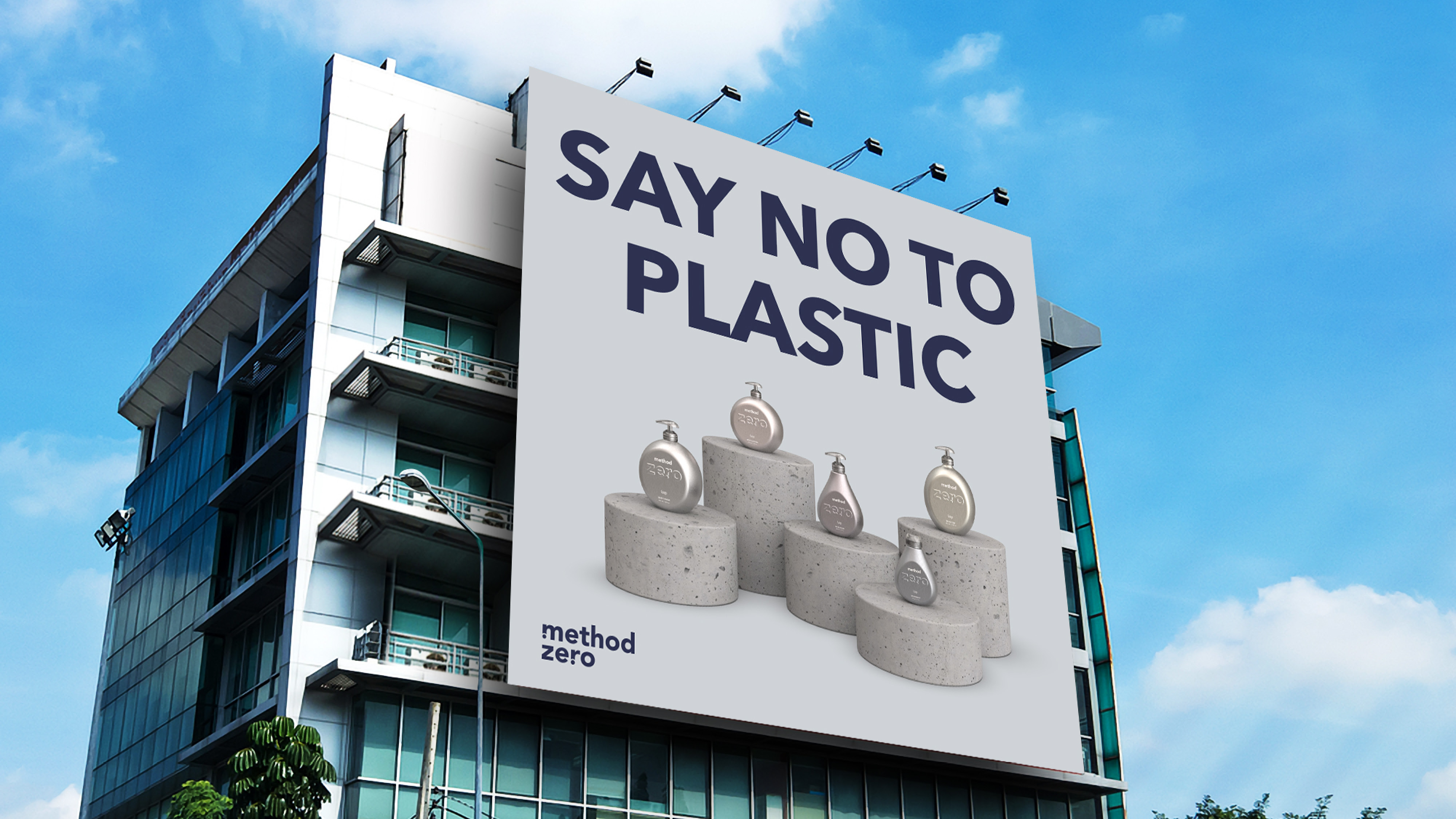
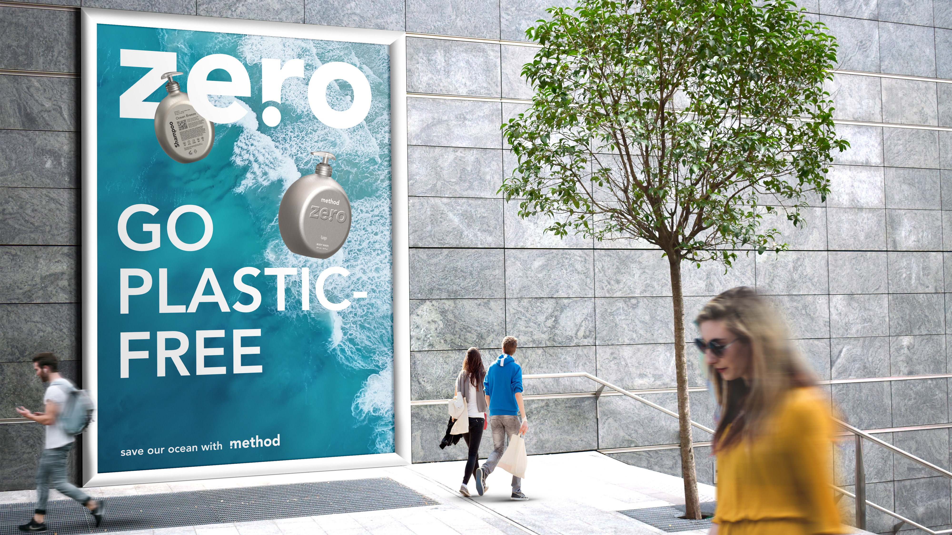
/ Method Zero Plastic Free
/ Jan–Apr, 2021
/ Packaging Design
/ Branding
/ Identity System
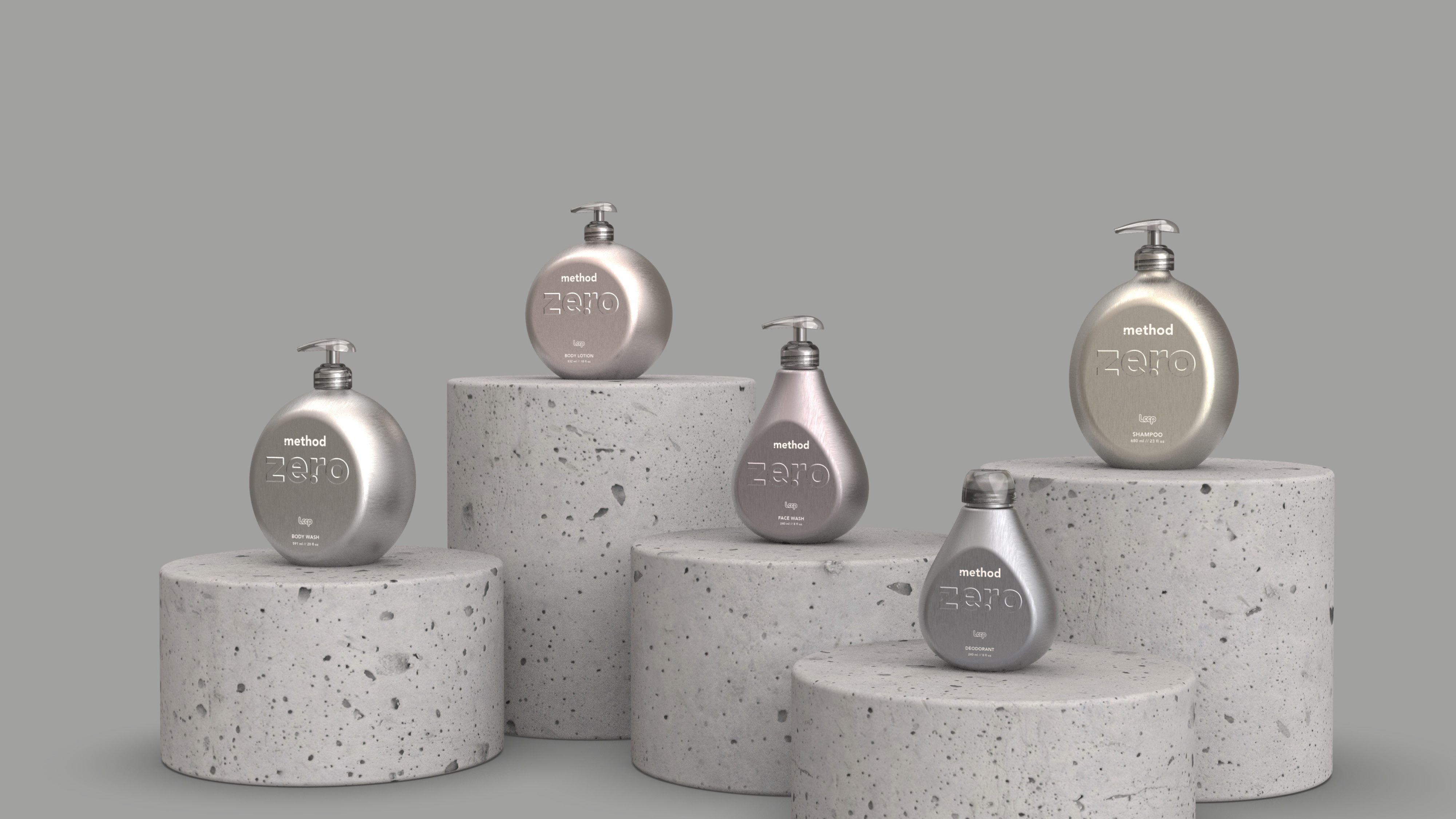
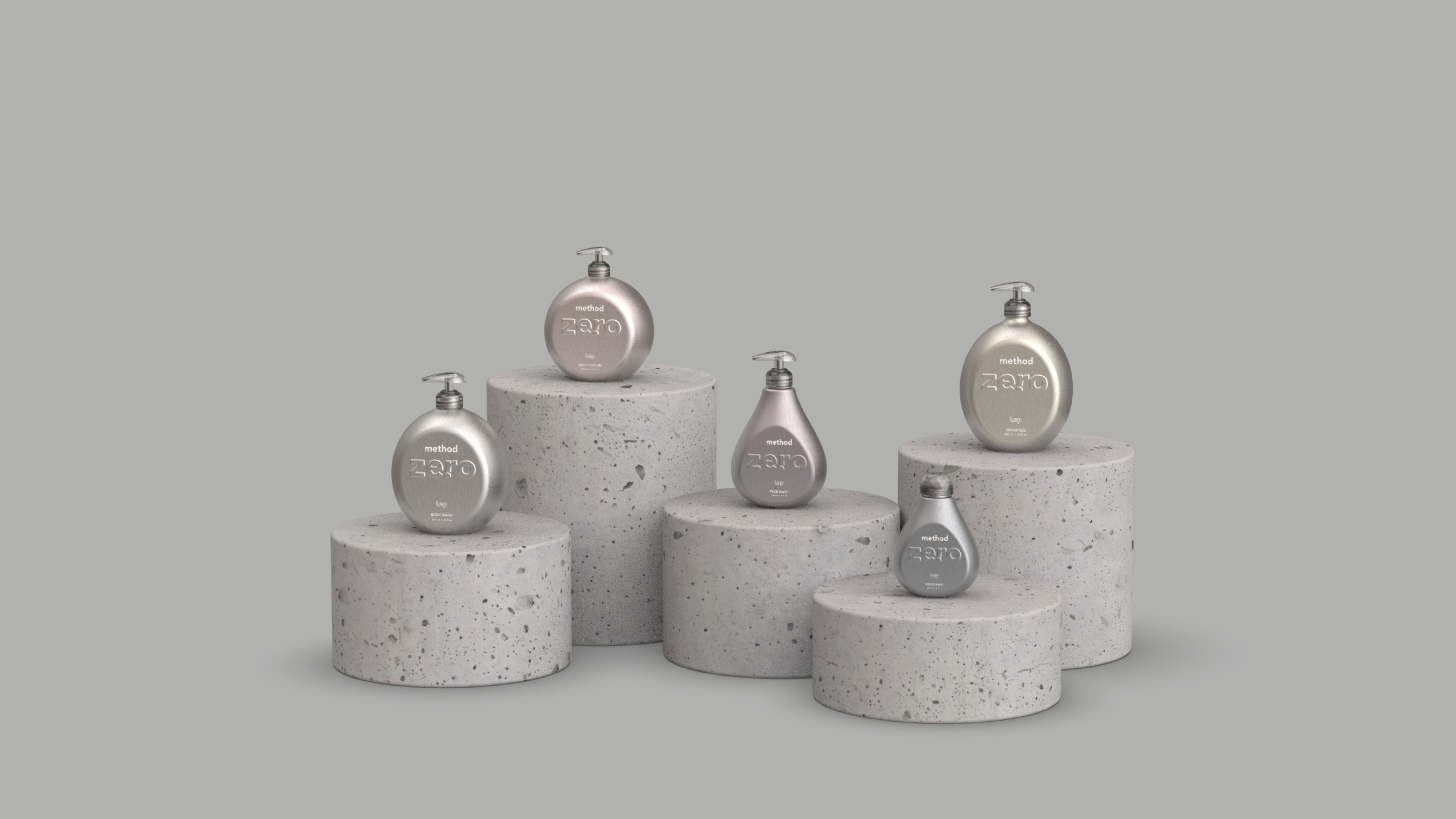
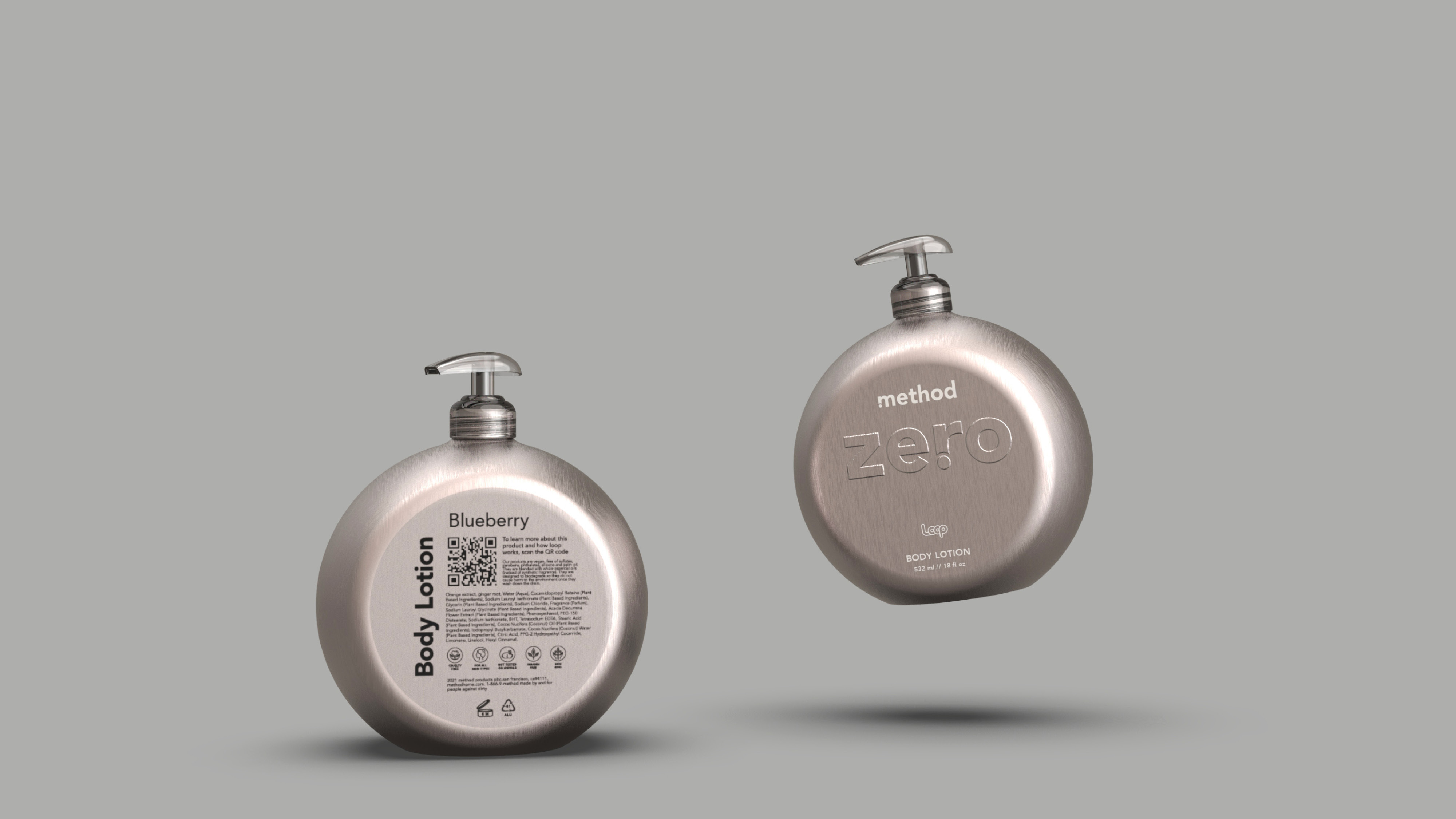
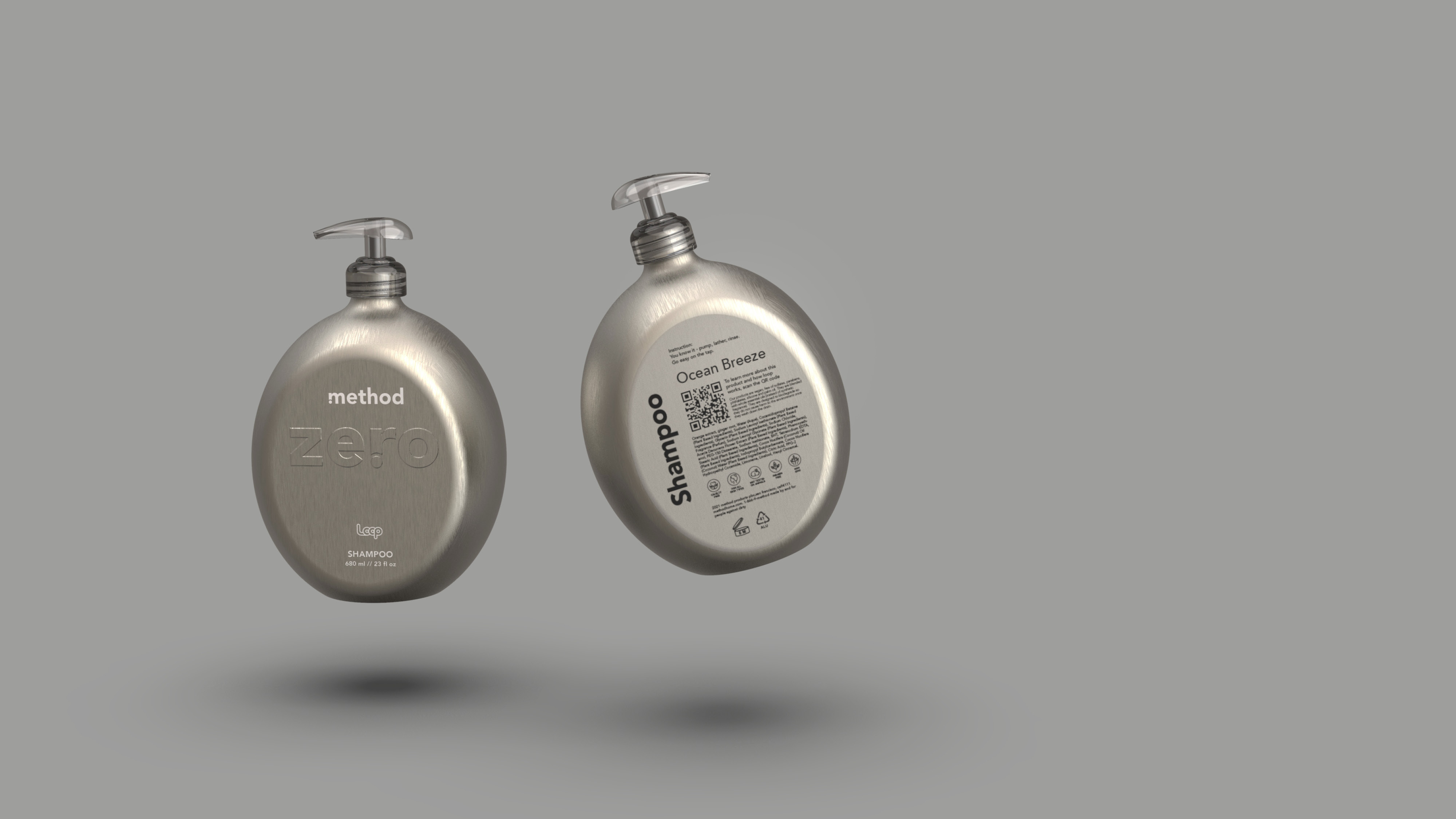
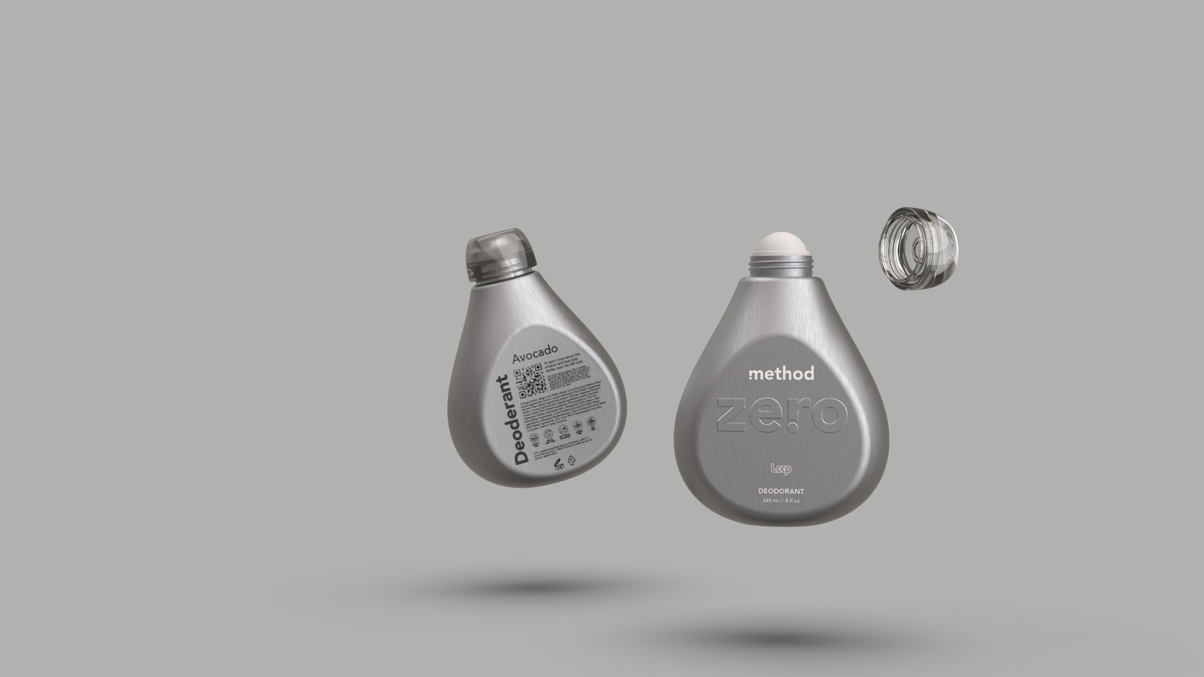
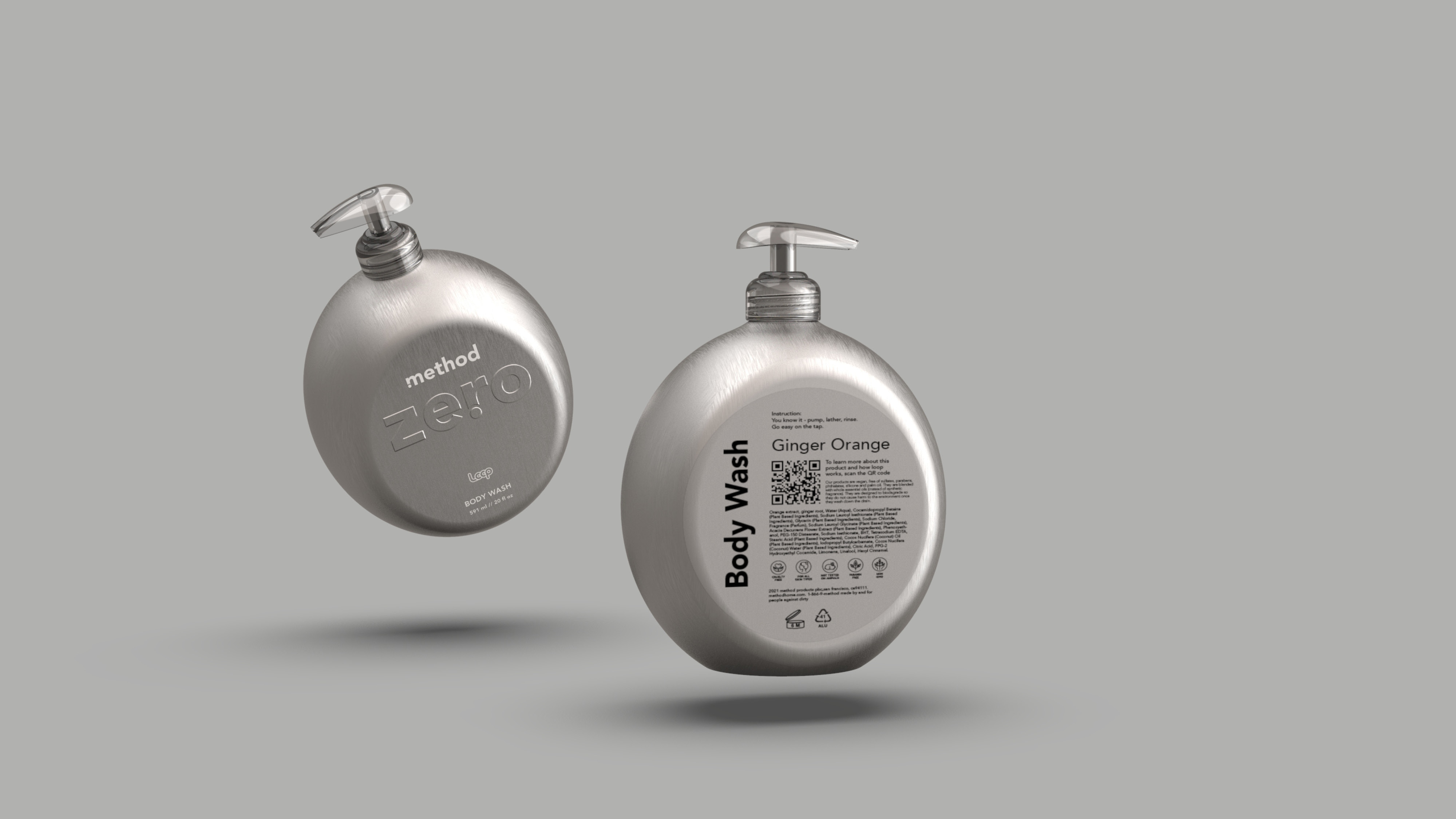
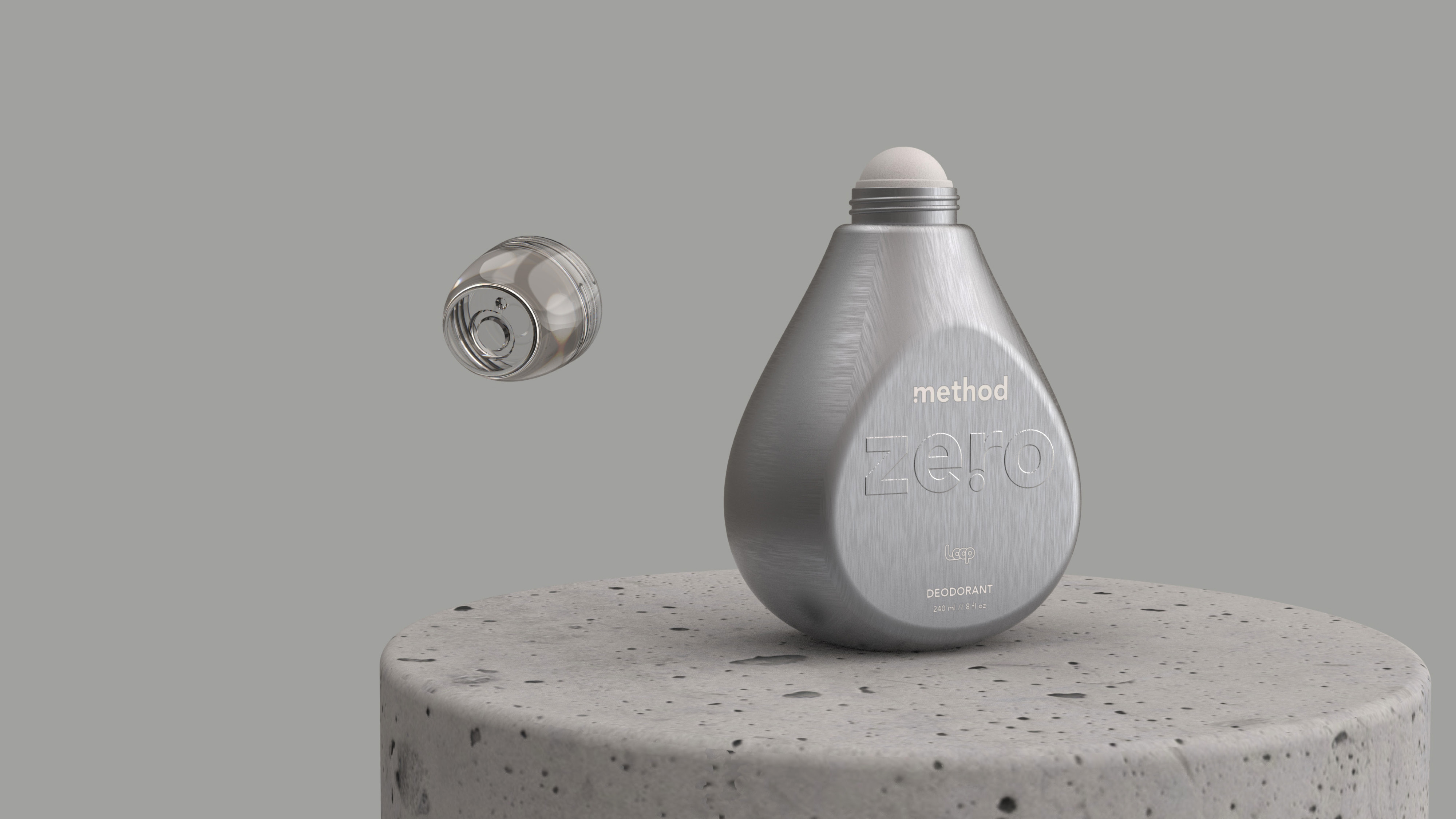
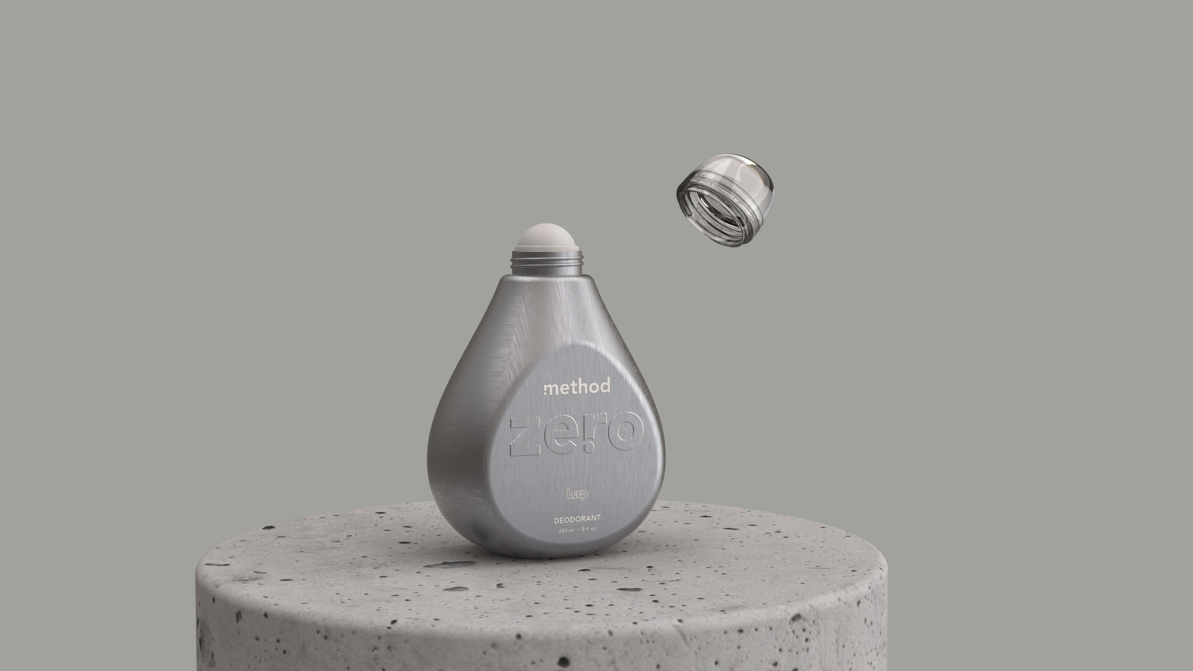
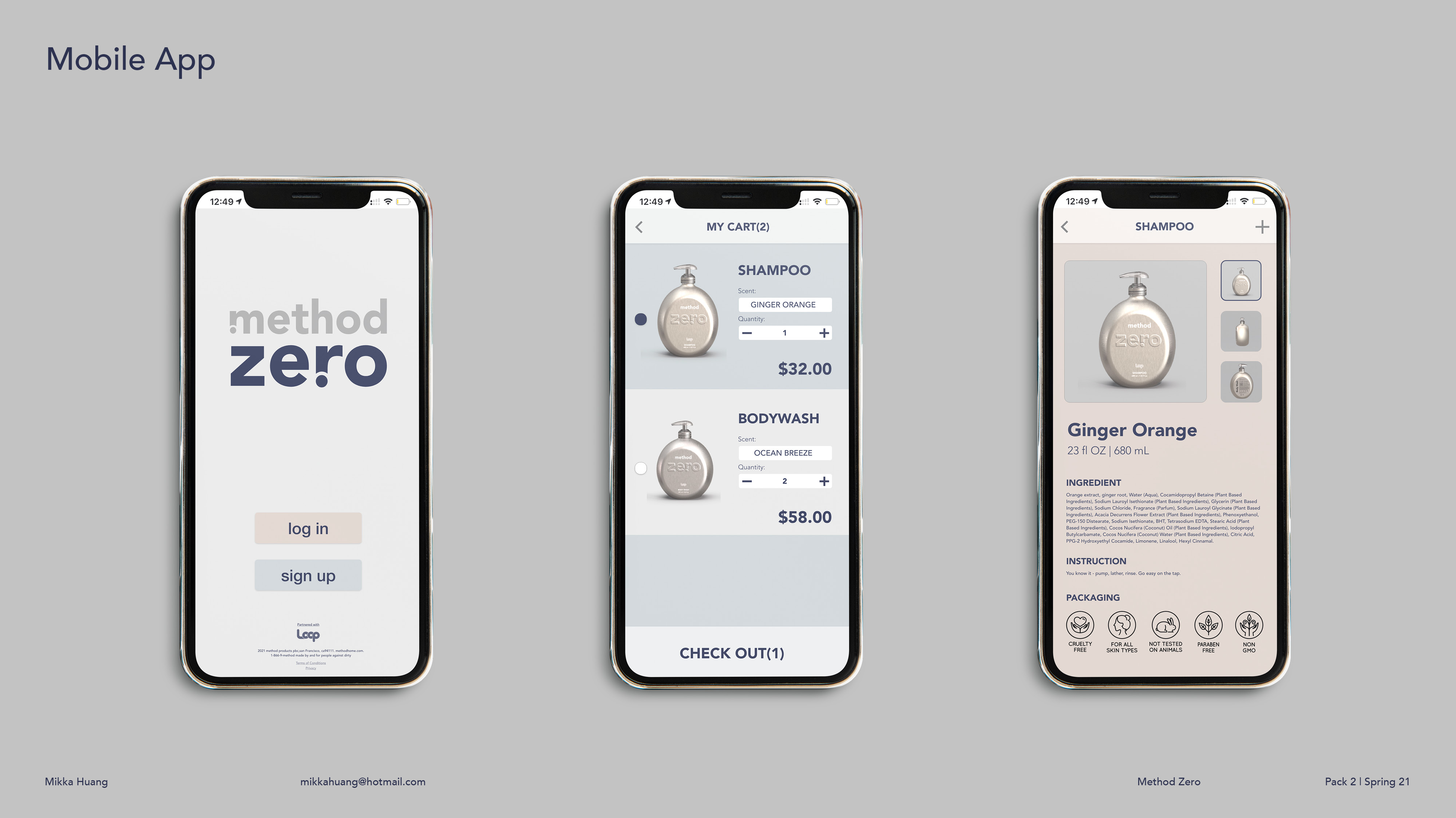
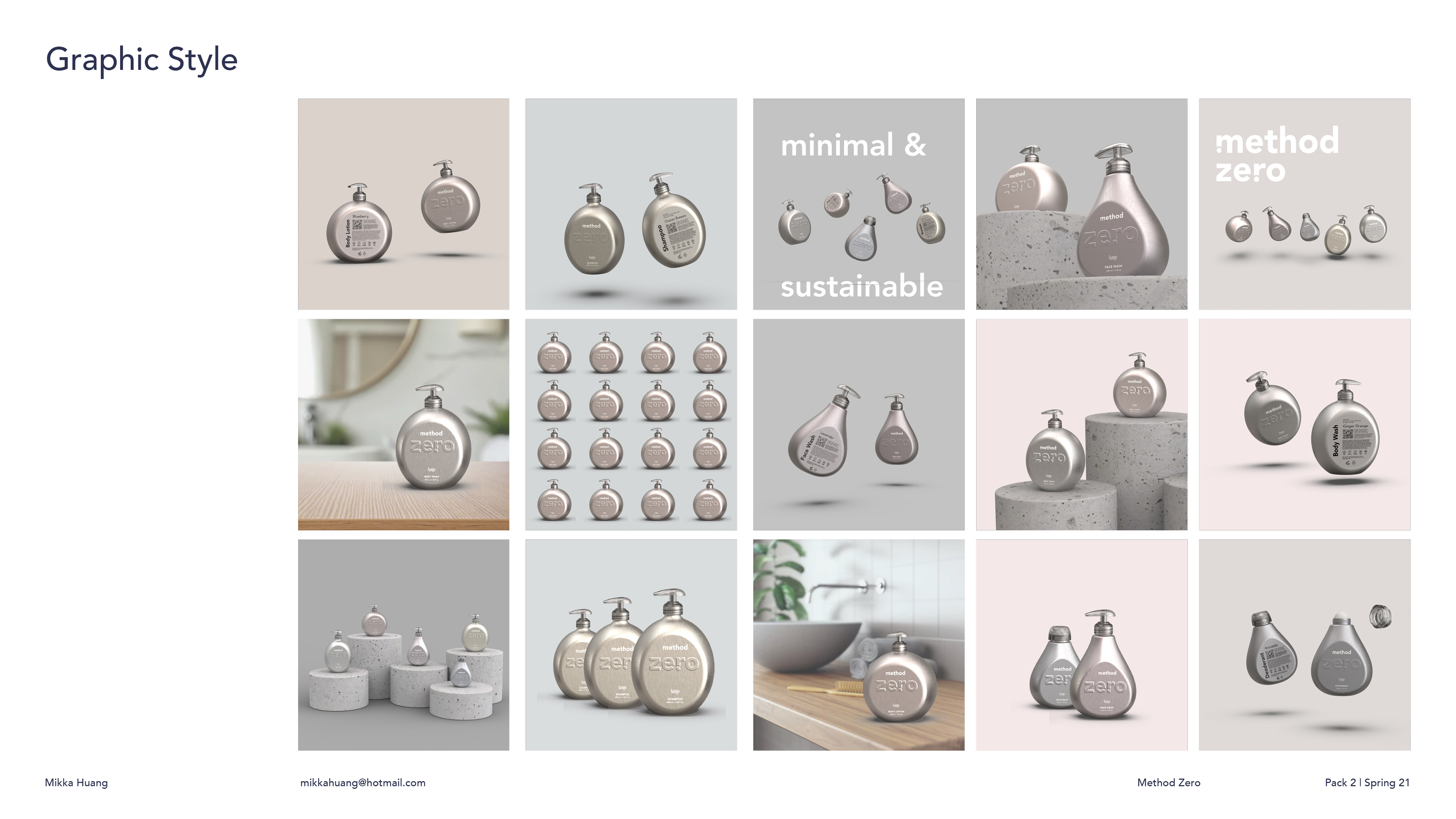
Zero is a unisex plastic-free personal care product line of method. Inspired by the ocean, zero claims to save our environment and marine populations by achieving zero pollution and zero waste.
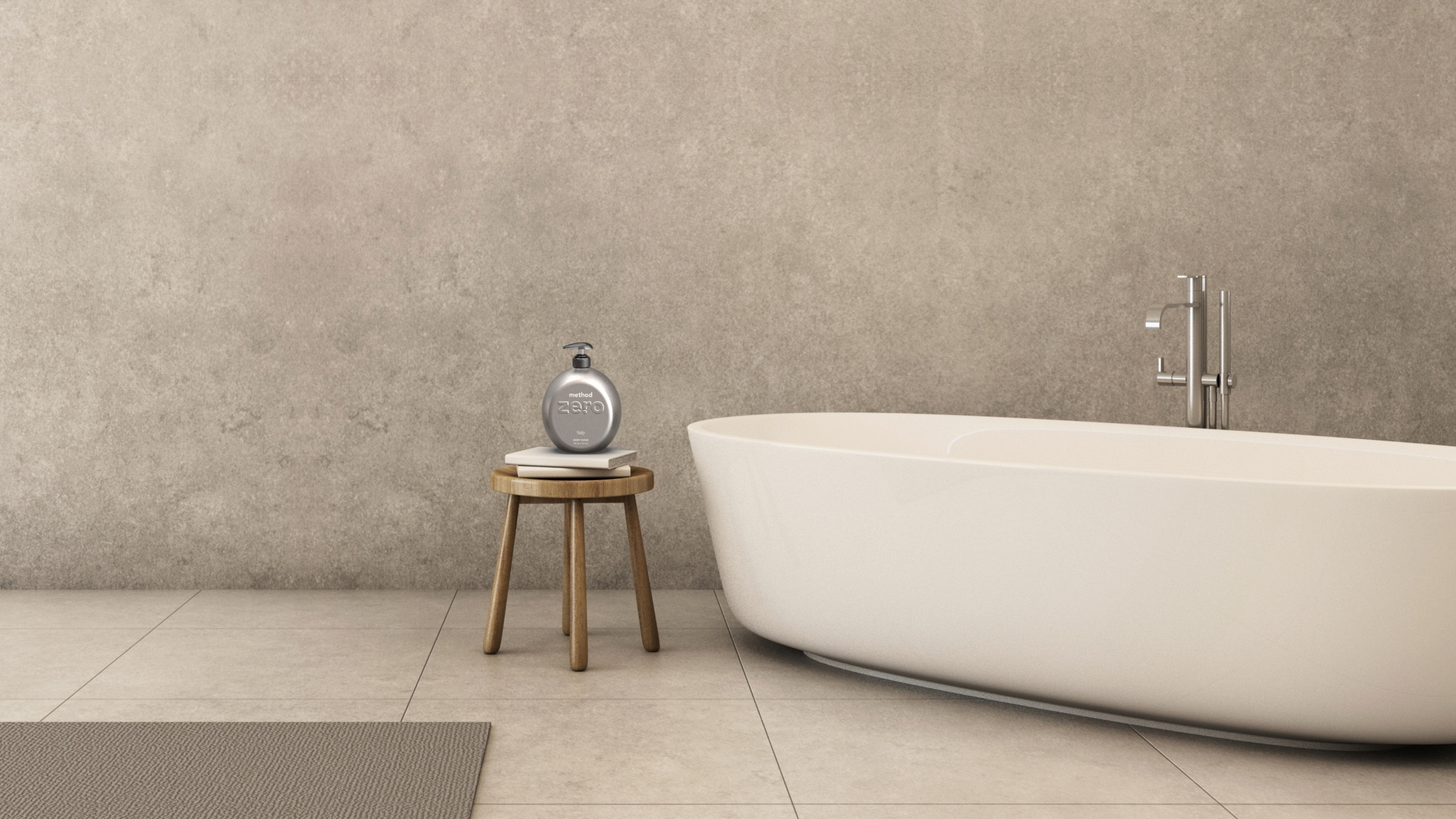
Features a loop system packaging to reduce ocean waste through reusable, sustainable materials for environmentally conscious individuals which functions well with the minimal, contemporary design.
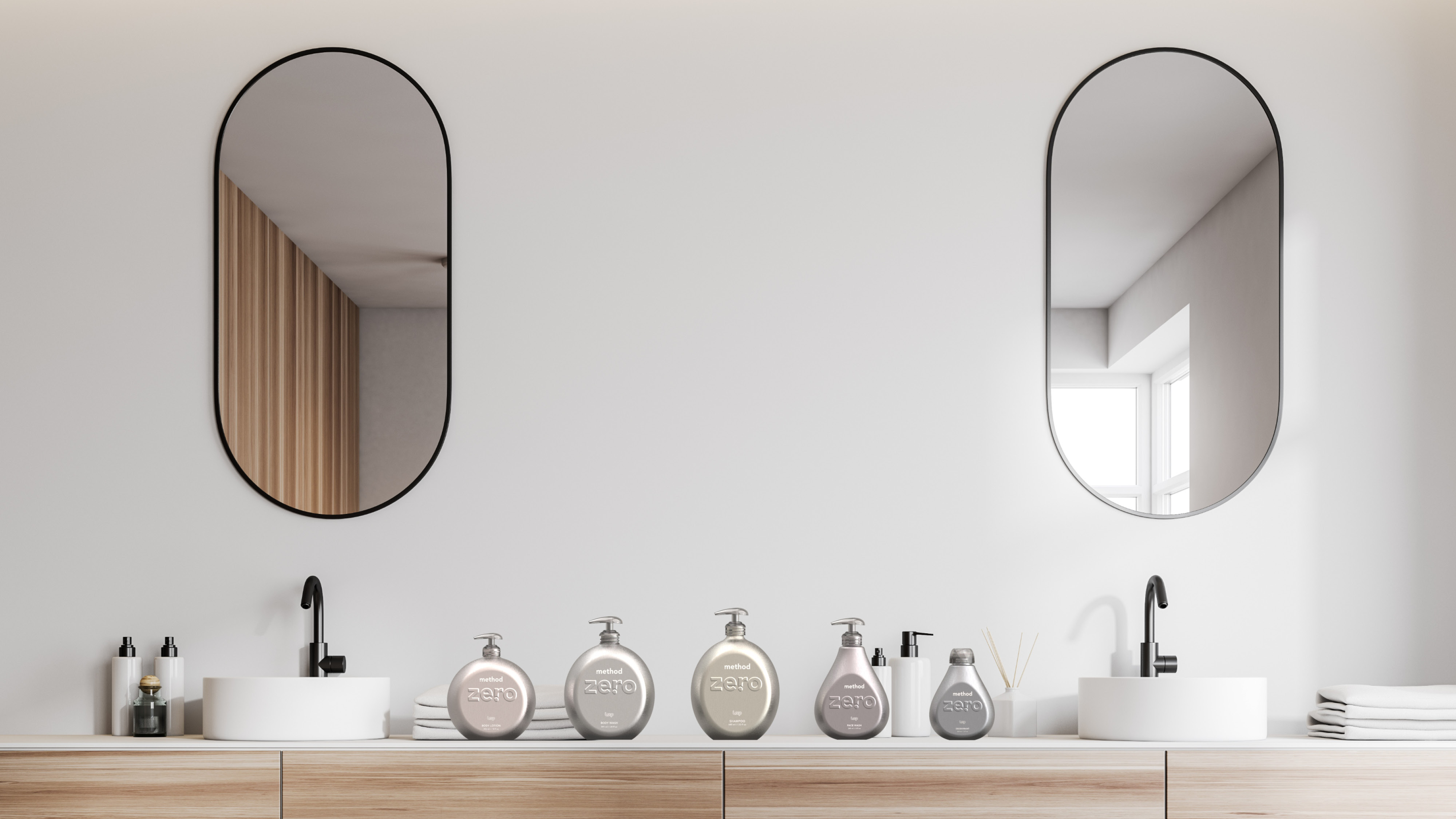
The minimal packaging design allows the product to be displayed as a decorative element in consumers bathroom.
Models was created with Rhino 7 and rendered with Keyshot.

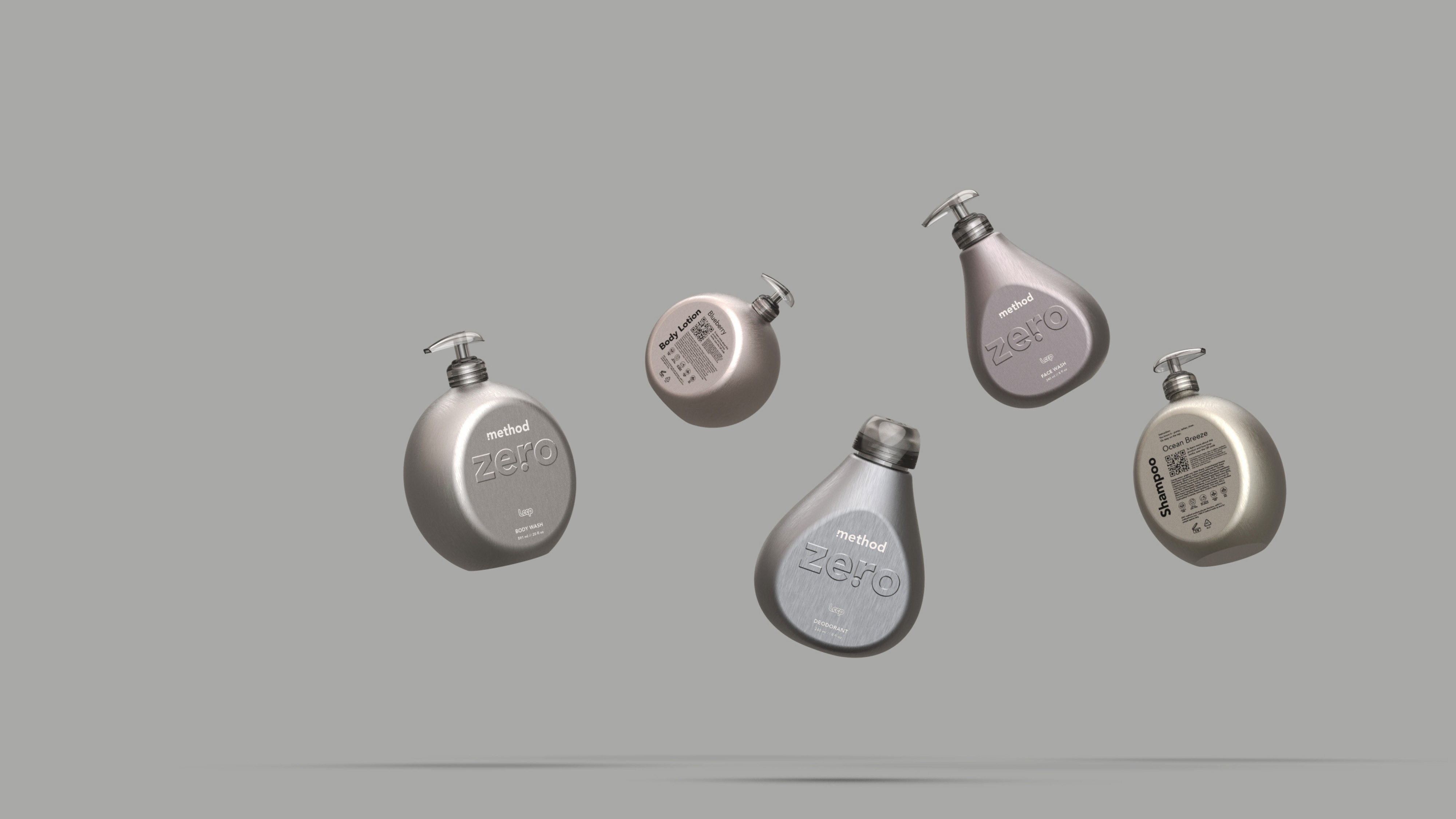
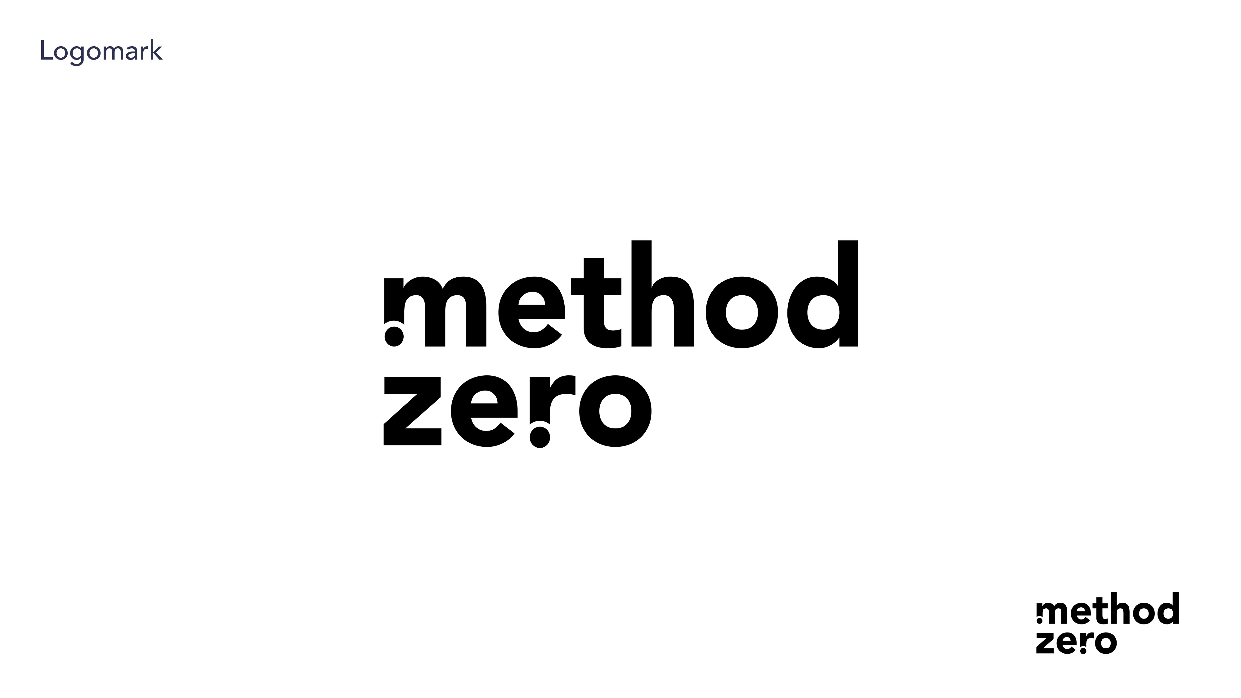
Identity system shows minimal and contemporary style of the sustainable series.


Purchase can be made on the Method website, mobile app and Instagram store. Consumers can also subscribe recurring shipments to save time and money.

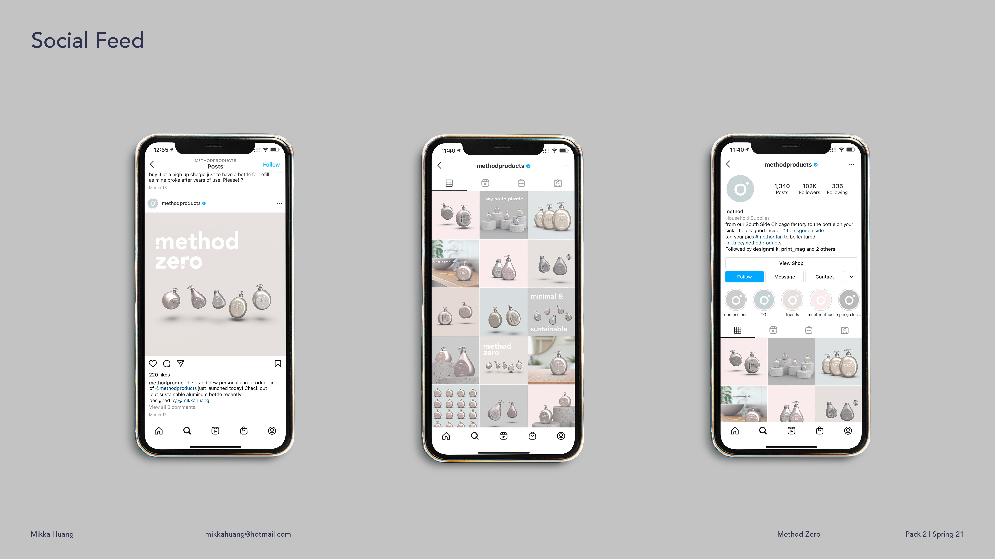
Marketing materials follows the minimal style of the sustainable series.
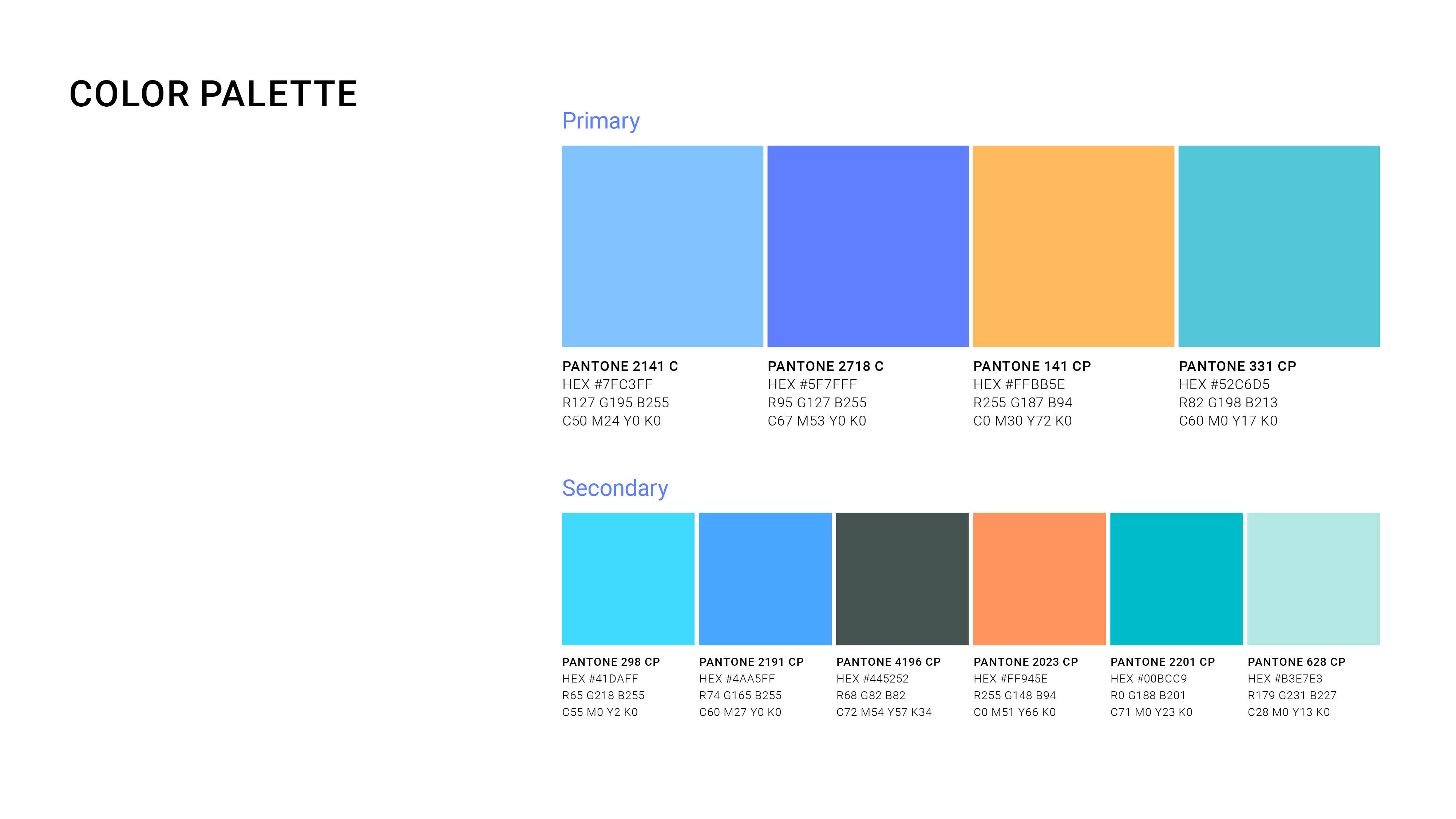
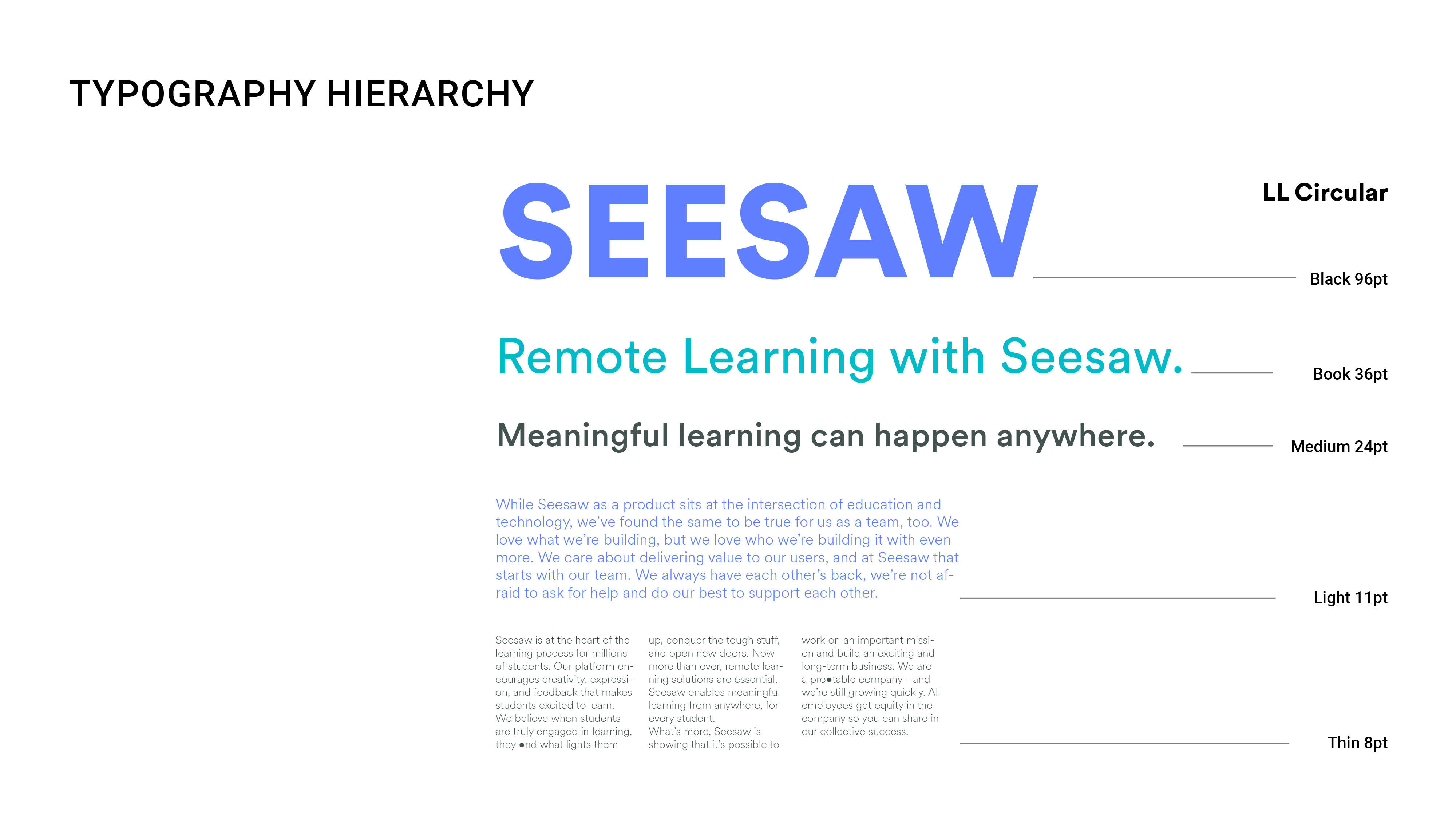
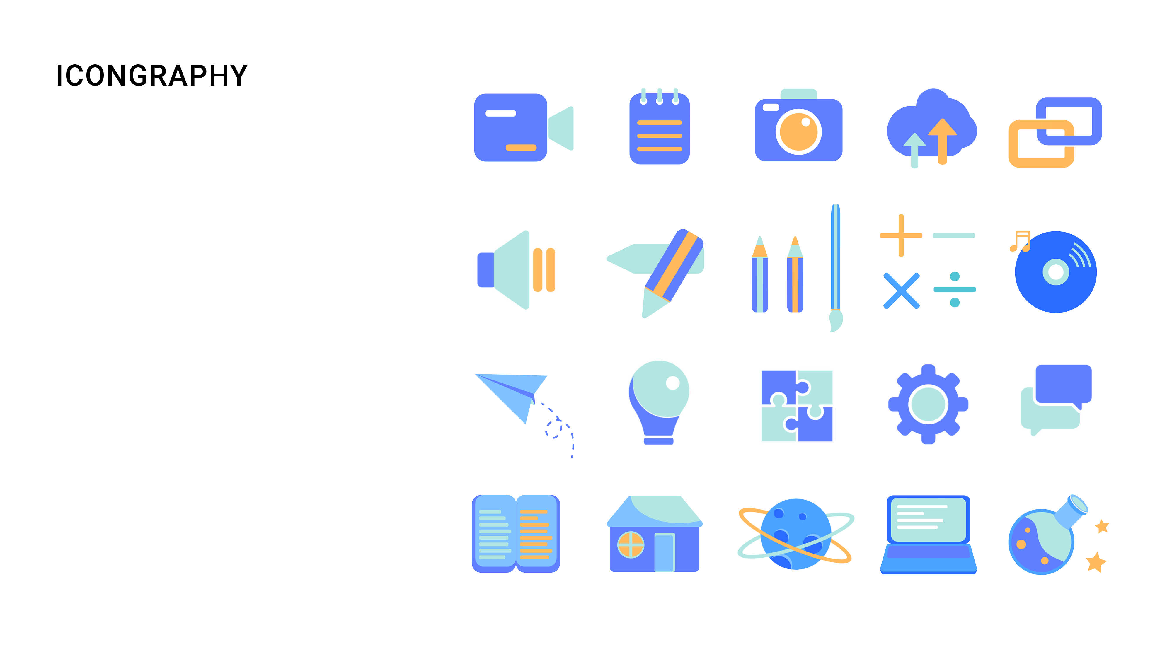
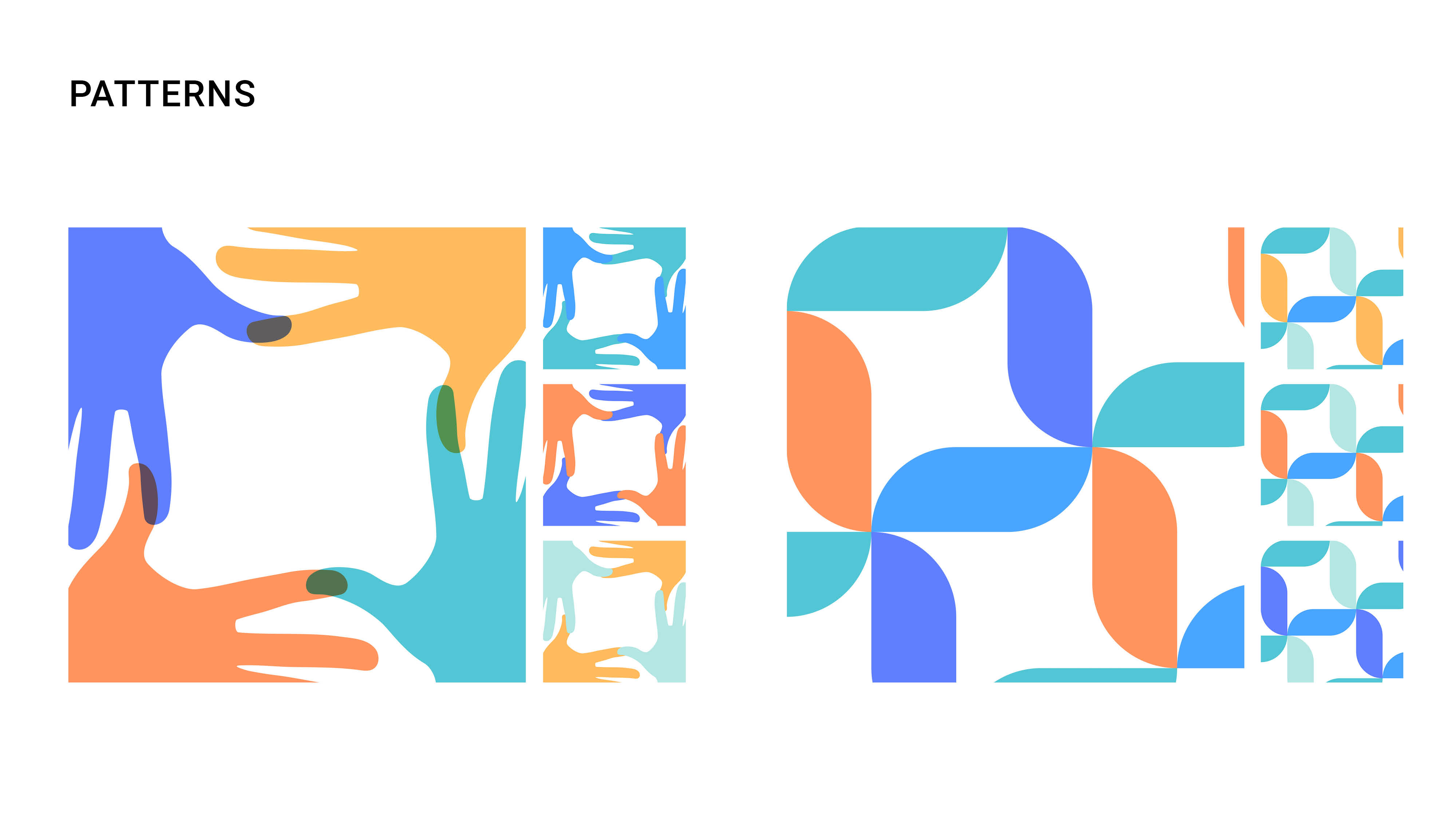
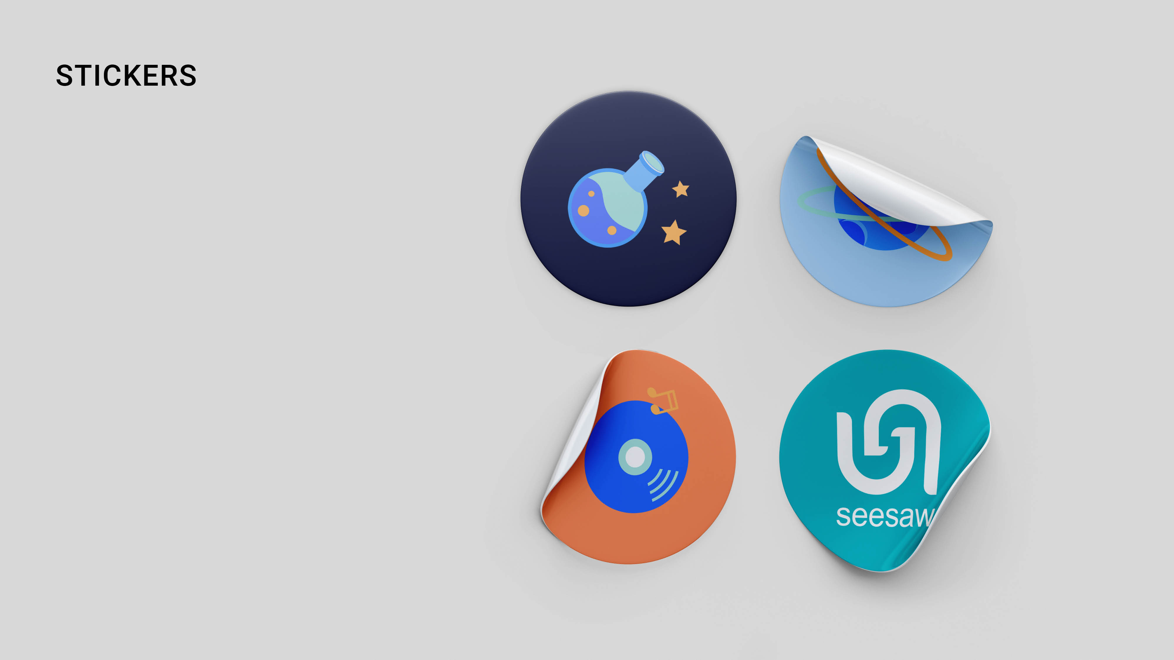
/ Seesaw Rebrand
/ Aug–Dec, 2020
/ Branding
/ UI/UX
/ Identity System
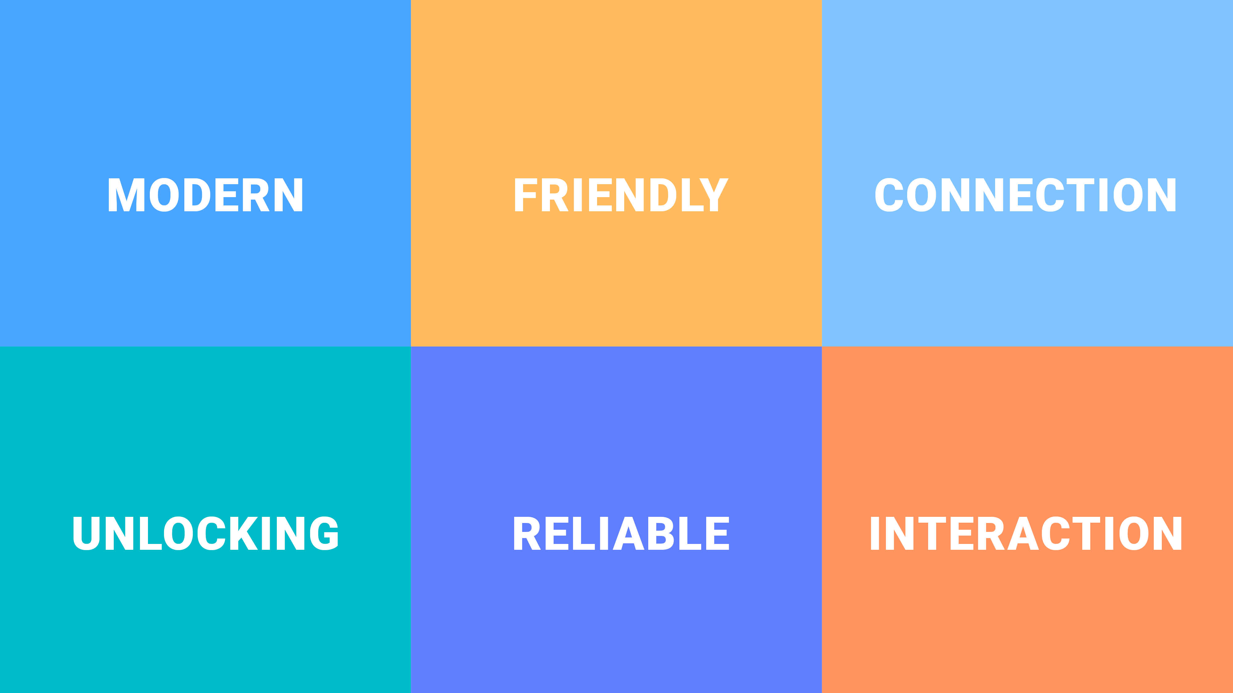
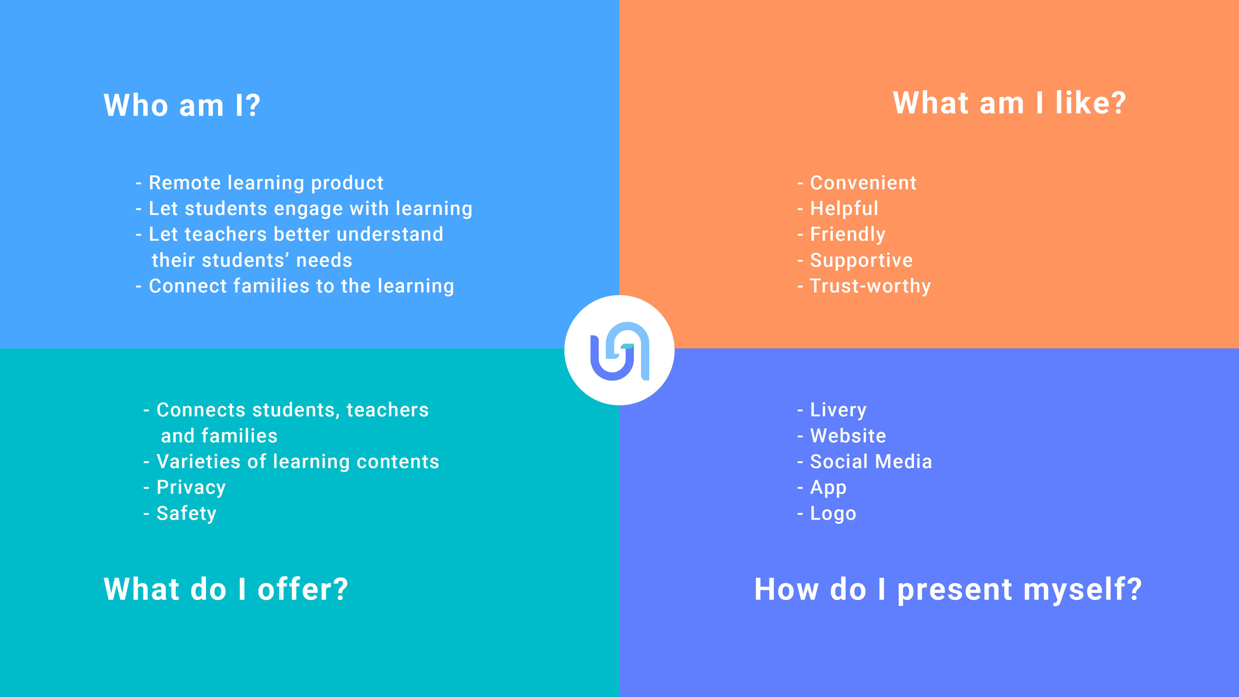
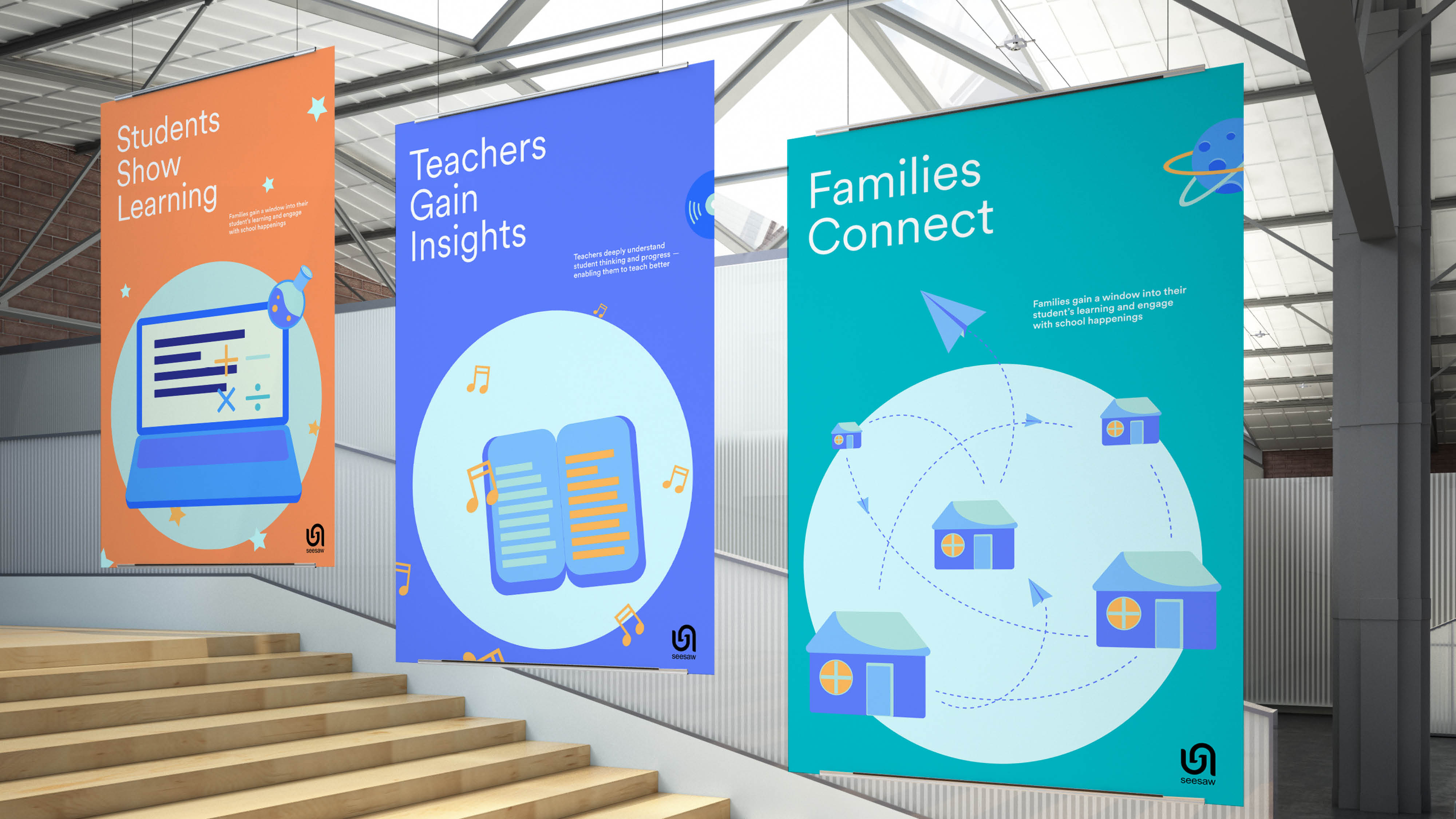
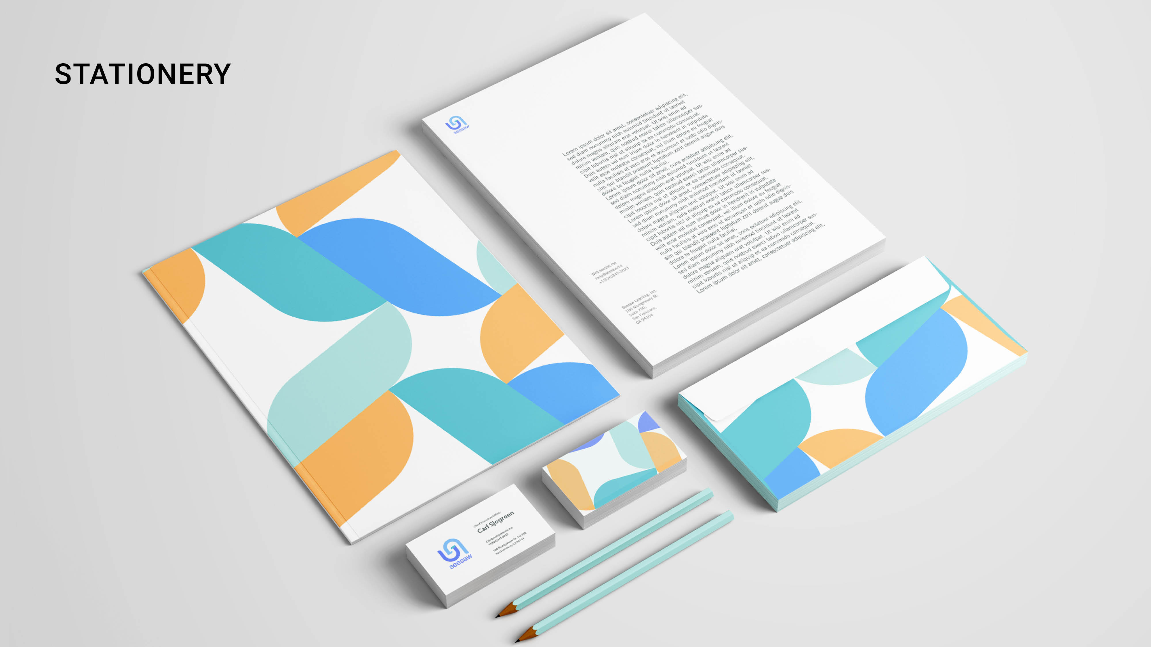
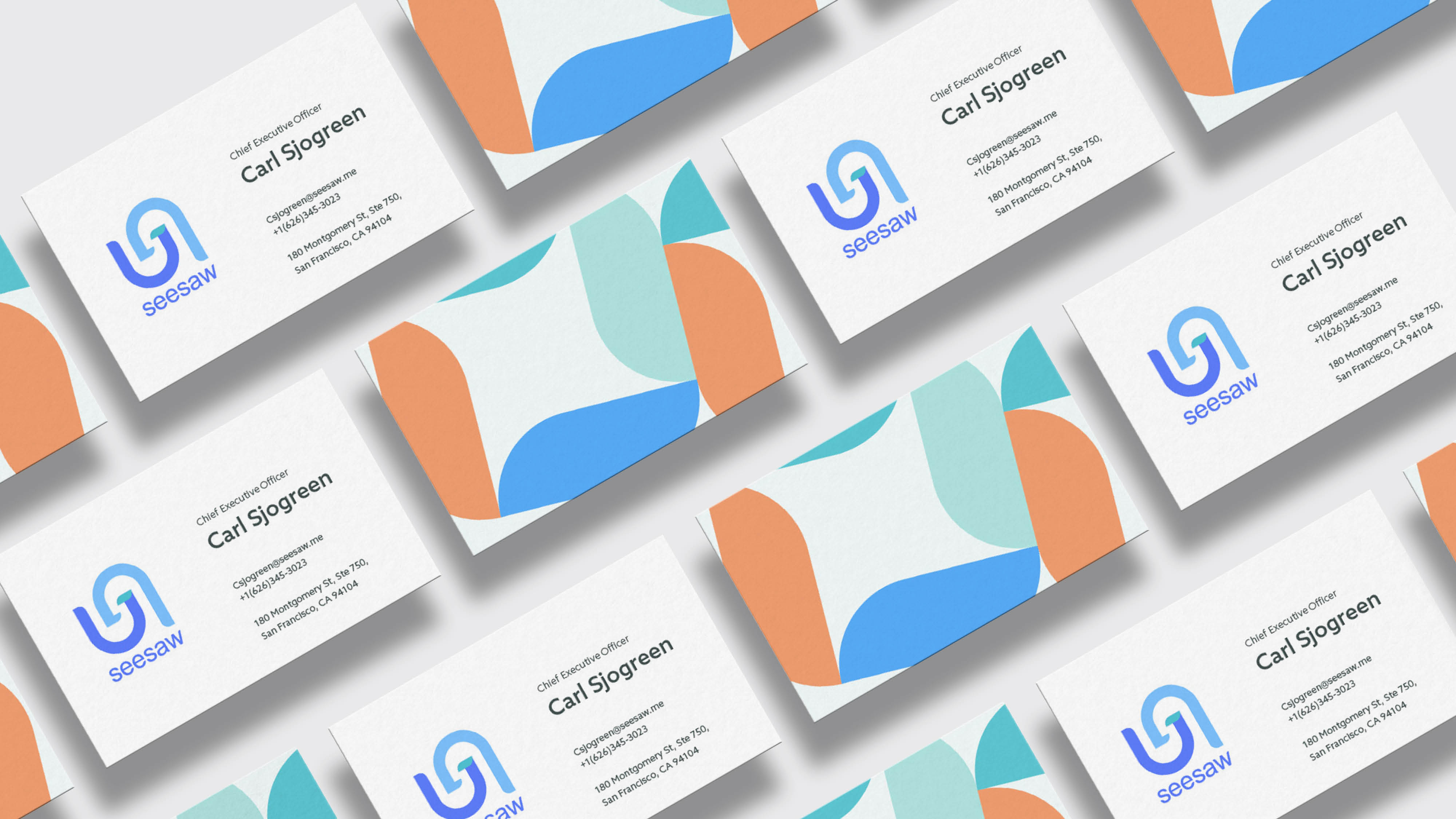
Seesaw is an interactive remote learning tool which provides meaningful learning to PreK-5 students no matter where they are, while connecting students, teachers and families together.
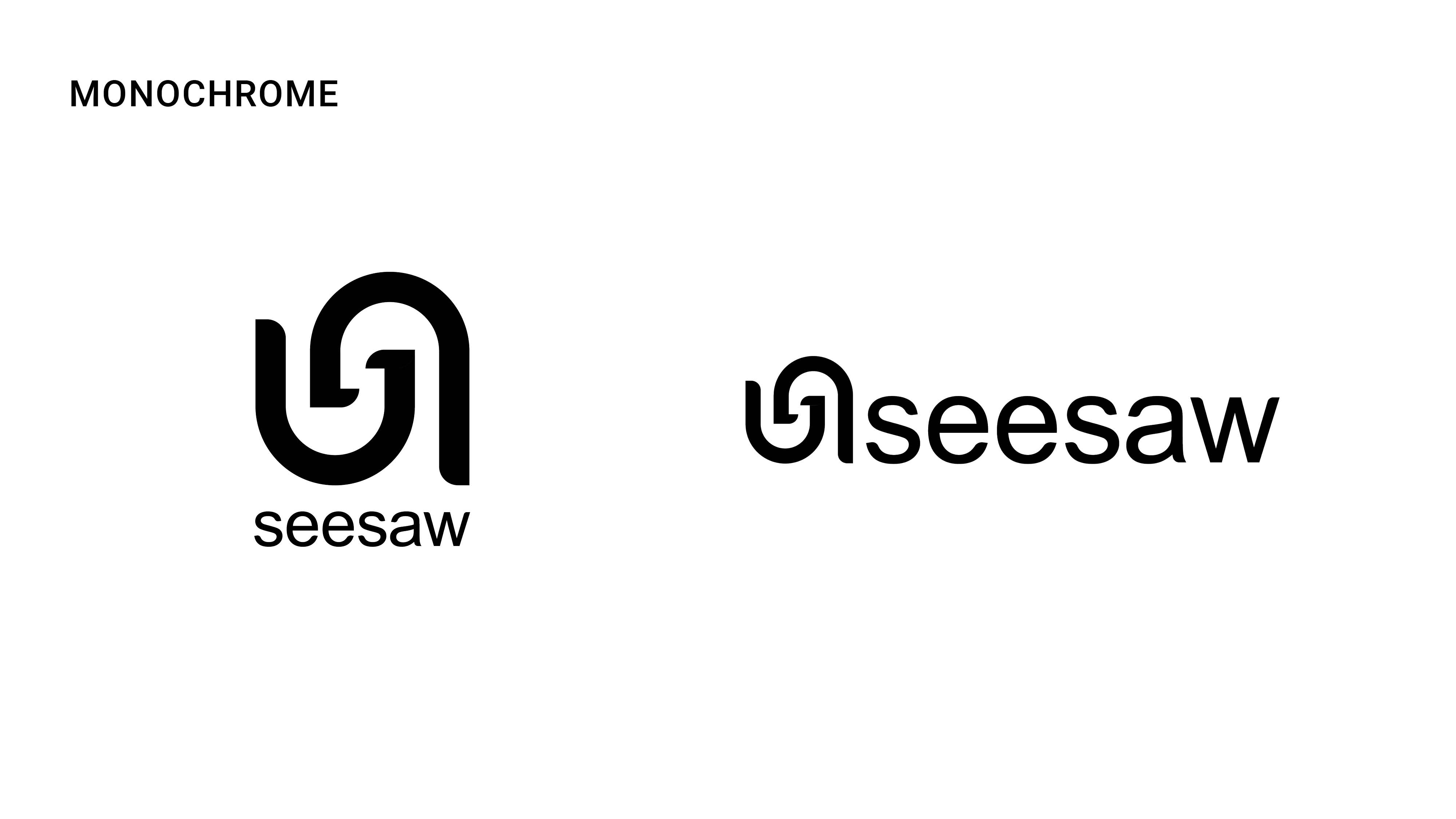
The rebranding integrates interactions and friendliness into the new identity, enhancing the trust-worthy image of the brand.
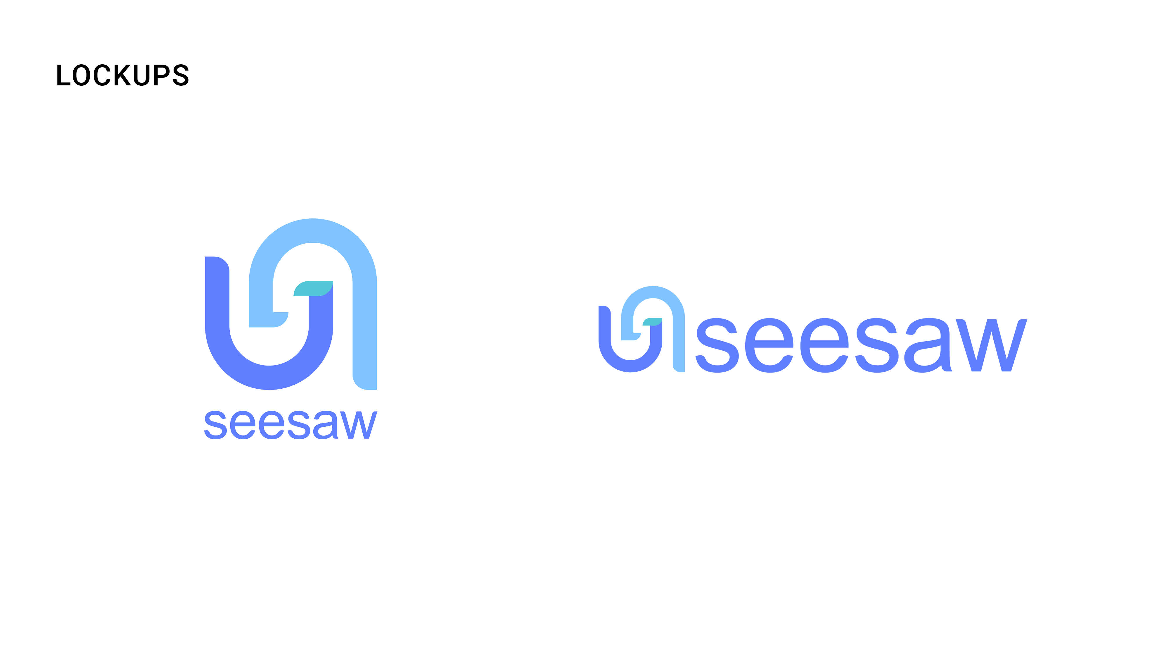
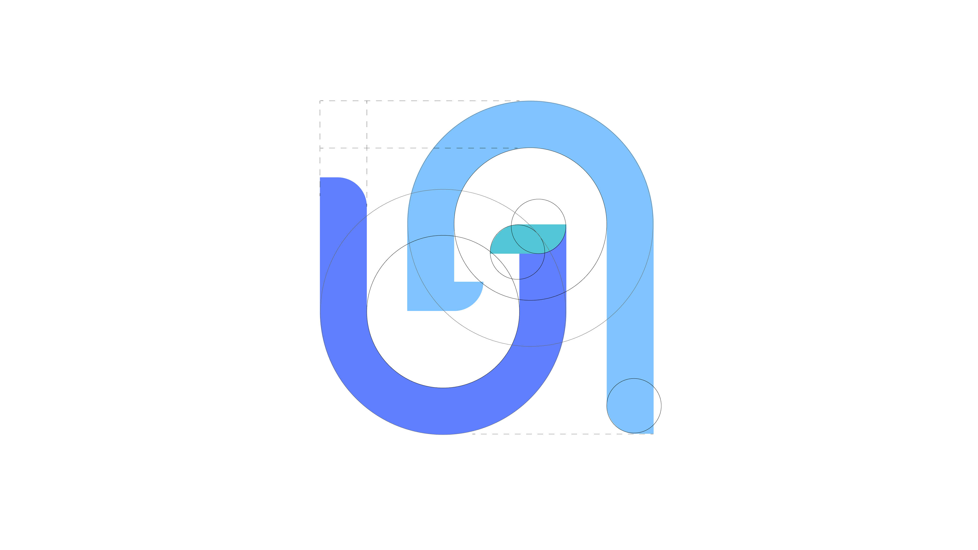
Interlocking the letter S's from the brand name Seesaw, the logomark conveys the message of connections between students, teachers, and families.
With preK-5 students as primary target audience, Seesaw aims to unlock their passion to learning.
The logotype was hand rendered to show friendliness and playfulness.
With preK-5 students as primary target audience, Seesaw aims to unlock their passion to learning.
The logotype was hand rendered to show friendliness and playfulness.

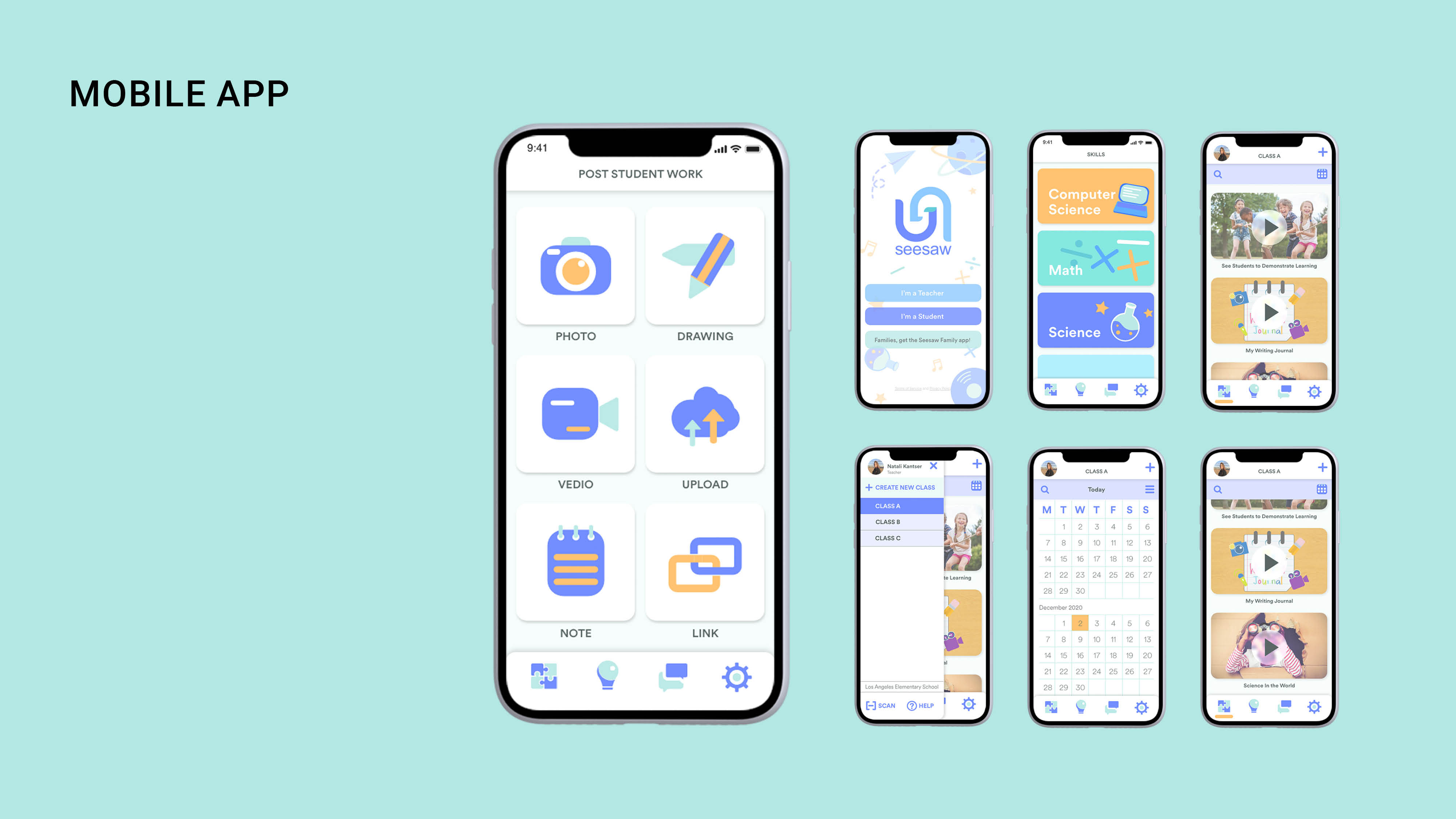
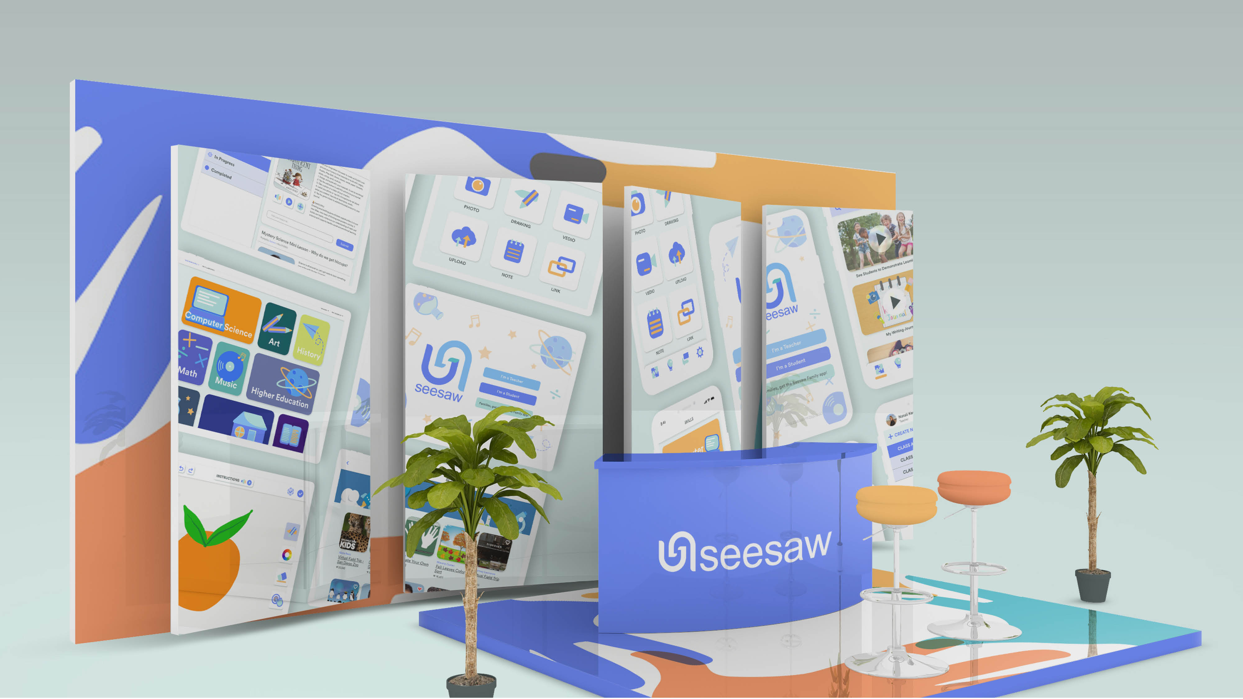
Teachers will mainly use the mobile app to generate content, assign homework to students and connect with students’ families.
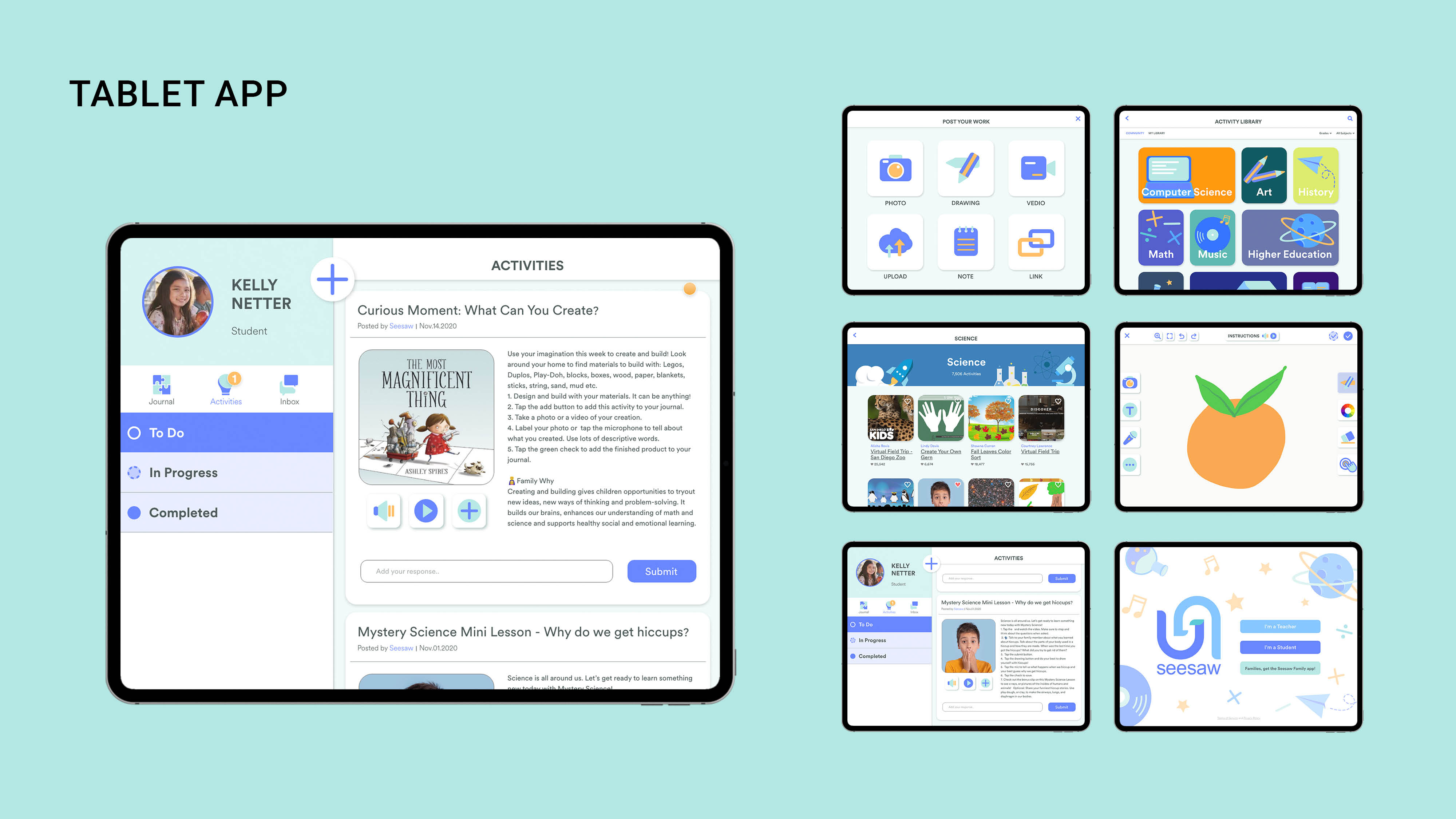
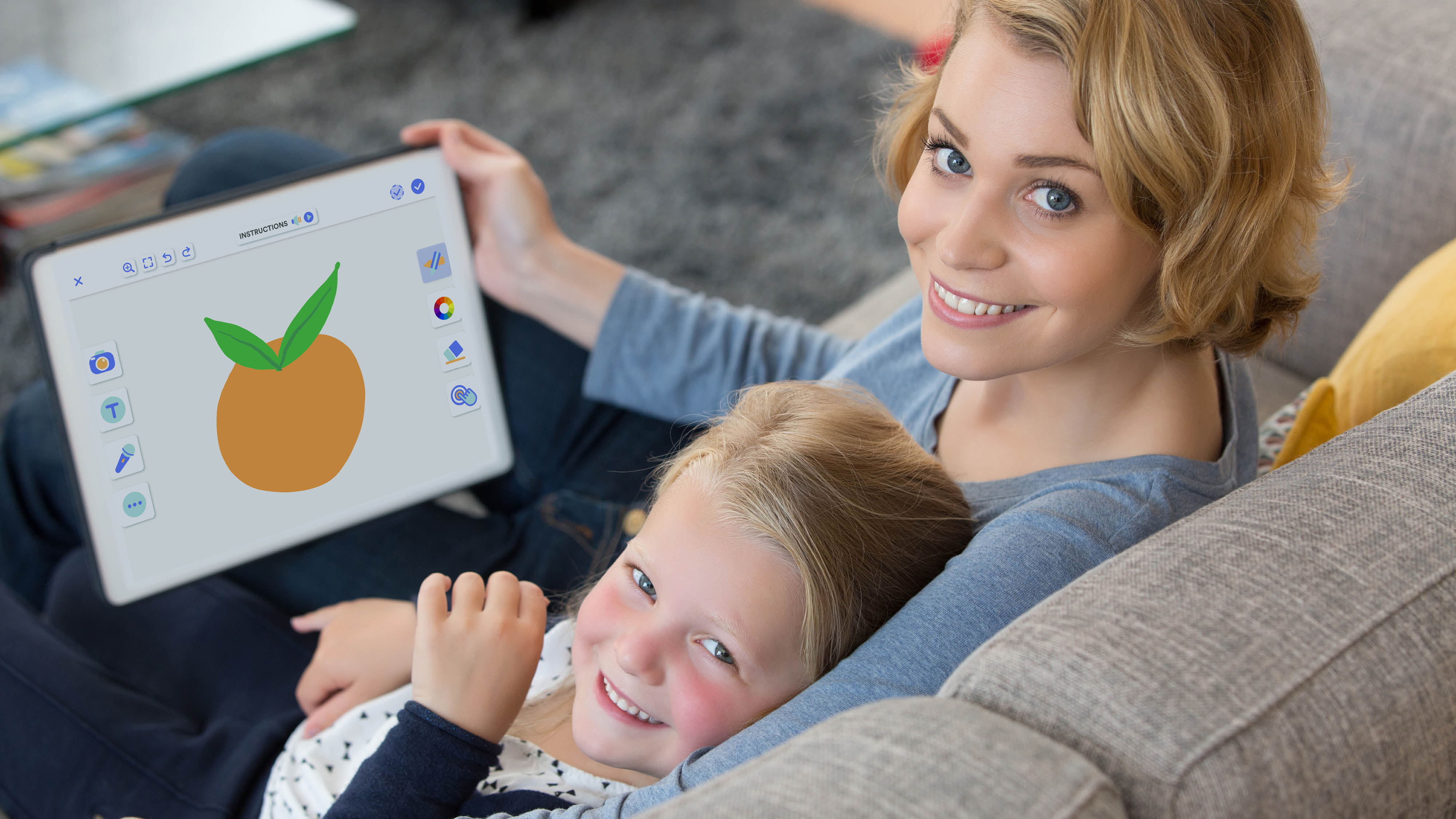
The tablet app is the major platform kids use. All structures are adapted to fit the contexts.
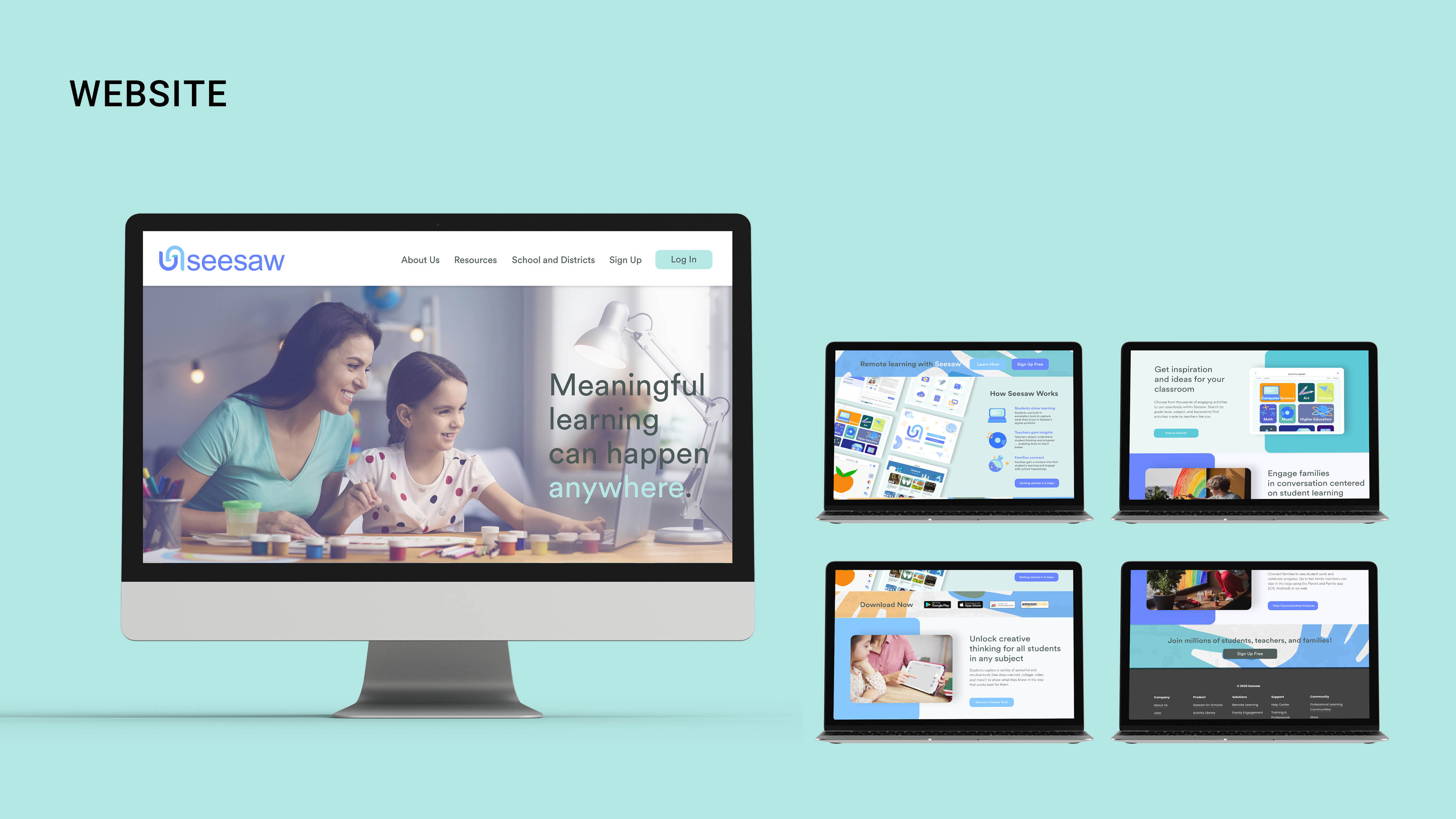
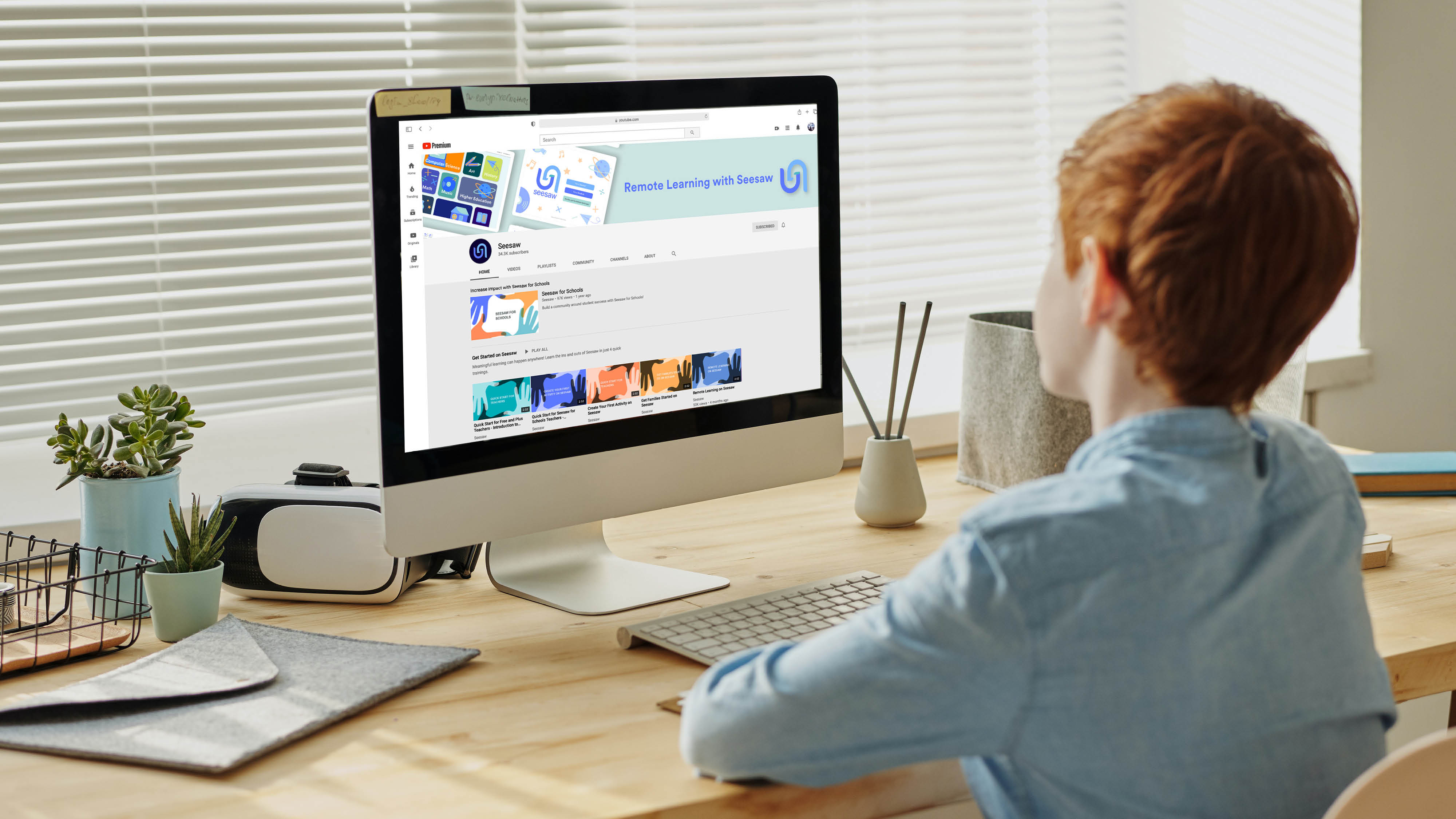
The website is created to showcase the features of the product, promoting it to teachers, schools, and enterprises.
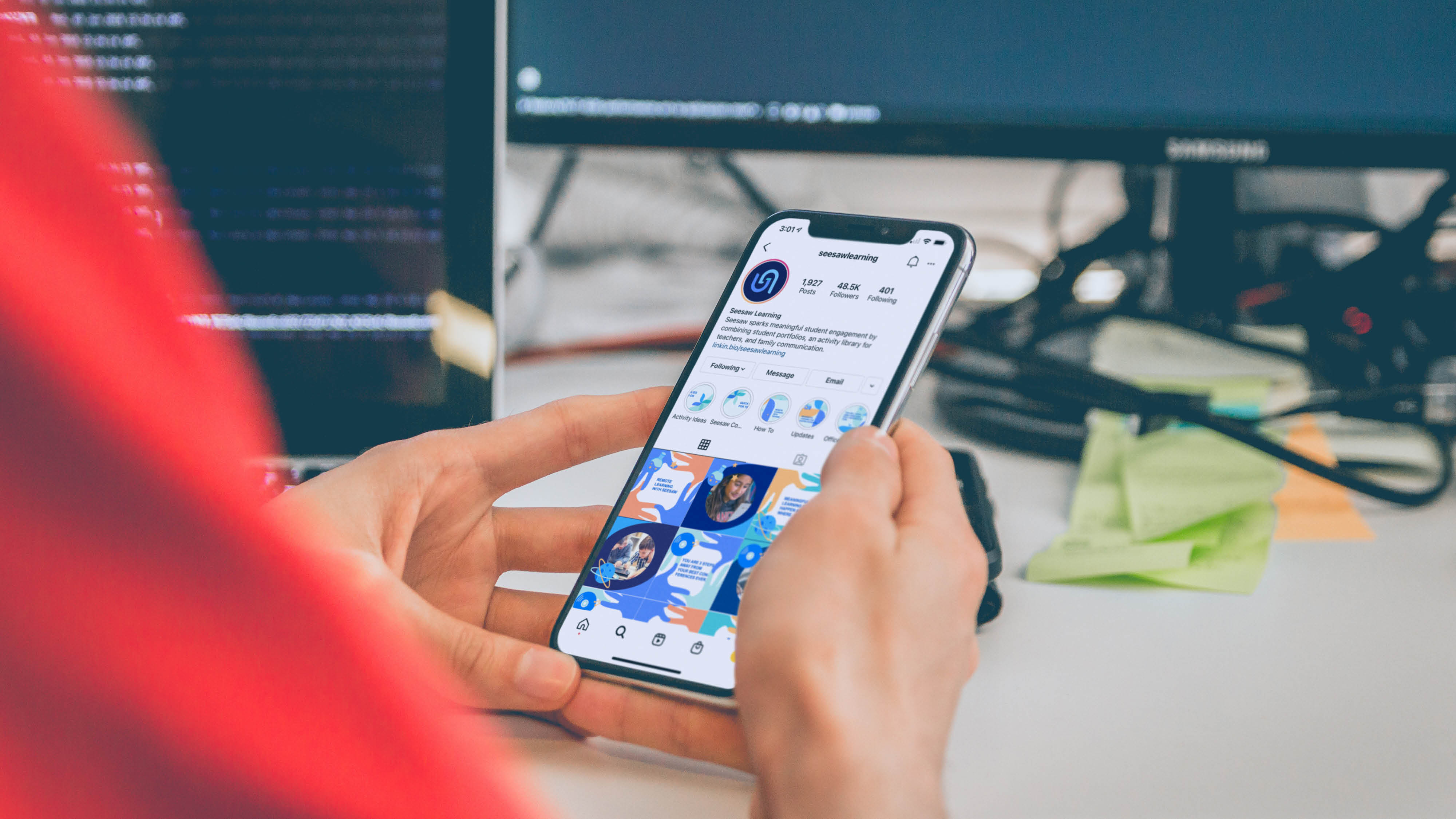
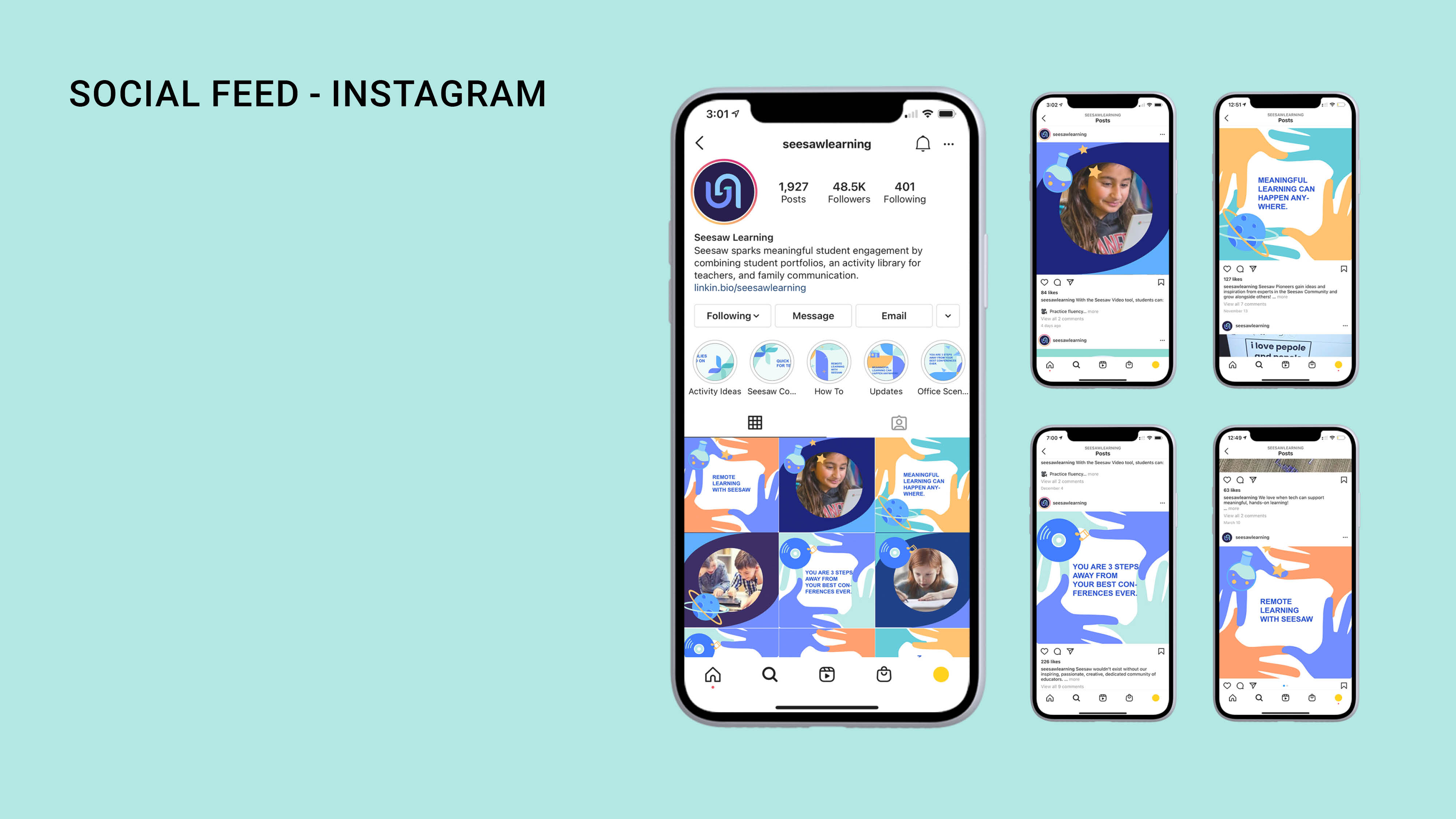
Social media contents are created to help both teachers and students. Tutorials and resources are ready to use for users. Verifed users can also contribute the community with their own content.

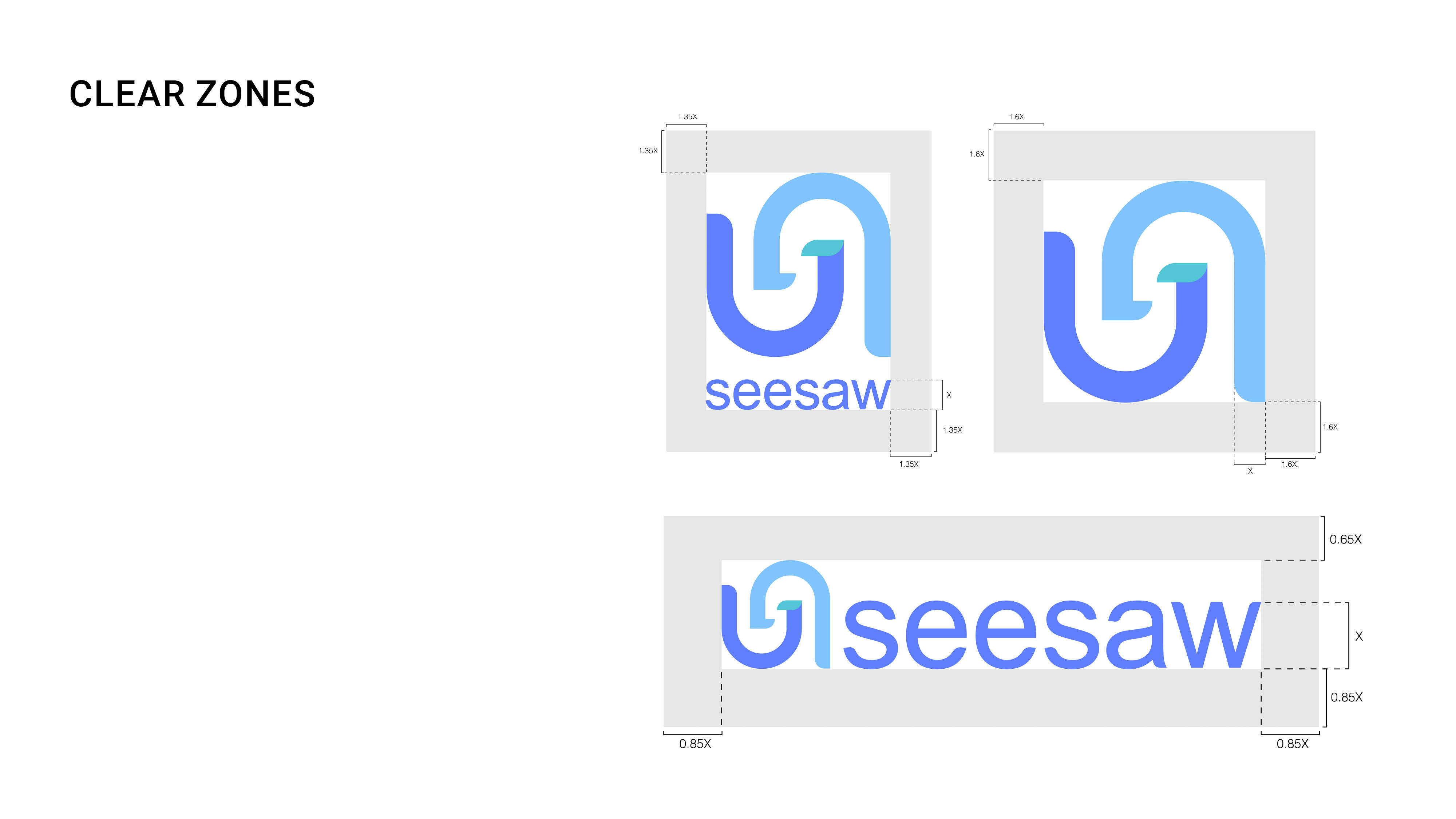
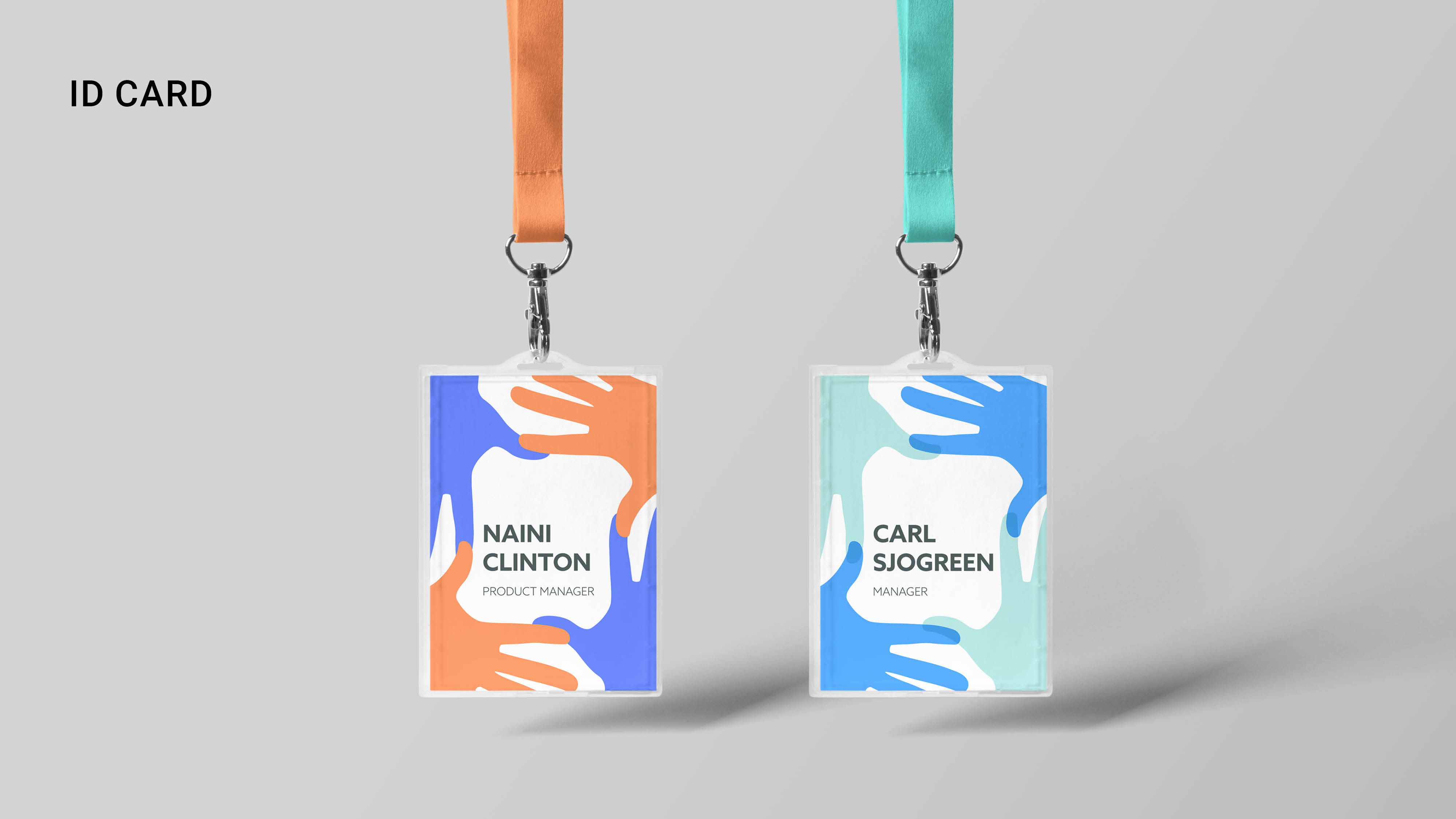
The identity system includes both 2D and 3D elements.


Check out more details –
From research to identity system elements