/ Seesaw Rebrand
/ Aug–Dec, 2020
/ Branding
/ UI/UX
/ Identity System
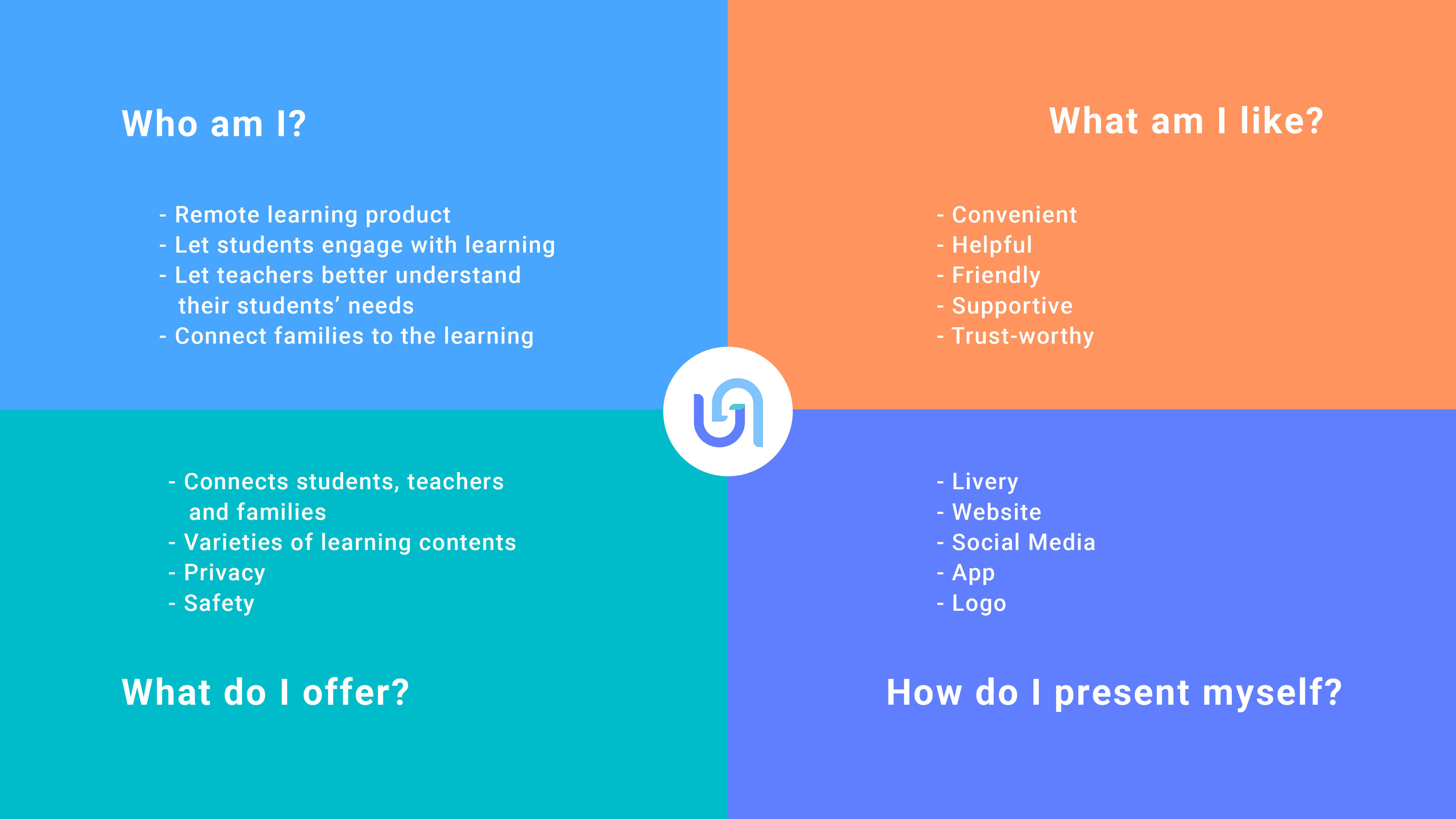
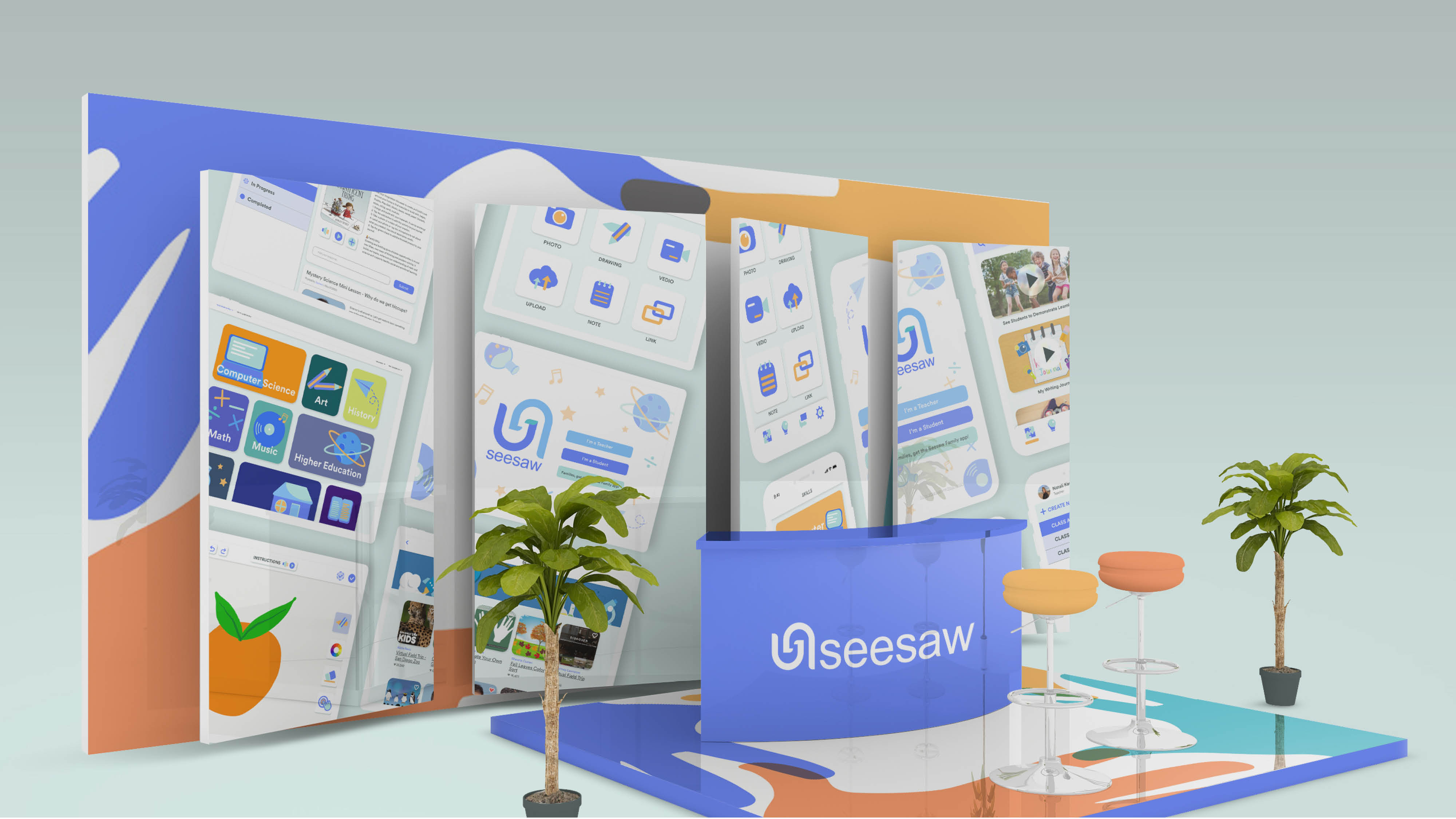
Seesaw is an interactive remote learning tool which provides meaningful learning to PreK-5 students no matter where they are, while connecting students, teachers and families together.
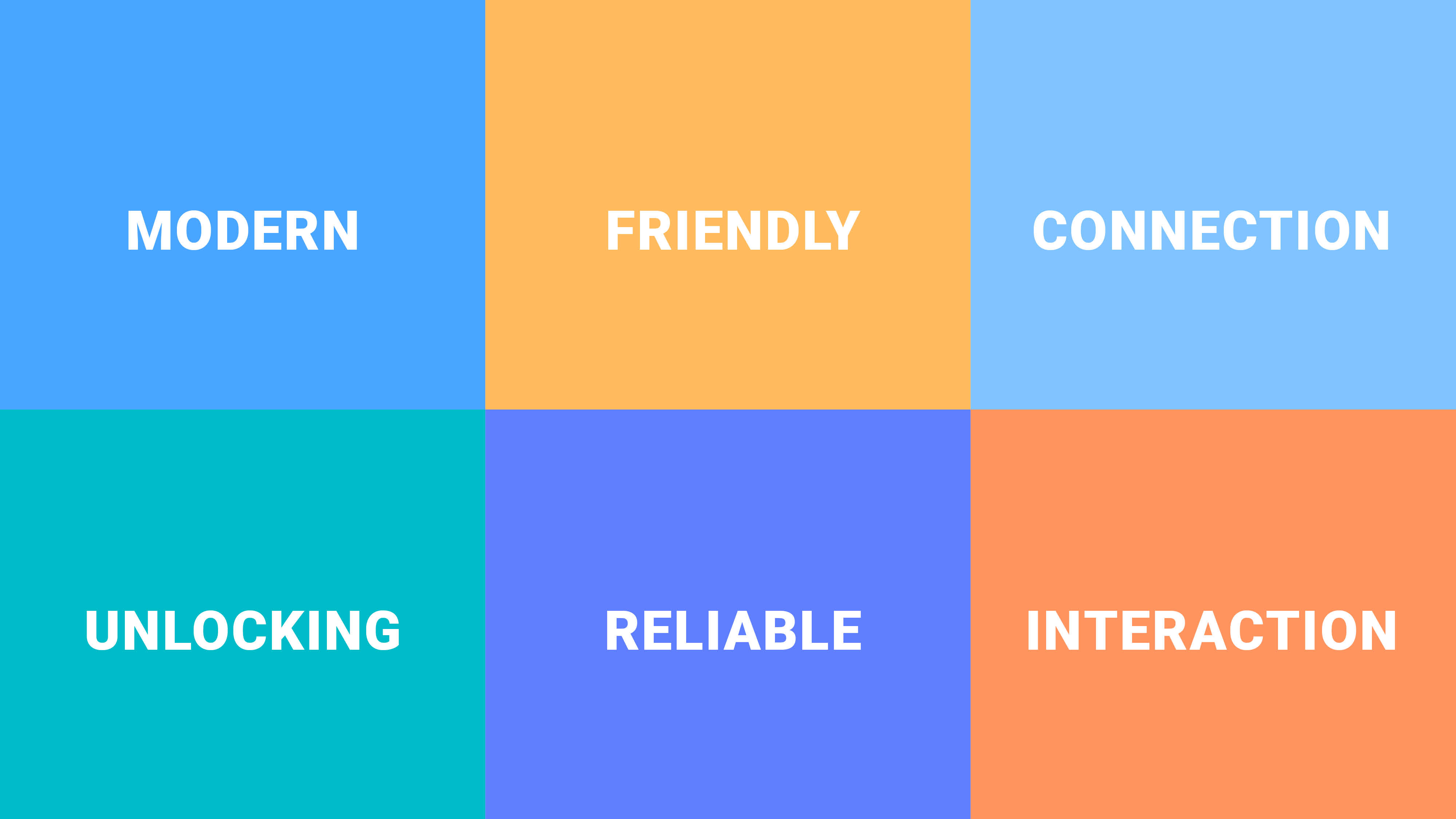
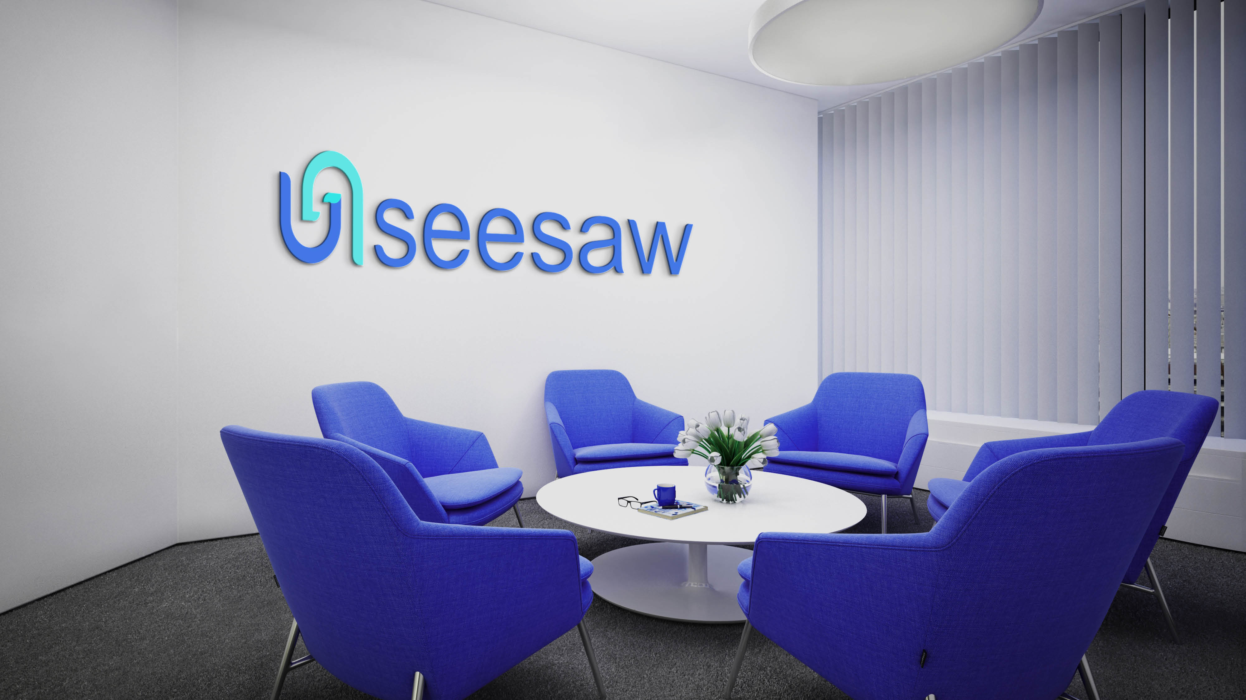
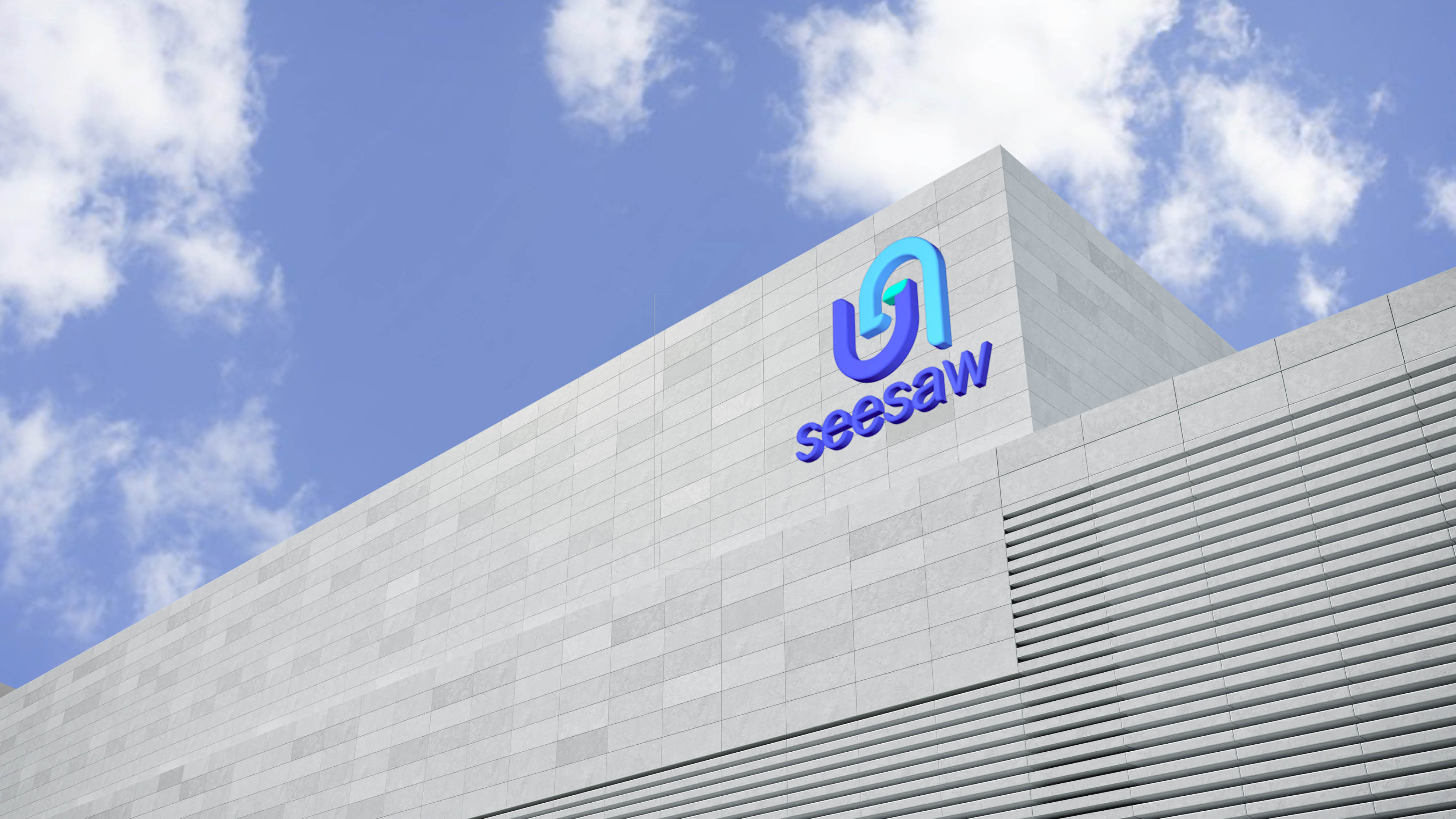
The rebranding integrates interactions and friendliness into the new identity, enhancing the trust-worthy image of the brand.
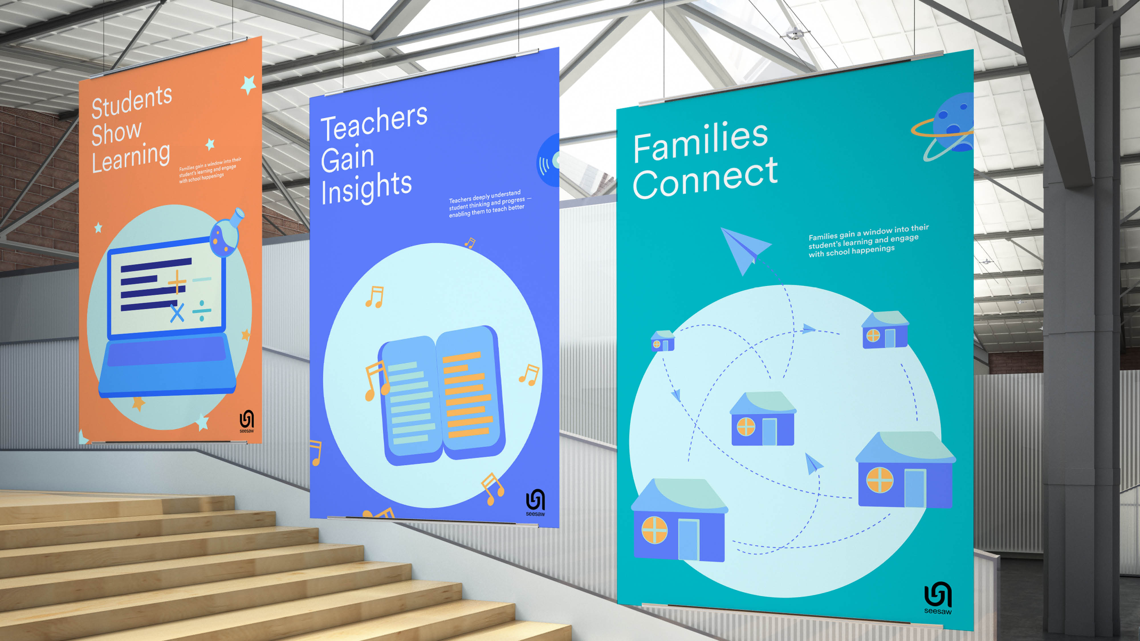
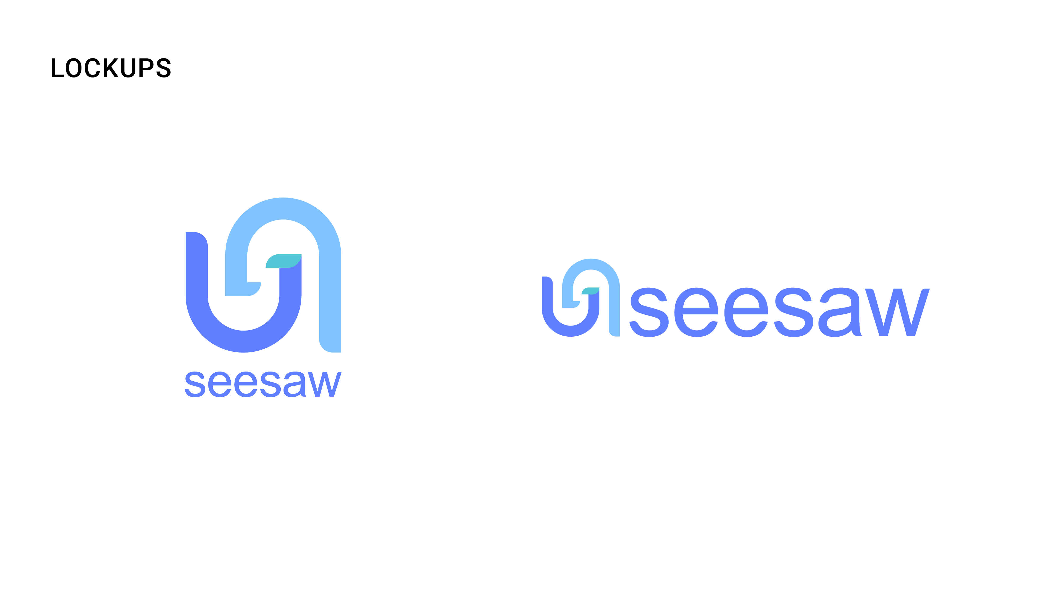
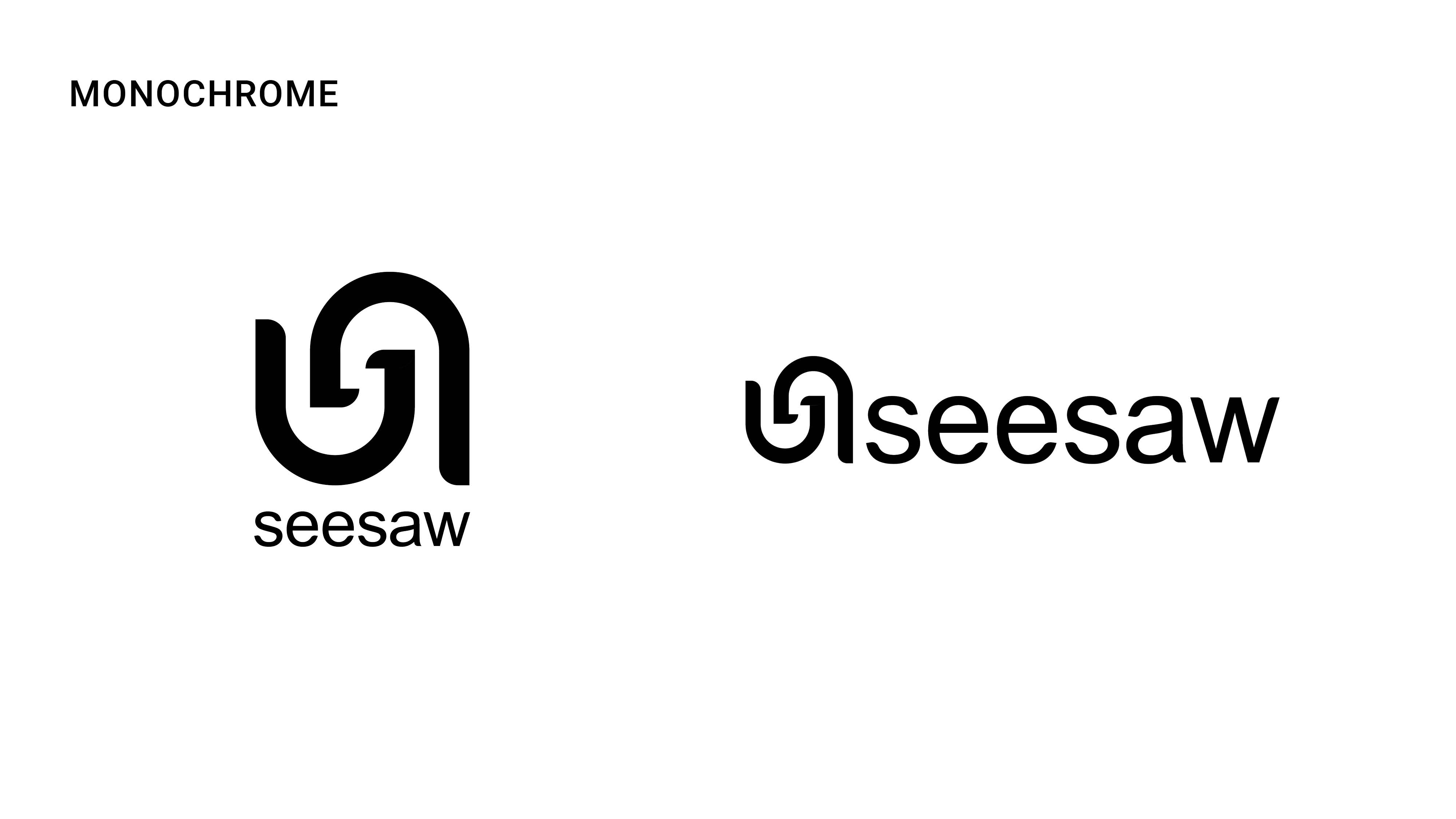
Interlocking the letter S's from the brand name Seesaw, the logomark conveys the message of connections between students, teachers, and families.
With preK-5 students as primary target audience, Seesaw aims to unlock their passion to learning.
The logotype was hand rendered to show friendliness and playfulness.
With preK-5 students as primary target audience, Seesaw aims to unlock their passion to learning.
The logotype was hand rendered to show friendliness and playfulness.


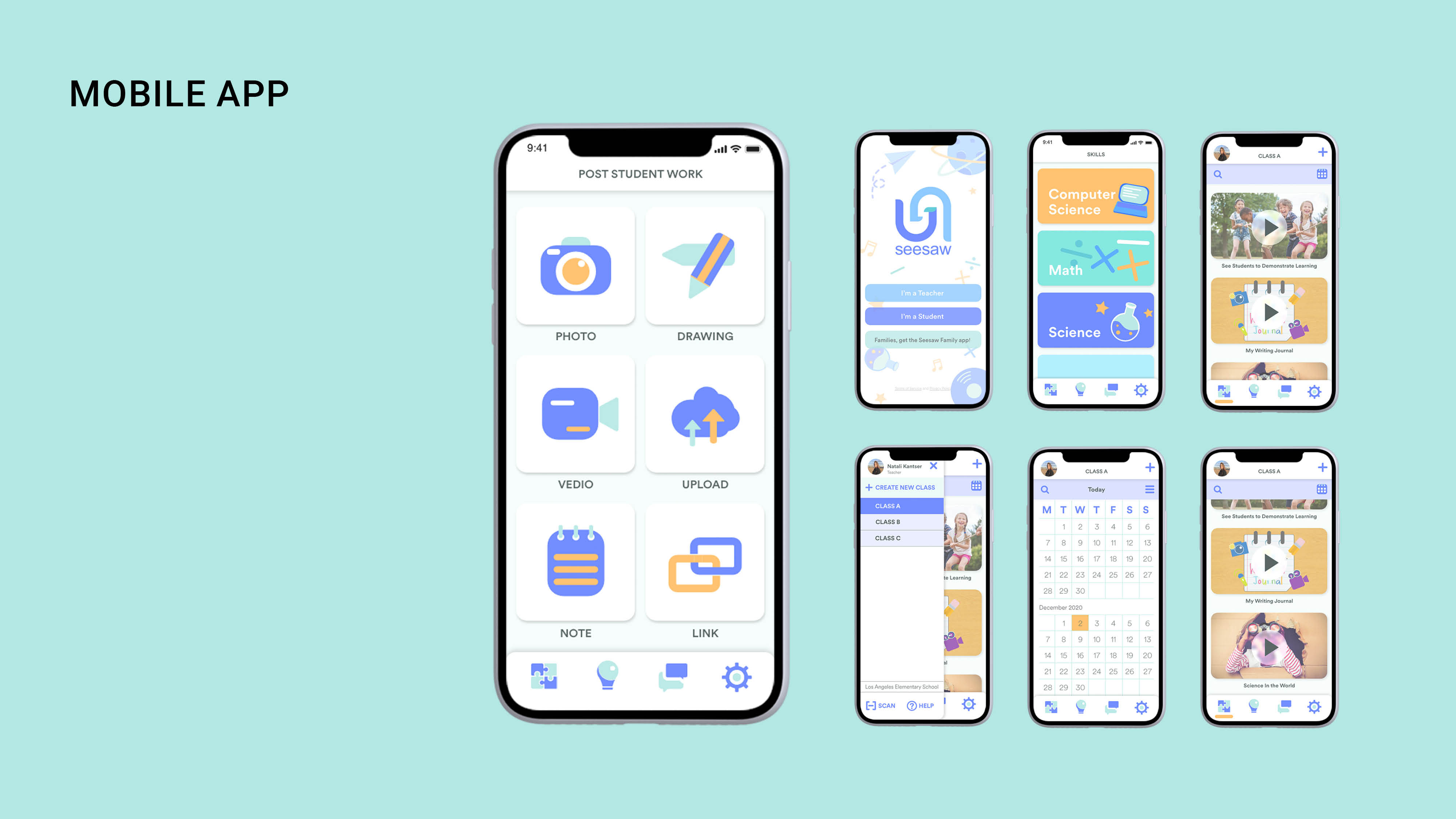
Teachers will mainly use the mobile app to generate content, assign homework to students and connect with students’ families.
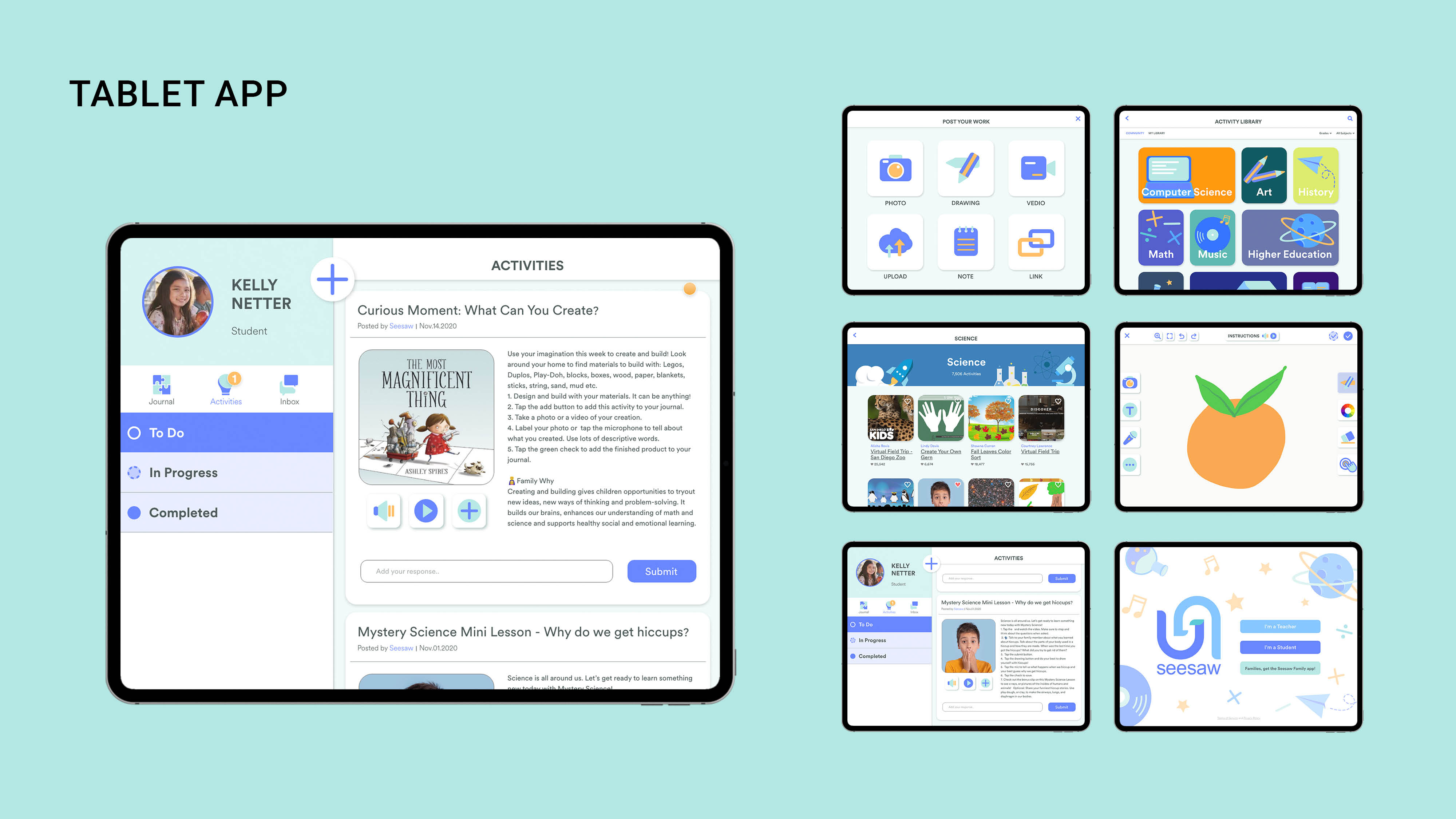
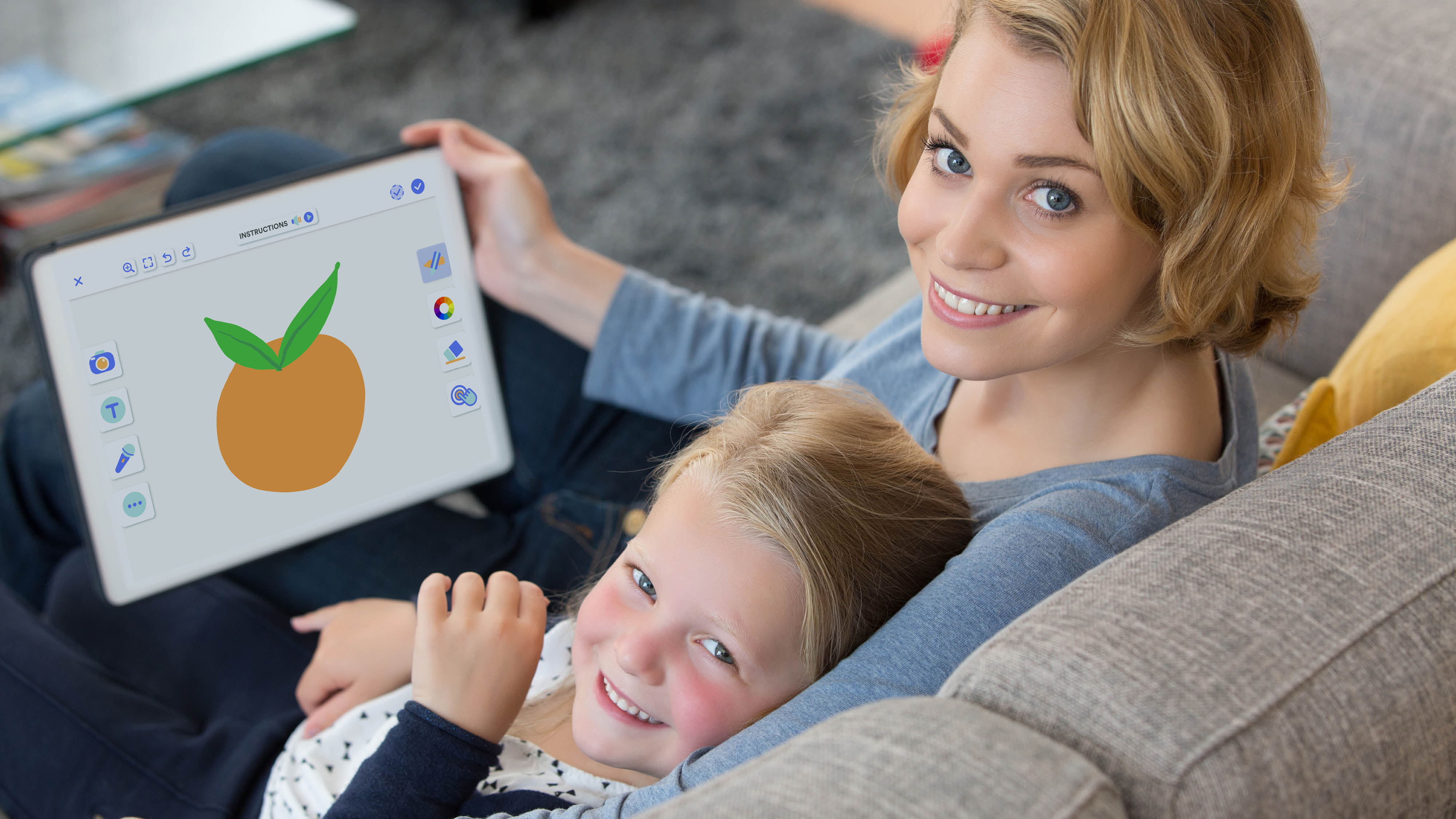
The tablet app is the major platform kids use. All structures are adapted to fit the contexts.
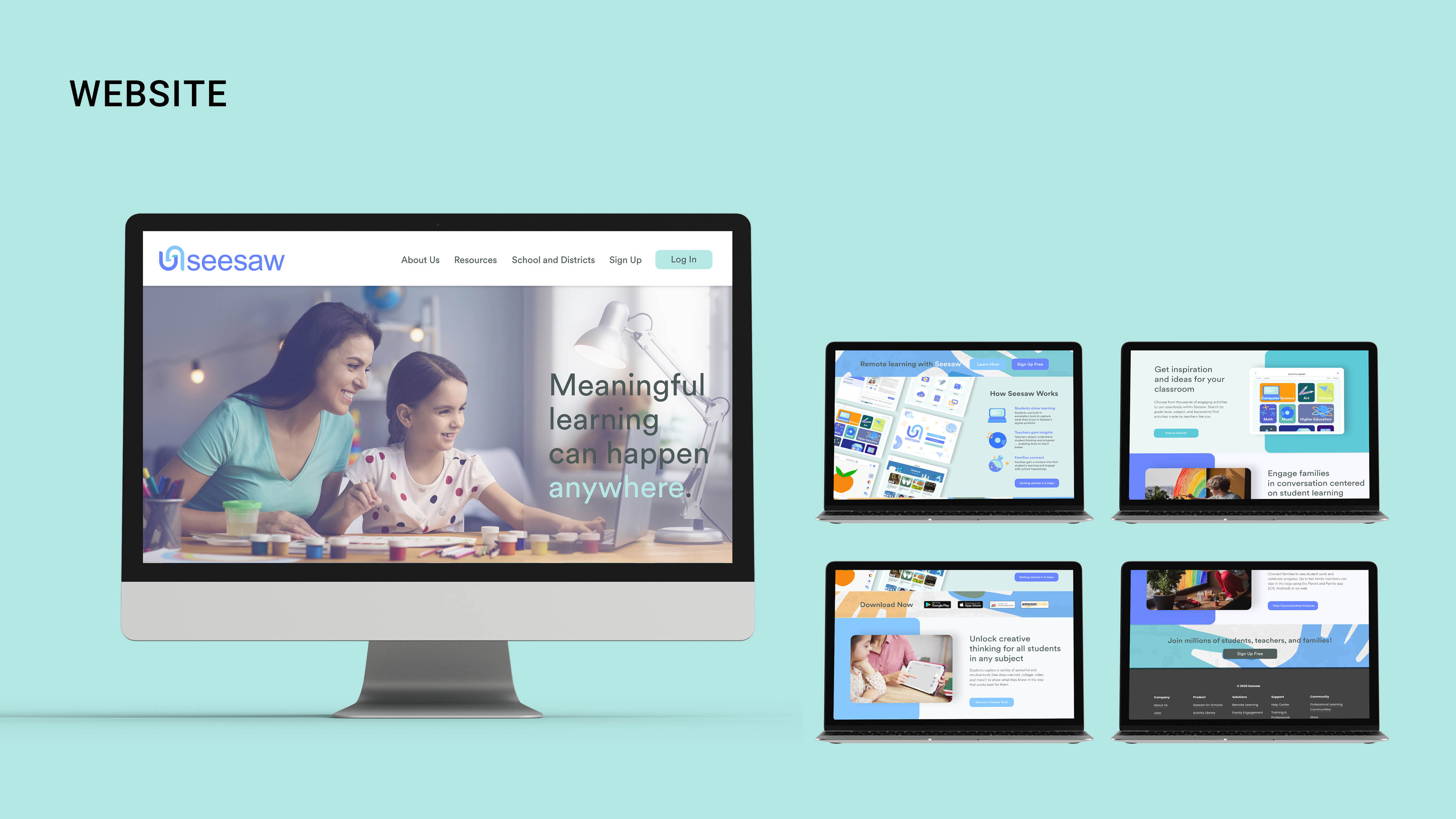
The website is created to showcase the features of the product, promoting it to teachers, schools, and enterprises.
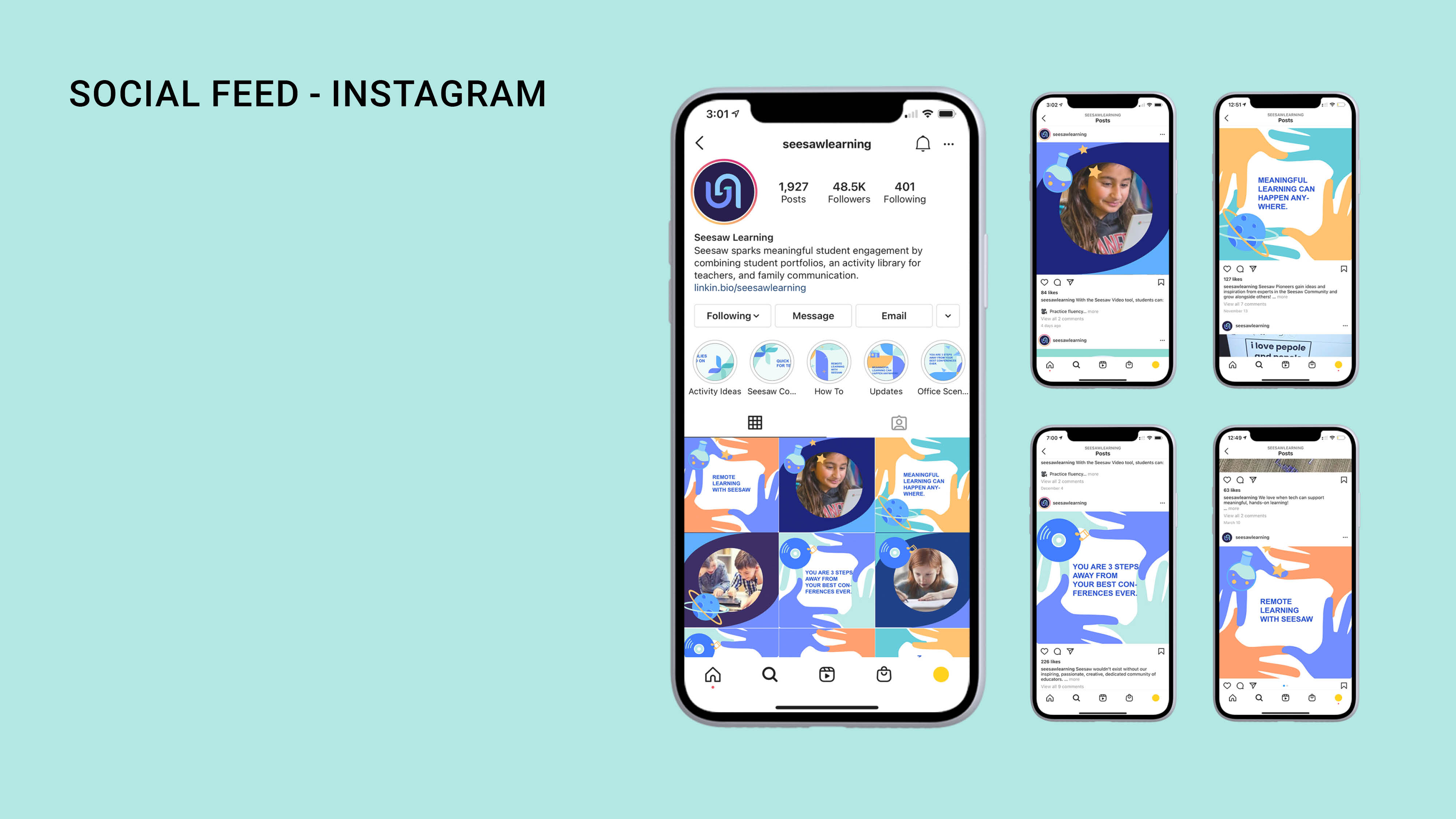
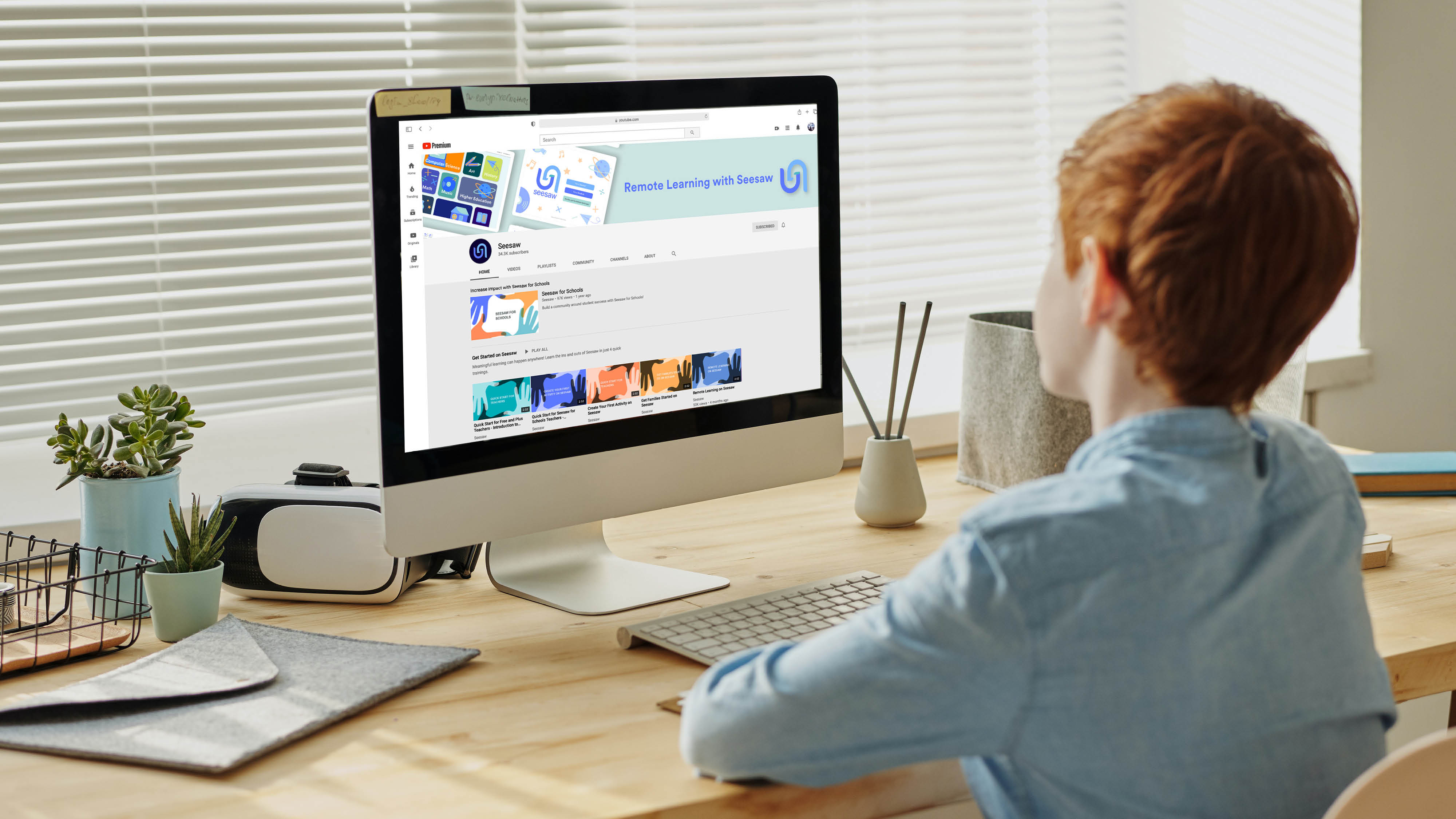
Social media contents are created to help both teachers and students. Tutorials and resources are ready to use for users. Verifed users can also contribute the community with their own content.

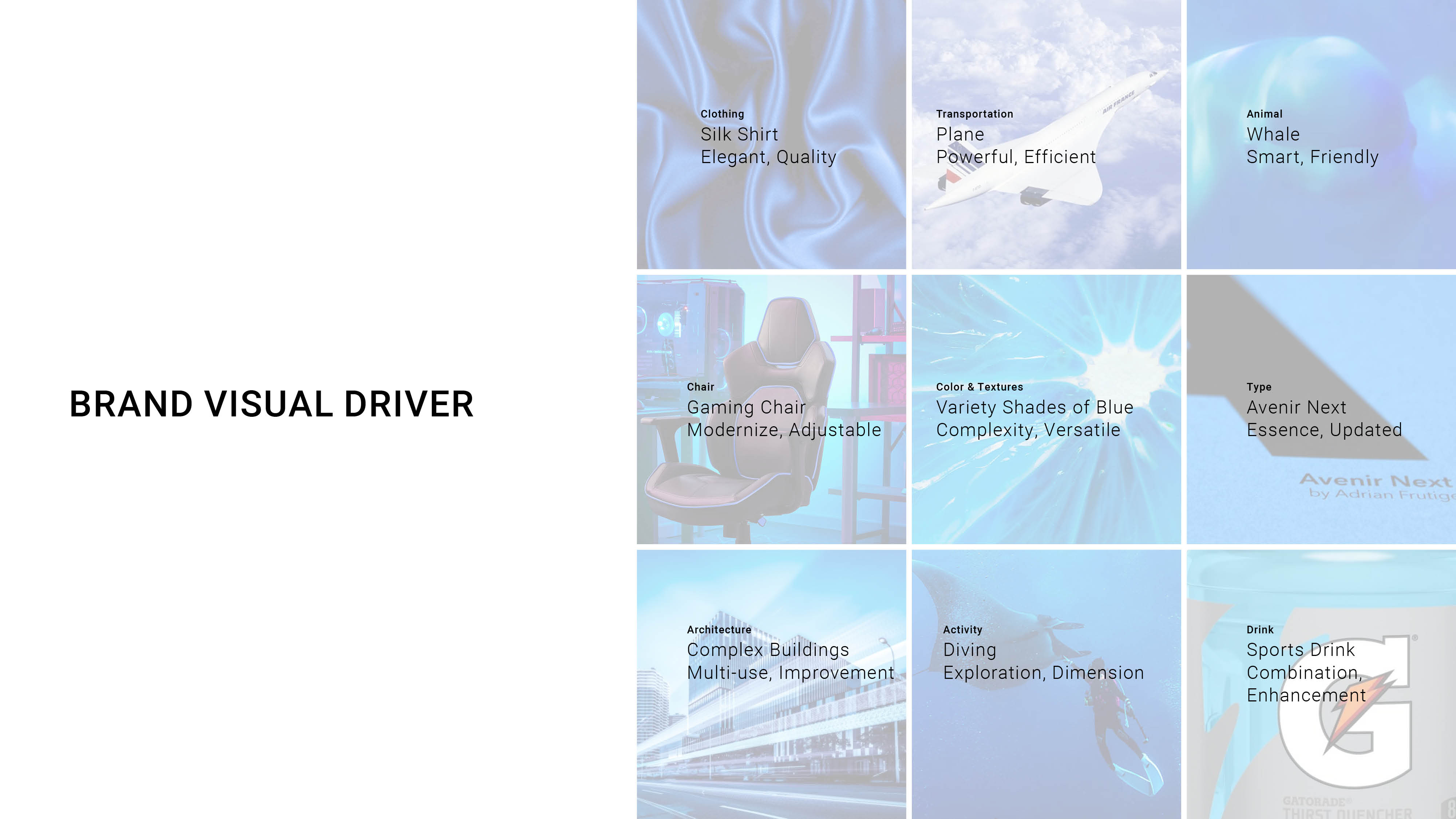
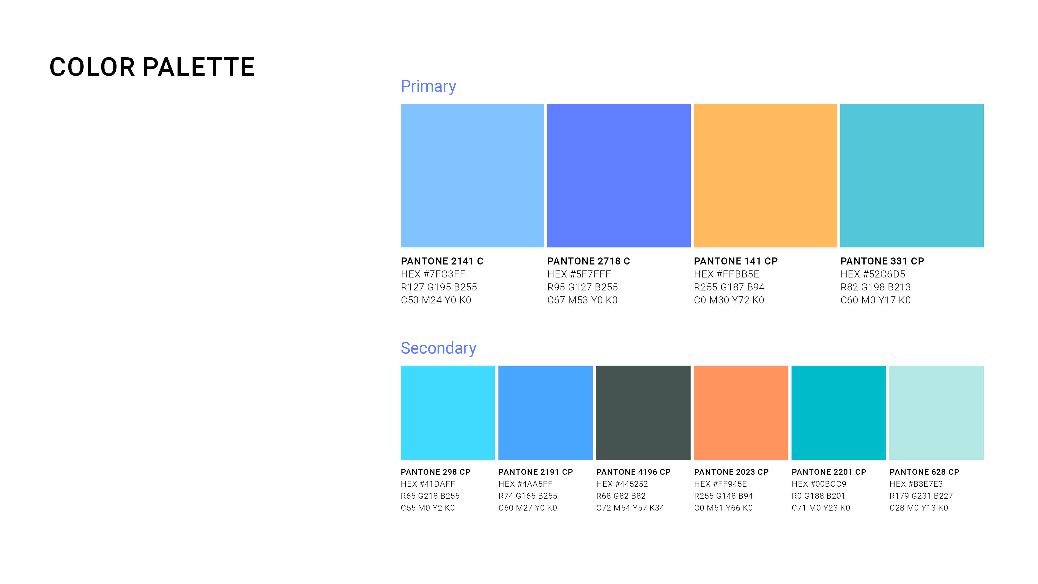
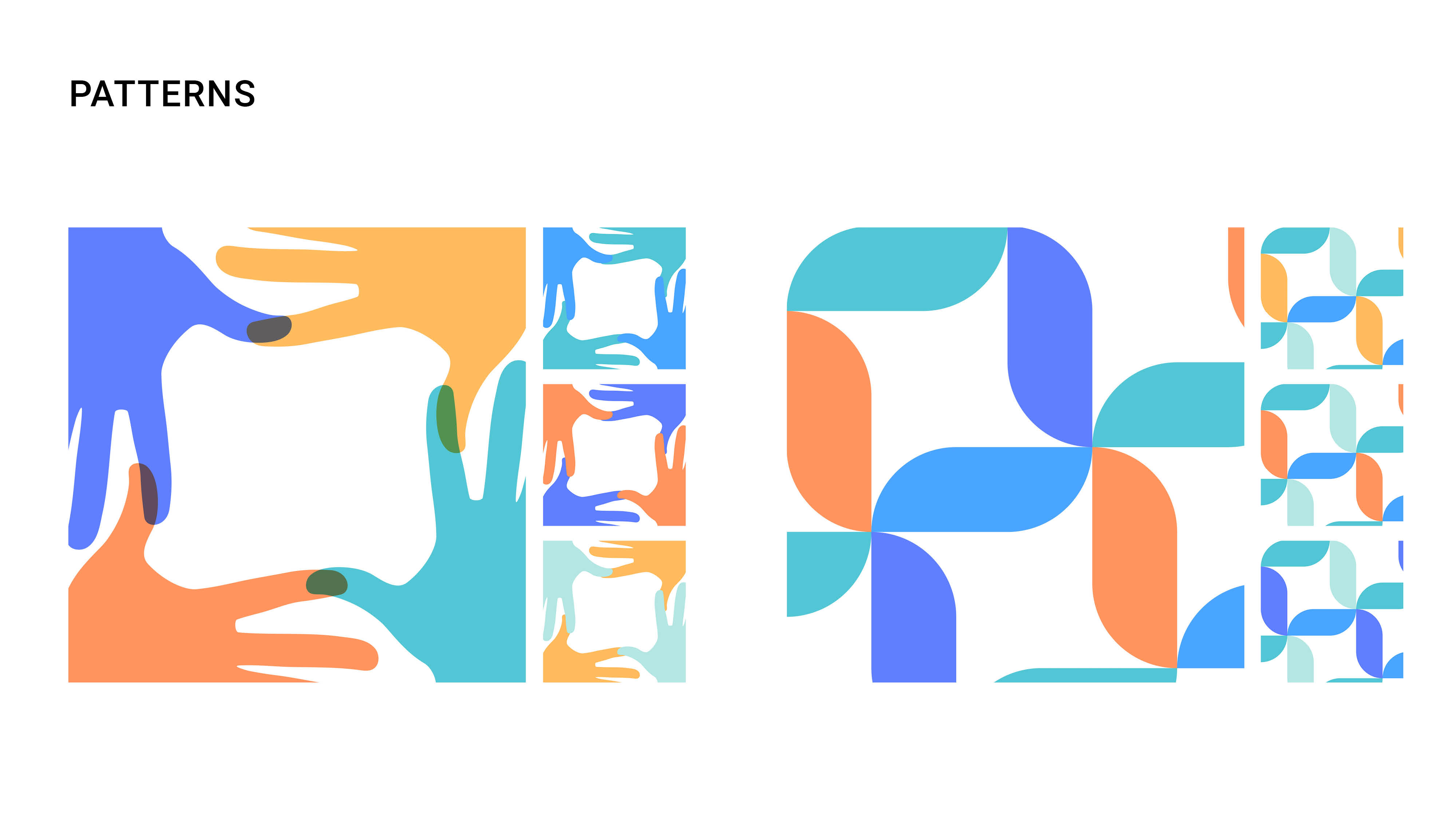
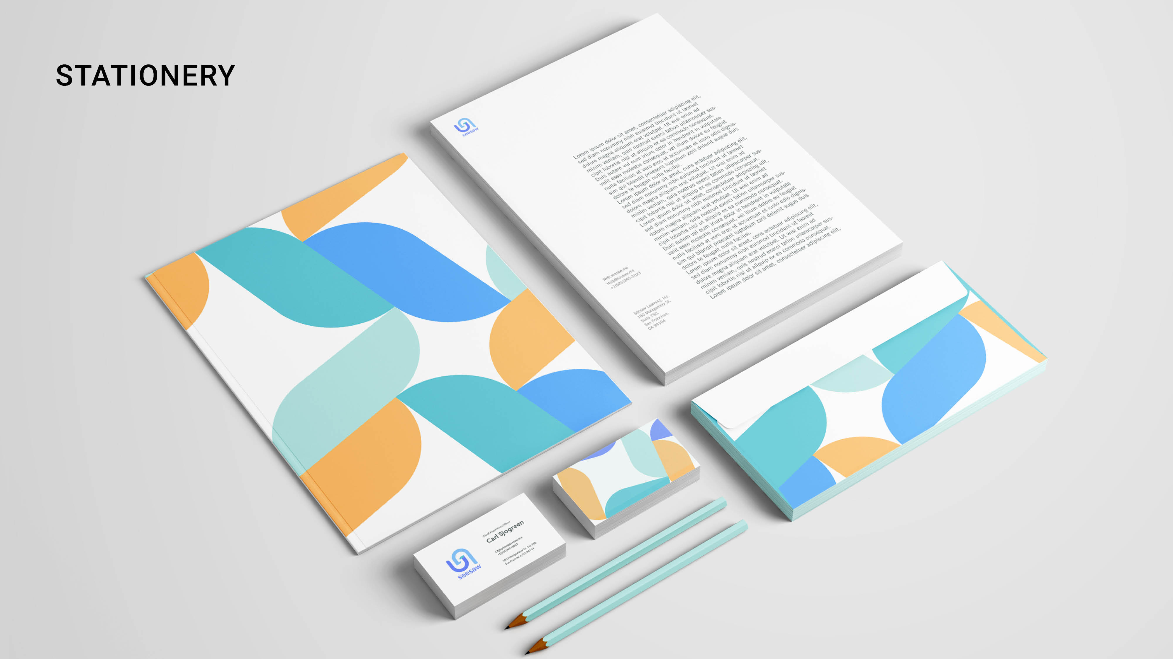
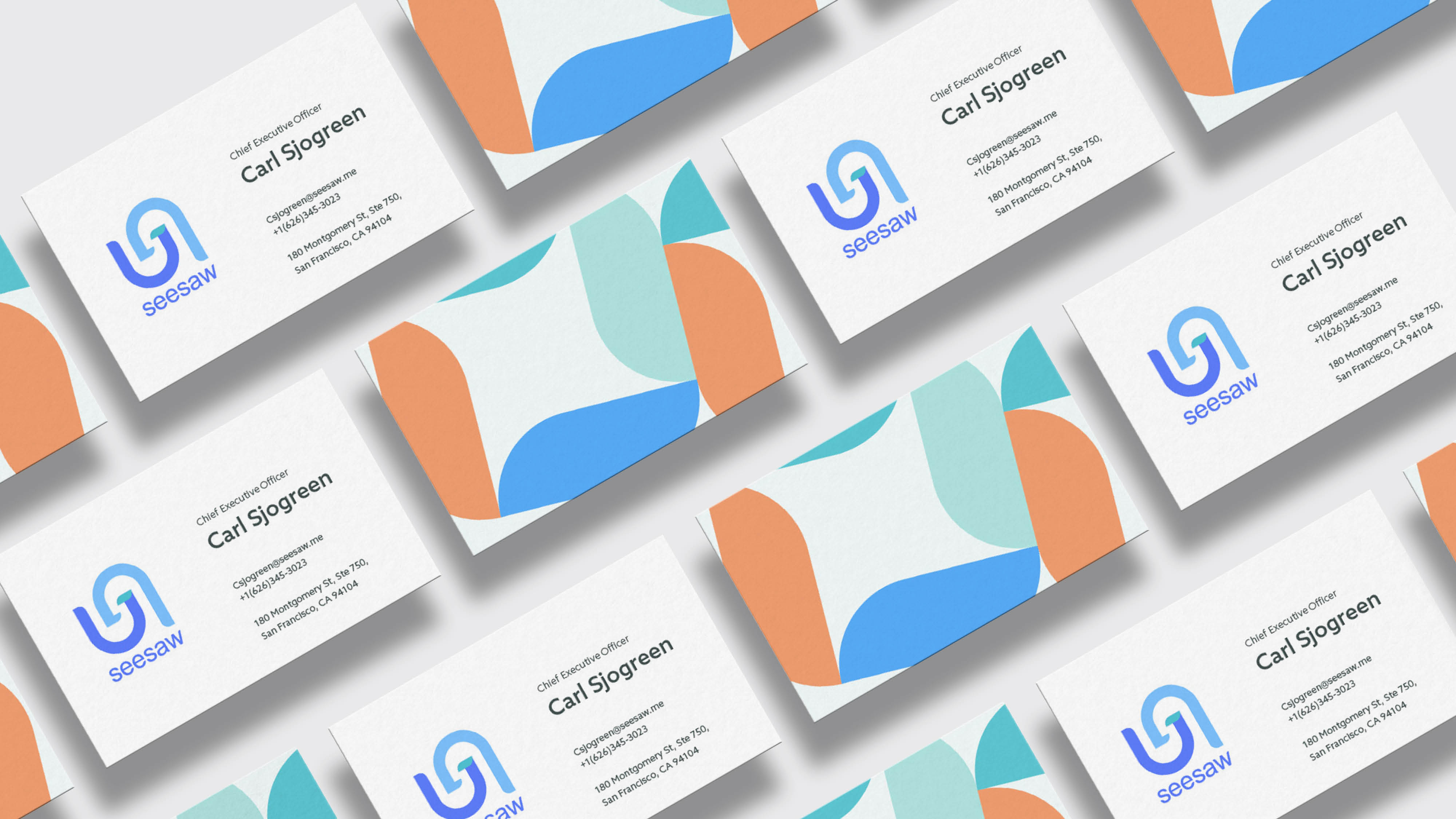
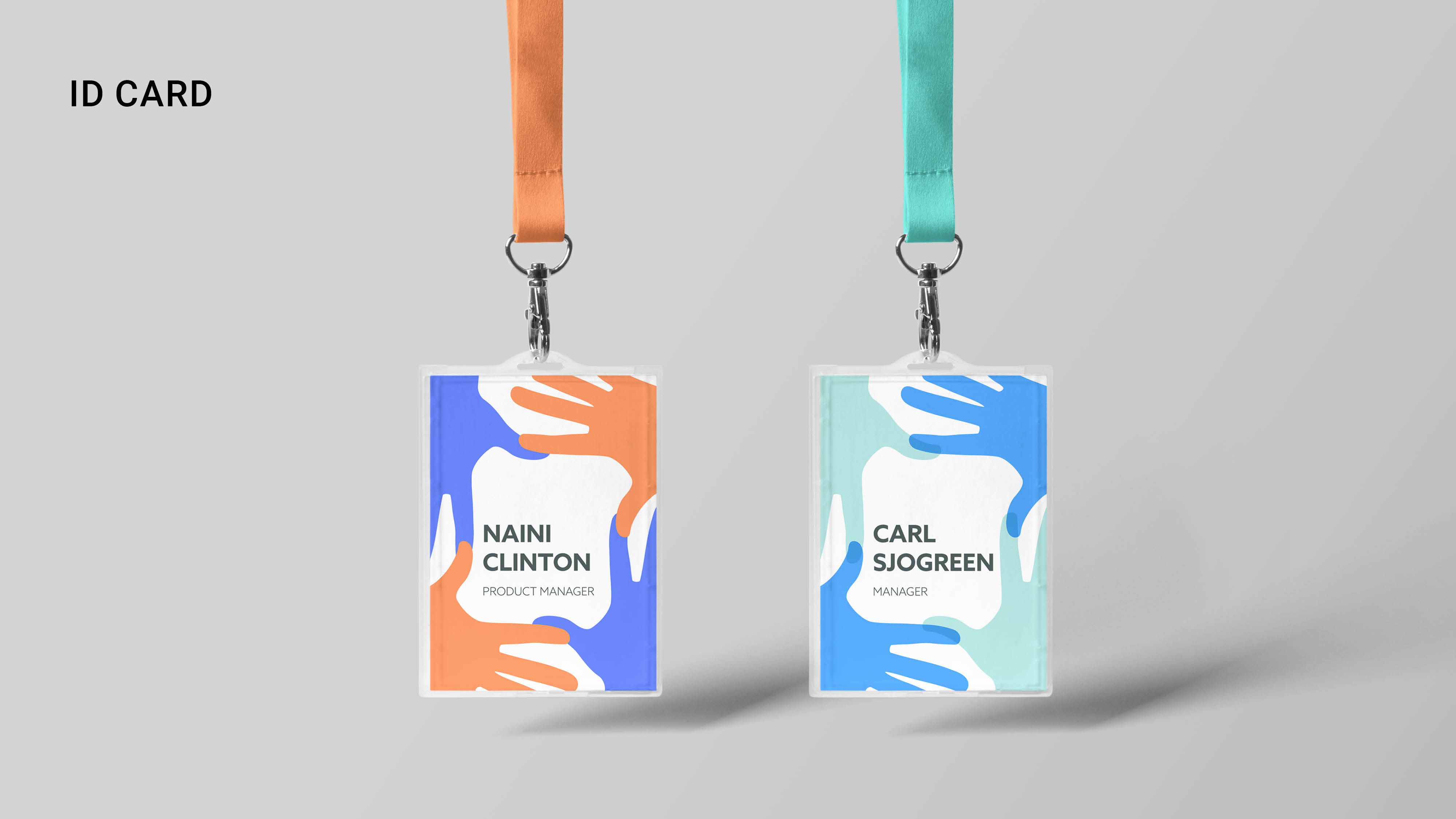
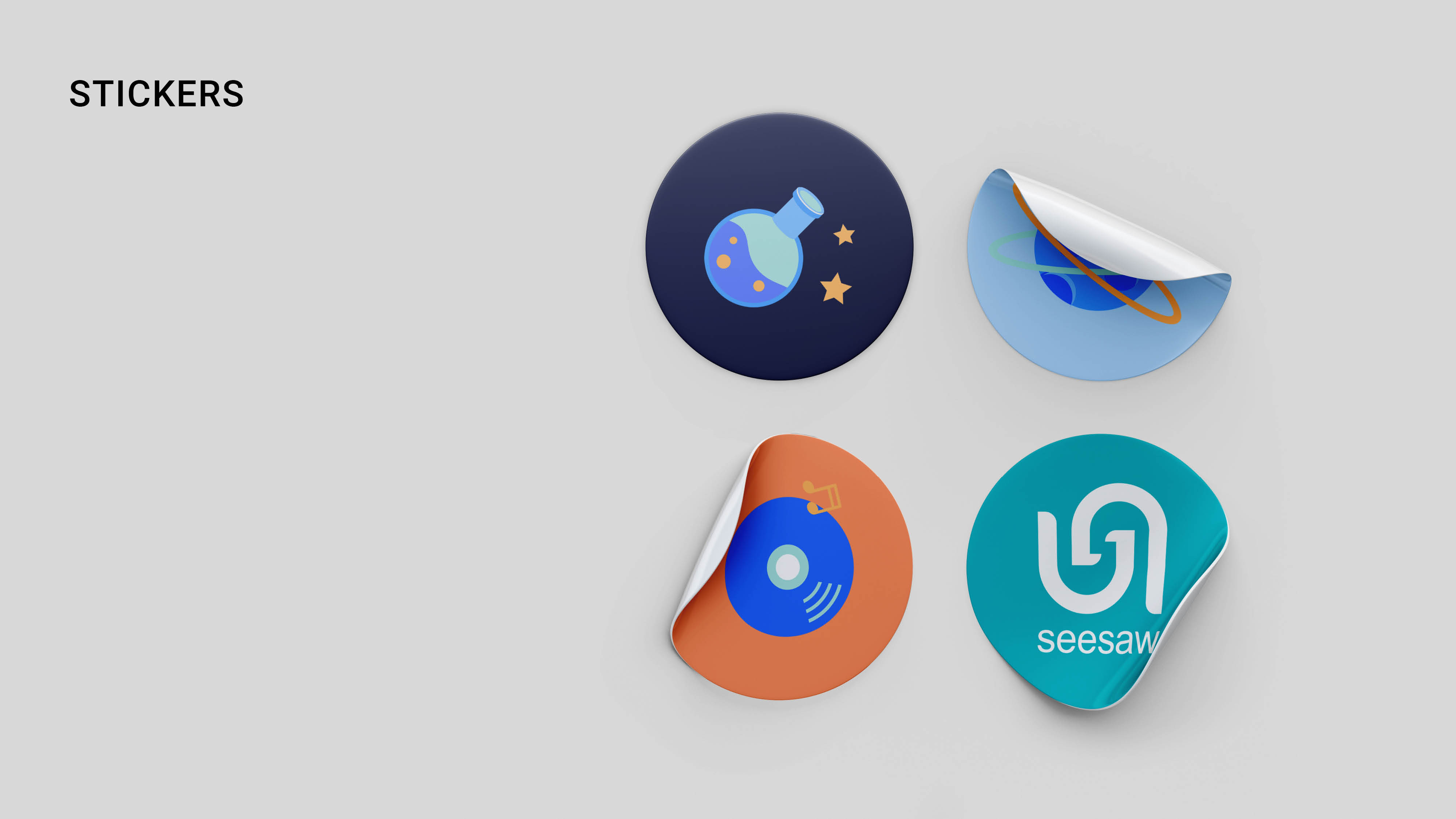
The identity system includes both 2D and 3D elements.


Check out more details –
From research to identity system elements